
..........................................................................................................................................................................................................
keeping up with the times
i like to think of myself as an approachable sort of despot, the sort of person who writes in-depth, highly researched articles with a casual, devil may care attitude, that will encourage searing debate amongst twmp acolytes and a re-appraisal of the very meaning of our deeply held obsession. sadly, thinking it is probably the nearest i'll ever get to such lofty ideals, and until that day dawns, you'll have to put up with the black and yellow pixels such as they are. however, there are one or two occasions when something i've scribed has engendered a response that produces further food for thought; a dialectic, if you will. yesterday's mention of the new rapha team kit produced just such a dialogue with a correspondent, resulting in today's acutely observed commentary (sorry, relapse into simulated skillful mode there).
i was fortunate enough to review the 2008 rapha condor recycling long sleeve team jersey, added to eventually, by the matching team cap. as mentioned in my previous article, recycling.co.uk, who had operated a team of their own in 2007 before merging with rapha condor, decided to move out of cycling sponsorship for 2009, leaving rapha condor without a third source of sponsorship, and a sizeable number of cyclists wearing outdated cycling kit. not exactly outmoded cycle kit, you understand, simply not of the moment. it's hardly a new problem, if indeed such an epithet can be applied to the situation: sporting teams of all descriptions have been changing their apparel year on year for some time past, and it's not all of us who find last year's that much of an embarrassment to be seen on the bike.
soccer, in particular, seems to have embraced rampant commercialism with regard to each season's jersey, almost assessing it an annual income of right. due to their perceived higher commercial value in this modern world, soccer teams are quite likely to retain the same sponsor year on year, meaning there is no real need for a change in jersey design. but the jersey gets changed anyway. in fact, as i remember it from my days as a youngster, when father and brother attended matches every week of life (or so it seemed), soccer teams were identified by their unique jerseys which only changed when playing away from home against another team, whose jersey design could easily be confused on black and white television.
whether wearing last year's jersey bothers you or not, we eventually come across the dilemma of when an outdated version becomes regarded as a classic: wearing 2008 rapha team kit may be seen as 'so last year', but encasing one's torso in a 1980s del tongo colnago long-sleeve, is likely to confer a degree of connoisseurship. something that wearing a polti jersey from yesteryear certainly wouldn't. and that discovery channel kit surely can't be considered the most fashionable choice you ever made for the sunday ride?
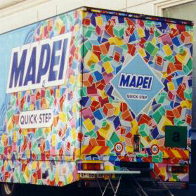
it may be, however, that this problem has escalated to an altogether more expensive realm, if we start to look at the hardware part of the equation. my correspondent pointed out, quite correctly, that he felt a mite sorry for those who had purchased a not exactly budget-priced 2008 rapha condor team bike, since the 2009 edition bore a similar, but identifiably different colour scheme. i tend to concur to a certain degree, happy in the knowledge that i didn't order my c40 in either rabobank or mapei colours (though it might just be that the latter could be considered a classic by now, coloured cubes notwithstanding). of course, that tends to be the way the world works nowadays; those of us involved in using computers for the daily grind (probably most of us) must surely know that the best time to buy a new computer is always next week.

if it's something that bothers you, perhaps it would be better to ignore the team offerings: stay away from probike-kit (no disrespect intended) and any frame that bears any similarity to something used in the pro peloton. leave the discrimination to andy and mick at prendas: when it appears on their site, there's an evens chance that it is now considered a classic and is likely to elevate your status midst the more knowledgeable members of your peloton.
thanks to rob brown for pointing me in the right direction here.

posted on friday 30 january 2009
..........................................................................................................................................................................................................the style council
i've deliberately left this for almost a week to separate it from its topicality, not because you wouldn't want to know all about the event itself, but because part of the latter impinges on today's scrawl. (and i do apologise for such an indeterminate introduction).
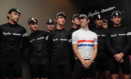
on friday last, at malmaison in london, rapha condor launched their team for 2009, not necessarily notable in and of itself, but considering the way the team funding is structured this year, it's definitely worth taking note of. quite how much it costs to operate a cycling team over a very full season (i counted a total of 55 races on their 2009 calendar), but with recycling.co.uk removing themselves from the sponsorship equation at the end of last year, this would mean that either rapha and condor have to stump up with a few more pennies, or they find another way to fill the gap. bear in mind that we are talking about probably the most sartorially stylish team on the circuit; too many logos do not a decent jersey make. (see below)
so the 2009 rapha condor team have gone about raising the money in another way that still fits the bill of sponsorship, only some of it isn't commercial in the form we have come to recognise: they asked their customers for money. individual 'membership' of the team costs £1000 (corporate is £10,000), for which, of course, there are a very pleasant series of fringe benefits that go along with this sponsorship. that, however, is not the main gist of my proposal here: i have criticised - and not without good reason - the designer of the 2009 team columbia jersey, a team with a higher professional profile, but considerably more money in the pot. the comparison here is that columbia are a clothing manufacturer, who presumably employ people who design stuff. so where they went wrong is hard to fathom.
rapha, as we all know, also design clothing, happily the sort of stuff that clothes cyclists rather than the coverings for mountain climbers. so when it comes to promoting their own product through a cycle racing team, it is in their own best interests that the jersey, shorts et al are at the forefront of the genre. ok, black and white trimmed with pink are hardly the colours that legends are made of, but in this case, they quite likely are. can you remember the team colours of any others in the premier calendar? (there's always one smartass at the back). the simplicity of the design is superb: the team is known as rapha condor, and that's all it says on the jersey, almost the same as ullrich's and coppi's bianchi jersey. up until now, the team philosophy has been to compete to the best of their ability, and look particularly stylish while doing so. up till now, they have arguably exceeded those expectations, but team manager, john herety seems intent on a smidgeon more aggression; "expect to see the same style and swagger but you'll see a harder, more ruthless team in the races this year. it's time for us to get noticed and not just for being cool." you can't say we weren't warned.

but just in case i am accused of impartiality here (i have many friends at rapha) let me show you the opposite end of the scale, where there are so many sponsors that the jersey has disappeared altogether, savio's diquigiovanni team. the jersey is seen here on the shoulders of gilberto simoni who seems remarkably pleased to be a cycling advertising hoarding in the worst sense of the phrase. it is not for me to disparage a successful professional team who obviously need the kind of money that such a wealth of sponsors brings in to pay not only simoni's salary, but also that of davide rebellin. but let's not kid ourselves, there is nothing resembling what you and recognise as design here. i admire the spirit that has kept this team going so well for so long, but a quick phone call to perren street could probably have avoided this. for if simoni, rebellin and their team-mates travel as fast as they hope, i'm not sure who is going to be able to read all those names in any meaningful way.
isn't it great to criticise or praise from a distance - a distance that has no real sense of inherent responsibility, but simply that of appreciation?

posted on thursday 29 january 2009
..........................................................................................................................................................................................................sugababes
i'm pretty crap at drinking when i'm out cycling. i don't really know why - i set out with the best of intentions and make an effort to take a slurp from the bottle at least every ten minutes, but as time goes by in the opposite direction to the headwind, i forget. doubtless this is a symptom of something a lot more fundamental: can i reasonably consider myself to be suitably concentrated on the task at hand (cycling) if i can't factor in a regular grab for the bottle? happily, so far, this seems to have had no ill effect; i still manage to finish my bike rides of up to 100km without completely finihsing a 500ml bottle and without the aid of paramedics and a luggage trolley, but it does rather concern me, considering the emphasis placed upon drinking sufficient quantities, that this state of affairs doesn't appear to be improving. i think i drink less now than i did a couple of years ago.
on the london-paris ride in 2007, on day two i met a very hot and bothered looking anthony mccrossan who had finished two 750ml bottles and was starting a third (this after 100km covered), while i had barely emptied one 500ml bottle. in mitigation, i should point out that i can consume vast quantities of liquid when the cycling has stopped, and on the day in question, i demolished two litre bottles of still water along with my lunch (and i didn't stint on the bread and rice pudding).
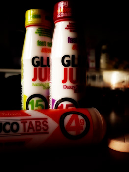
however, aside from the liquid content, if i'm out for many a kilometre, i rather fancy the idea of ingesting come carbohydrate to make sure there is still a pocket of energy when cancellara puts the hammer down. but of course, if i can't persuade myself to throw down lashings of water, then none of that lovely pink grapefruit flavoured torq powder is going to replenish my energy stores, such as they are. but i may just have hit upon at least a partial solution: gluco tabs and gluco juice. maybe you remember dex dextrosol, the character who used to advertise dextrosol tablets, little square lozenges of dextrose that were, for what reason i know not, very popular when i was at school. unfortunately, in the case of the latter, it was definitely a case of form over function: they may have been cool to be seen with, but they tasted rather sickly.
gluco products might not be quite so cool (if you catch my drift), but the taste of the tablets is a lot more yummy. the apparent advantages of dextrose (the most easily absorbed form of glucose) are a complete lack of fat or any other type of sugars, and since glucose is the food of the brain, kidneys, red blood cells it's a logical choice for us sporting types. each tablet contains 15g of dextrose which arrives in one of two flavours, orange or raspberry, of which i rather preferred the latter. it's pretty easy to flip open the plastic tube and pop one in your gob while puffing and panting up alpe d'huez, the col du telegraphe or port askaig brae.
but i thought you were moaning on about not being able to drink? i'm glad you mentioned that, because that brings me to my second point of order - gluco juice. containing 15g of carbohydrate, again in the form of dextrose with no fat, no caffeine and no gluten either, all hermetically sealed in a 59ml plastic bottle. it's easy to stick in a back pocket and glug some at any brief stop, or even on the bike. if it comes to the latter, you'd really need to open the internal seal before you set out, because it'll be a devil of a job while pedalling unless you can ride no-hands (and i can't).
that either the lemon and lime or berry burst are doing wonders for your sugar and fluid intake can be gauged by the fact that both taste faintly of a medicine of indeterminate type; not unpleasant at all, but not exactly like a fruit juice. what does concern me slightly are the devil in the details e numbers listed on the contents panels. particularly on the gluco juice which is contained in a white plastic bottle and not really seen in the process of gulping. since the e's seem to be there entirely for gratuitous colouring reasons, i'm not quite so struck on that factor at all. a 59ml bottle costs £1.59 while a tube of ten gluco tabs is a perfectly palatable 79 pence.
both are available from pharmacies throughout the uk.

posted on wednesday 28 january 2009
..........................................................................................................................................................................................................the merry dance
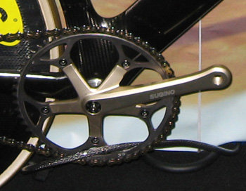
we're probably all aware of marketing in its various forms, but those on the other side of the marketing equation are rather hoping that we can't see the strings. it's why tv adverts change with unfailing regularity - if we become too used to a particular flavour, eventually it passes unnoticed. the test bike i have in thewashingmachinepost bikeshed at present has a crank with one ring, for use with a fixed cog on the back. this is a brand new machine, built within the last few months and equipped with some of the finest componentry on the market. and guess what? the bottom bracket is a cartridge square taper.
i'm alright at pedalling uphill, able to do so with a comfortable degree of speed (it's all relative, remember), but i can't say that my power output would give anyone a fright, so i'm unilkely to trouble even the spindliest of bottom bracket shells, and i've certainly been unable to have most of the 2008 carbon output i've ridden, to flinch so much as a millimetre. the bicycle in question is quite spindly, a feature that continues around the lowest part of the frame. but if we have listened carefully to those with our best interests at heart, a bulletproof bb shell combined with any of the current miasma of external bearing bracket sets, or those even bigger, chunkier jobbies relying on press fit bearings and even larger axles, is an absolute necessity to modern cycling. how anyone ever won anything without the frame twisting itself into just so much scrap metal or a shower of carbon splinters is worthy of examination by nasa.
but have any of you spent any time perusing the more obscure features of those team gb carbon bikes that have led to a knighthood, a clutch of new years honours and a lot of shiny gold, silver and bronze medals? me neither, until this morning. i, perhaps in company with the rest of you, had simply taken it for granted that a bicycle costing as much as a mid-range ferrari would be hung with the latest in fashionable technology. and i'm probably largey correct, except if you take a closer look at the bottom bracket of a team gb frame, one feature will not surprise you, but the other one might.
the blending of the down tube into the seat tube by way of the bb shell is expectedly colossal, utilising as much carbon in this restricted area as seemingly in the rest of the bike. but what of the metal and bearings ensconced within. no external bearings showing here, and the allen bolt head in the centre of the sugino crank unmistakenly points to a square taper bb spindle. it cannot have escaped your attention, if you watched not only the races but the inevitable slo-mo replays, that messrs sir chris and cohorts are unleashing enough power to light the average islay village for an hour or two - probably more than the chaps at the back of the train, heading towards the finish line of a tour stage.
so, if we accept that the quest for stiffness and rigidity has produced an incontrovertible truth, then team gb should obviously require cannondale's bb30 oversized spindle running in a set of much larger internal bearings. but they aren't. and not only are they proving the need for a breakfast of bran flakes, they're trouncing the french, new zealanders, australians and italians time after time after time. on square taper bottom brackets. so it would seem that we have been led up the garden path once more, since i for one figure that if a square taper is good enough for sir chris, what the heck are the rest of us doing chasing japan's, italy's and pennsylvania's idea of torsional rigidity?or have i missed something?

posted on tuesday 27 january 2009
..........................................................................................................................................................................................................break out the fixed velocipede, jeeves
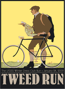
those fine human beings possessed of a work ethic that would bring the rest of us to our knees (in jeremy dunn's case, it quite literally did), the rapha continental finished their own tour of california on sunday after riding every stage of the tour in the way that they know best. a stream of photos that will make you jump for joy can currently be seen on michael robertson's velodramatic site. but while north america applied the laws of cycling in their own inimitable style, a ride took place in london where a stiff upper lip and tea with the little finger extended were order of the day. the way the brits do it. (well, the english, to be more specific - we were all too busy learning burns' poems north of the border).
on saturday afternoon (24th january) leaving from (where else?) saville row, the london fixed-gear and single-speed forum's tweed run meandered through the streets of london on its way to the bethnal green working men's club, stopping off at tour de ville for mid-ride refreshment. dress code for the day consisted of 'woollen plus fours, harris tweed jackets, flat caps, fair isle jumpers, alpaca coats, merino wool team jerseys, cycling skirts and perhaps a jaunty cape for the ladies, cravats or ties for gentlemen, and of course a hip flask of brandy' with prizes being awarded for panache and authenticity - basically, the more dapper, the better your chances.
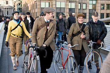
graeme raeburn of rapha described it as 'a brilliant afternoon ride, quite unlike any I've ever been on.' this seems like just the very sort of creative thinking that could help create the uk equivalent of the rapha continental - exactly the same only slower, quieter, less energetic, and more civil. in fact nothing like the rapha continental at all.
but great fun all the same (and a rather spiffing poster).
london fixed-gear and single-speed forum | flickr gallery

posted on monday 26 january 2009
..........................................................................................................................................................................................................in the buff
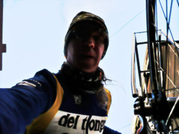
much like one of those words that you never quite know the meaning of, but are too scared to admit or ask, i'd not really got much idea of what buff or a buff was. yes, the logo rings a few bells, but associating that with a product was something that would have doubtless kept for a rainy day. that rainy day was yesterday.
so now that i have a plethora of buffs at washingmachinepost towers, what the heck is a buff? crudley put, it's a tube of polyester microfibre with a fancy pattern on it, that you can wear about your person in oh so many different ways. the name, you will be pleased to hear, comes from the spanish word for scarf - bufanda - spanish, because that's where the product originated from. of course now, you can buy them all over the world, and they're used for a multitude of purposes from sporting and outdoor to mere decorative effect. judging by the mini-catalogue that accompanied my buffs, there can be few patterns that have not been thought of, and happily to fit all sizes of people, from baby, through juniors, to big people often mistakenly called adults.
i'll confess that, left to my own devices, any buff fitted about my person would have merely emulated the common scarf because, well what else would you do with a tube of polyester? buff apparently have experienced the duh? factor many times before and put a very helpful dvd in the box containing entertaining instructional videos on how to create any one of the twelve different forms of neckwear, headgear, armwear etc. but you need worry not about the lack of your own copy of said dvd, since their website features all the same videos to alleviate your concerns after purchase.
the original buff utilises only the polyester microfibre, the reflective version has a scotchlite strip from top to bottom for those who wish to be cosy and safe after dark,
 and the polar version ends the polyester at one end with a hefty chunk of colour co-ordinated polartec fleece. if you're going somewhere really, really cold, there's polar buff thermal pro (which might just have come in handy yesterday). all of the polyester sections are seamless, therefore there are no irritating seams if worn under a jacket collar or helmet.
having watched the videos a few times (some of my early creations were inspired but not wearable) i was able to produce a very warm and cosy beanie to fit under the catlike, while opting to wear the original buff as a neckscarf doubled in on itself. islay is the ideal location in which to test this kind of stuff to best effect: jez (wearing a standard buff about his neck) and i experienced the expected wind, the also expected cold, heavy showers, and a wind chill of about four below. despite both ears being right next to my hearing, there was no sound of complaint from either, while a high collared waterproof over the buff kept the bulk of the cold at bay.
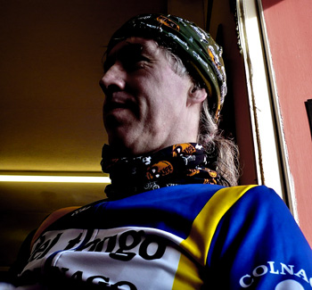
both versions are quite impressive and versatile, particularly the polar buff which, if i follow the guy on the video correctly, can be adapted to anything between cold, and even colder conditions while still fitting under a cycle helmet with ease. better still, buy two and wear the second one as a scarf until easter. you can form your own opinons of the sartorial elegeance or otherwise from the photos accompanying this article, but we think they're ideal if you're looking to dilute the belgian roadie image, and i'm conceited enough to think they look quite cool. don't bother to burst my bubble by e-mailing to say otherwise.
the reflective buff has to be regarded in a slighly different light, if you'll pardon the pun. naturally enough, it can be twisted, rolled anad scrunched into all the same shapes and uses as every other buff, but some of these will seriously dilute the intended point of the garment. to explain what i mean, there would really be little point in fashioning a beanie out of the reflective buff, then wearing it under a helmet: what is there left to reflect?
there are two broad strips of scotchlite on each side of this version, so to gain the maximimum glare, i made it nto a balaclava. in cold weather (such as now) this is actually a very practical use of a buff. the polyster tube is long enough to fit under the collar of a jacket and sit on shoulders and lower neck to keep the heat in and the cold out.
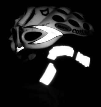 and if you get it just right, with the stripes on each side (see accompanying photo) there is little danger of not being seen in headlights on a (very) dark night. a spark of genius really, and immensely practical for the cyclist who needs to commute of an evening while keeping warm.
the standard and reflective buffs retail at £11.99, the polar buff at £19.99 (baby and juniors are from £8.99 and £10.99 respectively). apparently, if you feel the need for your cycle club (or suchlike) to be kept warm while retaining the team identity, you can order as few as 25 with your own design.
so even in winter, it's a perfectly respectable idea to be seen in the buff

posted on sunday 25 january 2009
..........................................................................................................................................................................................................santini threequarter bibshorts
it is winter. there can really be no denying, and on islay, where there are acres and acres of sky, you can see winter's attack long before it hits you. this, in any other walk of life, would allow for sheltering, for the seeking of some place of hideaway until the attacking front of winter passes by. sadly, all you can do around here is watch it edge ever closer before unceremoniously dropping substantial quantities of precipitation. very cold precipitation at that: it's winter after all.
of course, we're disgustingly tough and hardy round these here parts, and shuffle off winter as if it were just another season, though if you promise not to tell, encasing ourselves in breathable waterproofs and cosy, fleecebacked garments over the nether regions - thermal gloves are good too - keeps character building firmly in view even if we're not all we've made ourselves out to be. realfeel is about three degrees below, and while the wind has been stronger in past days, it has abated to around 35kph. and it's cold; colder when the rain hits, just like a brain freeze when you eat ice cream (not that we intend to in the current climate.)
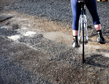
demonstrating this toughness of character to no-one but ourselves, even though we don't really care, has seen the flash of some lower calf and shin. tights tucked into waterproof overshoes would perhaps be more seemly, but bib threequarters demonstrate a far hardier constitution (don't they?). in the case under consideration, a very fine pair of santini's super roubaix, fleece backed bibs in dark blue (2009's new black) have not only managed to keep those pins warm and drier than expected, but the comfy bit has proved a worthy adversary to the yet to be broken in brooks b17 atop the indyfab club racer.
on a digressive aside, the link with my beloved colnagos is made through the decal on the left chainstay: between the words club and racer is a verisimilitude of colnago's famous marque. salves the conscience.
the santinis appear a tad more industrial around what we could agree to refer to as the waistband, but industrial is good; it forms the perfect fit, with no notion of discomfort and an ease of function on the bicycle. the bib is unlike many we have become used to, with no mesh panel across the back -
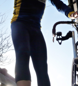 the bib straps cross over at the point where they attach to the shorts, but the real proof of the souplesse is in the pedalling, and like a fine pair of winter socks they were almost ignored: perfection is a strong word in this context, but in the struggle to find a better one, the santinis have come perilously close.
of course, winter has its benefits - there can be little more pleasure, after a soya cappuccino and a couple of bits of mrs washingmachinepost's christmas cake, than cycling home with that 36kph wind at your back, clear(ish) blue sky and the knowledge that winter will soon be over.
around mid-july, if i'm not mistaken.
a pair of santini threequarter bibshorts can be acquired from prendas for the mind-numbingly low (sale) price of £39.95 ($55). colours are navy, black, red or light blue: sizes from xxs (black only) to 4xl. as recommended by an islay winter.

posted on saturday 24 january 2009
..........................................................................................................................................................................................................