
..........................................................................................................................................................................................................
boneshaker magazine
water is a pre-requisite for life on earth, but it's a resource that, aside from the necessity of ingesting at regular intervals, is many different things to many different people(s). the obvious secondary use, is the ability to swim in it, both for recreational purposes and safety; the safety comes from the observation that others like to sail on top of it, again perhaps for recreational purposes, but as i know only too well, also for transport purposes. that's the principal method of getting to and from the island. of course, there's also fishing to be done, scuba diving and likely one or two other uses that haven't quite come to mind. for the purposes of illustration, however, that's likely enough to illustrate my point; water means different things to different folks.
while i'd be a bit dubious about its necessity to sustain life, the bicycle features in a similar way. for some it is the tour de france (on occasion, little else) or other of the grand tours. ignore the fact that there are possibly more cars and motorbikes involved than bicycles at times, this is proffered as the pinnacle of our sport, with a history and heritage that's as long as your socks tied together. not that one wishes to denigrate the machinery in any way, but moving to a more mundane level, the bicycle fulfils a transportational function for many folks all across the world, as well as serving as a recreational vehicle for youth and adult alike. and in certain parts of the world, owning a bicycle is as close to a necessity as the water we talked about earlier.
the bicycle empowers people; it can engender a degree of independence that cannot be matched by motorised transport, since the rider is also the engine, and not dependent on fossil fuels. thus there are squillions of us in love with the bicycle, but each looking at a different facet of the same thing. that is the very strength of the bicycle, that it can be put to more than one use. i have no doubt that, should the situation arise, bradley could ride to the shops on his pinarello, instalments of shopping stuffed in those rear pockets. granted it might involve more than one trip, but that's called training.
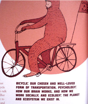
in ocober 2000, lewis blackwell and david carson published a book entitled 'the end of print': the graphic design of david carson. i have little doubt that i could successfully fill an entire article debating the meaning(s) of such a tome, because we can all see that print didn't quite end at the behest of the new millennium; if anything it may have expanded somewhat. nonetheless, you'd have to a be a brave man/woman to take the plunge into print nowadays, particularly in the niche market involving the bicycle. with devices such as the ipad now predicting a wholesale change in the way we experience the world of print, audio, video and images, you would put more money on the emergence of media to fill this promise than those who embrace the world of paper and ink.
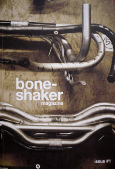
thankfully there are still bastions of the old world left, people with a passion not only for several facets of the bicycle as an entity to promote change and wellbeing, but with a corresponding love of print. these very coalescing choices have resulted in the first issue of boneshaker magazine, a beautifully crafted publication that occupies around half the space my macbook pro inhabits.
'i set up the bristol bike project and have been running it with a friend of mine for the last 16 months and during that time, i just began to realise how many great things are going on with bicycles and wanted to start to document it. I am really interested in the humanity behind bicycles and bicycle-led projects more than the competitive or techy side of it and wanted the magazine to reflect that. myself and john (the designer) have always loved printed media and used to create a b+w music fanzine ten years ago and this time round wanted to make something a bit more 'proper' !'
the words belong to james lucas who, as stated above, originated the bristol bike project, a volunteer-run community bike project in the heart of bristol's artists' quarter. their mission jim (appropriate) is to repair and recycle unwanted bicyces donated by the public, then passing them on to underprivileged and marginalised groups in bristol. a throughly laudable affair, if you ask me; one that seems only do-able by those with a love of the bicycle and all it represents in this context. and that's kind of the content within this first issue of boneshaker.
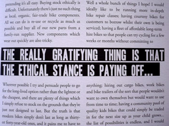
the opening interview with australian percussionist puncture kit was a bit of a revelation. a man who cycles with drums in the panniers, flips the bike on its back, adds the drums, and busks wherever his percussives are appreciated. very cool. there's cycling in guatemala, and i don't mean touring, touring switzerland in 1966 as england swept all before in the world cup and several other offbeat articles that are testament both to the bicycle, james and designer john coe. some of the writing is a tad on the rudimentary side, but this is all from the heart; most of the contributors are cyclists, not necessarily writers. the design and layout is magnificent; subtle yet effective.
boneshaker costs £4 and can be ordered direct from the publishers, as well as being available in a number of retail outlets not just confined to the uk. a superb debut. grab one while you can.
'boneshaker is definitely not aimed at any slice of the cycling market and in fact (as i say in the welcome blurb of the first issue), i really hope that it will appeal to people who don't even have a bike and perhaps even inspire them to get one! it has definitely been exciting to see how it has been enjoyed by such a wide demographic already and i hope this will continue.'

posted monday 7 june 2010
..........................................................................................................................................................................................................endura equipe cycle clothing
endura have been around for a long time in the uk cycle clothing market, relatively speaking, having been started from scratch by jim macfarlane in 1992. while their originator gained the impetus to start his own clothing company when participating in a triathlon in australia, rightly or wrongly, endura have a reputation for being more involved in the mountain biking market over the intervening years. since the early to late nineties was pretty much all about mountain biking, that would appear to have been a reasonably astute if not predictable path to follow. however, mountain bikers have differing needs from those of us on skinny wheels; speeds are rarely dictated by the amount of wind resistance that can be negated by close-fitting apparel, and there seems almost to be a coolness factor to be accommodated too.
road warriors, whether of the weekend or racing variety, are no more or less discerning than their off-road brethren, but different their requirements most certainly are. no flappy sleeves at this end of the world.
road bikes have, arguably, re-asserted themselves to be the equal, if not the dominant partner in the clothing market, evidenced, perhaps, by the number of new, road only clothing that has become available during the last decade. having always had some presence in this area, endura have been well positioned to take advantage of the demands of the modern day roadie; design specifics, followed by a healthy degree of on the job testing. to this end, and perhaps to demonstrate that the mountain bike heritage was being re-evaluated, endura formed a professional cycle team to contest last year's tour series, a team that has benefited this year from an increased schedule, new management, and clothing that puts them on a professional footing at all points of contact.
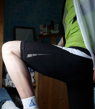
this new endura range, aimed at the top end of the sport, has been monikered equipe and consists of jersey, shorts, gilet, jacket, mitts and overshoes. this is the same kit worn by the endura team, but without all the attendant logos, and more than likely (certainly in my case) ridden a lot slower. endura are based on the other side of my home country, so there has to be a bit of national pride and a soft spot for their output; that said, everything i've received from them up till now, has been well constructed, and more than equal to the task at hand. my only quibbles have regarded the fit, an aspect that affects more than just endura.
however, without knowing the whole story, the equipe range would appear to have been the result of ignoring most of what has existed to date, and going back to the drawing board (or cad workstation, to be thoroughly modern) and starting from the ground up. i was sent a jersey, bib shorts, a gilet and a pair of lycra overshoes, all of which were subtly and not so subtly colour co-ordinated. the jersey is lime green.
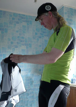
and it's endura jerseys that i have had cause to ciritcise previously; top to bottom, the fit has been verging on impeccable, but a discrepancy has always manifested at the chest area, which has generally been a bit baggy. now it could well be that, for a cyclist, i should have a chest akin to that seen on an action man, but i haven't seen much evidence of this being the case even on the professionals. perhaps endura have agreed with me, for the equipe jersey has rewritten the script, and now stands out only through virtue of its colour. lime green is great for the photos, but personally i'd prefer something a smidgeon less ostentatious (the jersey is also available in red, white and black). the fit, in this case, is fabulous, a fact underlined by the short sleeves pulling inside out when the jersey was removed. it may sound silly, but that has almost become a mark of a well-fitted cycle top in my experience. i'm not a great fan of making the various panels in different colours, even though there are one or two differing fabrics at work here. since many others do likewise, i fear there may be a psychology at work of which i am not a part, but i'd really rather not have swoops and darts in contrasting colours. personal preference only.
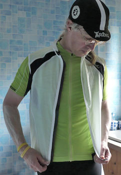
a road jersey is all but defined by its pockets; the days when those were buttoned on the front are long gone, and capacious compartments at the rear are the order of the genre. endura have gone for one colossal pocket mid-rear, a space that could almost qualify for council tax, but the two outboard rears have suffered by comparison; i couldn't even convince my rather small compact camera to inhabit one of those spaces, and the only content i can see sitting comfortably would be a munchy bar or a very small pocket pump. even an inner tube was a bit of a struggle. this has gone too much the wrong way i fear, though that middle pocket, which happily has a zipped pocket riding coat-tails took the camera, a cycle cap, the gilet and a rainjacket, with space left for more. in practice, the cargo arrangement was not a real problem, but i think it only proper to call into question the efficacy of those two outer pockets.
the fabric is a close-fitting coolmax lightweight polyester, with full length zip, and gloopy stuff on the hem to prevent it reaching your armpits in the heat of the sprint. the gilet features what our american cousins apparently refer to as a zip garage, a little foldover of material preventing the zip from making contact with the neck, yet the jersey doesn't. endura pointed out that the garage, as far as the jersey is concerned, often catch when using a lightweight fabric, so they opted to run without one.
the gilet is a welcome thought in the range, a garment that all too often, seems to be a bit of an afterthought, and not necessarily an early part of a new range of clothing. as mentioned above, the full length zip has a little garage to cover it atop a commendably high neck, and its scarily lightweight fabric fits like the proverbial glove. the biggest criticism i, and others, have levelled at gilets in general, is that they are often too baggy, fitting poorly at the shoulders with all the je ne sais quois of a bin bag. not so the equipe; wearing a medium jersey covered by a medium gilet, you wouldn't know it was there.
not that you'd expect otherwise, the fabric is windproof and water resistant, with a mesh back for ventilation, and a full width, zippered rear pocket, which was a surprise but very welcome feature. the panel in which this sits is waterproof for those devoid of mudguards/fenders, and again there is gloop along the hem to keep it where a gilet needs to be.
the jewel in the crown has to be the bibshorts. even on a totally superficial level, the fact that endura have seemed incapable of printing a logo on the legs that will remain there for the life of the garment has been a continual source of distress. even new(ish) pairs have started losing their identity after only a few washes. the equipe bibshorts should, however, see an end to all that, given that the logo appears to have been sublimation printed onto one of the white panels on the left leg. the shorts are available in either of two flavours: endurance or criterium, the main difference being the pad and the existence of a pocket at the rear on the endurance version. while hopefully no-one will ever see, the dimpled pad on the criterium pair supplied was colour matched to the lime green of the jersey. a nice touch.
i still maintain that a pair of shorts likely to fit well, should exhibit a bit of difficulty when getting them on. anything that slides on without a hint of exertion is likely to be too roomy to provide a decent journey in the saddle. that, of course, depends on the size chosen in the first place, but the small size equipe bibshorts are a lesson in upper leg couture (if you catch my drift). the panelled construction lends total support during even minimal exertion such as my own, and the pad bears all the comfort of a parker knoll armchair. and they look good.
with the addition of a sports psychologist to the british cycling track team, it has become apparent that the thought of going fast is almost as important as the actuality of being able to do so. sadly my own abilities in this department are very much weighted ot one side; i do regularly think about going fast, it's the rest of my body that isn't keeping up. thus a pair of endura equipe lycra overshoes would appear to have little to commend them other than a touch of the frank vandenbrouckes, and i can't deny that wearing these on a leisurely sunday ride carries more than just a hint of the poseur.
but psychologically they may be more of a boost than you'd think. the mighty dave t, lord carlos and myself arrived back at debbie's a full twenty minutes faster than expected. it could only have been the overshoes. with a stretchy cordura sole, featuring a cutout to accommodate the cleat, and a zip at the rear, these stretch over whichever footwear takes your fancy and completes the race verisimilitude. my one suggestion would be a flap behind the zip at the top; shorter socks allow for a scratching at the lower calf. irritating when you've just dropped oscar and tyler, with sights set firmly on mark in the near distance.
taken as a whole, the endura equipe range is an encouraging step forward towards race fit-ness if you see what i mean. the overshoes cost £24.99 per pair; the bibshorts arrive at a somewhat incredible £89.99; the equipe s/s jersey retails at £74.99 and the very packable gilet costs £49.99.
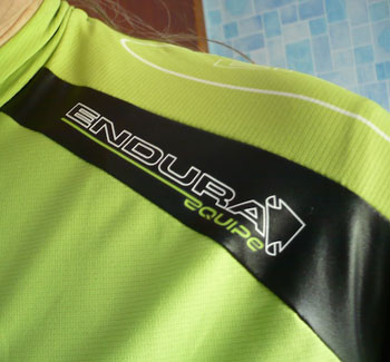
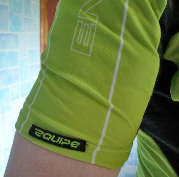
the only bit i really don't care for is the equipe logo, particularly when the initial 'e' is used on its own. but it wouldn't stop me wearing it.
i apologise for the quality and quantity of the photographs accompanying this review. those taken out of doors showing yours truly at speed on the bike, mysteriously suffered technical problems and could not be adequately reproduced. by the time i discovered, the kit was all in the machine.

posted sunday 6 june 2010
..........................................................................................................................................................................................................bicycles on the cover
mrs washingmachinepost is a childminder, and those in her care range from kids of around one and a half up to nine years old. a bit like trying to teach a similar range of ages how to ride a bicycle, it is often necessary to occupy one set of kids, while paying a bit more attention attention to the others, before swapping allegiance. a finely balanced selection and one that she surpasses me at without too much trouble. an activity that is all but guaranteed to occupy more than just a few minutes is pen/pencil and paper, giving expression to those fertile imaginations. animals feature large in the subject matter, particularly horses for the girls, and usually cars for the boys, though i've noticed more than one or two trees entering the fray.
given that washingmachinepost cottage features more than a few hints that bicycles may be the mainstay of my world, every now and again a bicycle is drawn. yet considering the relative simplicity of the machine, compared to your average ferrari, while recognisable as bicycles, you wouldn't want to ride one in the tour series. however, that double diamond frame and a couple of spoked wheels are as much an icon as that of the empire state building, a fortuitous comparison in the present circumstances.
wishing to create a humorous publication that would portray more sophistication than the corniness of its contemporaries, harold ross and his wife jane published the first weekly issue of the new yorker on february 21 1925. intended to occupy and target the literary sophisticate, the magazine slowly augmented its humorous touches, becoming a forum for more serious fiction and journalism. though the modern day new yorker continues in print, it has also embraced the interweb, allowing subscribers access to every back issue viewable in their original format.
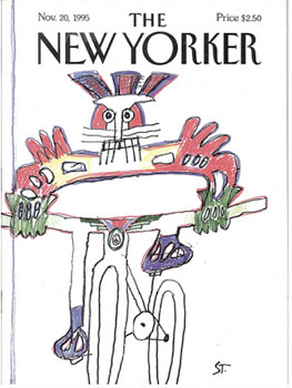
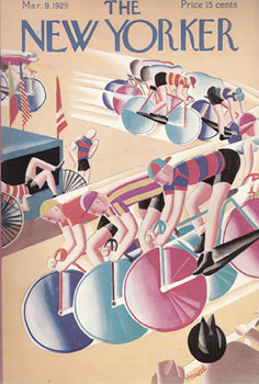
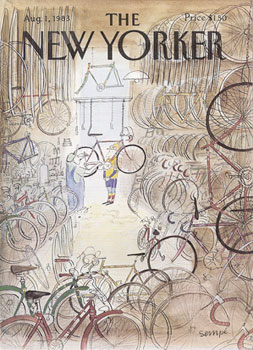
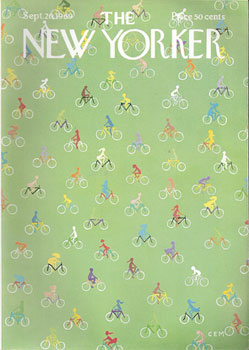
as with the majority of print publications, when viewed in their natural habitat, that of a rack in the newsagent nearest to hand, it's the cover that advertises the magazine midst those deemed to be of similar ilk. unlike newspapers who tender for readership via block headlines and sensationalism, the new yorker has long employed the talents of some of recent history's finest illustrators, most of whom have moved past the tendentious drawings of those in the care of mrs washingmachinepost, and featured the bicycle in all its various glories.
as a resident of a small rock on the edge of the atlantic, you may well be wondering how a non-sophisticate such as myself would be acquainted with the historical cover art of a publication such as the new yorker, given that the rock is distinctly on the wrong side of the atlantic? i could quote many examples of serendipity as it relates to thewashingmachinepost and selective articles contained therein, but my self-adopted counterpart in warwick, massachusetts has brought many an interesting yet obscure notion to the surface, that i might better edify both you and i.
richard sachs
"i first noticed bicycles on the cover of the new yorker in the early eighties. within a few months, a succession of other covers appeared. about a year later, i saw another one or two. it caught my interest, and i decided to see if there were others i might have missed.
 "back in the day, the publisher offered a fulfillment service that sold original covers, straight from the printers, none of which had ever been bound in a magazine. and, of course, they also sold fresh back issues.
"i proceeded to buy all of the available material(s), and also found ways to conduct my own research. as it happened, they had about 22 cover dates listed, and i found some that missed their radar. i made up my mind that i would collect them all, somehow.
"in the mid-nineties i purchased a book which listed all covers ever printed. i combed it profusely with loupes and magnifiers, and to my surprise, discovered that since 1928, a bicycle in one shape, or form has been in the cover art of the new yorker well over 100 times."
having been a regular and sustained critic of the covers appearing on cycling weekly in the uk (and they haven't improved any), it seems a surprising delight that a magazine with no apparent connection to the bicycle (you're unlikely to read anything on larry's preparation for, or contesting of, the tour de france), should have seen fit to depict the velocipede with greater reverence and insight than britain's self-styled weekly bible on the subject. collecting things appears to be a characterful human trait; how many of us started with stamps, trading cards, shells, matchboxes and ended up with a garage or bikeshed full of bicycles? the intangible made concrete.
"it was my first ever truly ocd collecting habit. the best part is that, not only is my collection complete (with duplicates and multiples of many issues), i did all of this pre-internet. that's a lotta research finding 'zines going back to the 1930s atmo."
this would be almost of academic interest to most of us, for even though i have appropriated one or two images by way of illustration for these particular black and yellow pixels, the full majesty of years of new yorker covers featuring bicycles would remain, to an extent, apocryphal. richard keeps all of these covers in archival bags, far from the reach of sunlight, and describes his collection as "the single most tangible item i have, and certainly more important than the new old stock seventies era campagnolo goods that live in the closet, too full to move around in."
and ps: all of mine are perfect - no subscription labels, folds, creases, mayonnaise stains...
i am eternally grateful to richard sachs for sharing his enthusiasm and perspective on the bicycle with me, and ultimately, with you too.

posted saturday 5 june 2010
..........................................................................................................................................................................................................swrve clothing
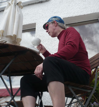
i'm not sure if it's a worrying fact, or one that should be accepted as an oblique part of absorbing cycling into the mainstream, or perhaps, more likely, the opposite. lots of us have carbon with bendy bars and skinny wheels sitting in the bikeshed, machinery that all but demands lycra and/or sportwool. the latter can be comfortably considered as necessary apparel for the weekend warrior, as well as those with a competitive gene in the sock drawer, but as a sartorial necessity in a day to day basis, dupont's finest lacks that certain something. it may well be that zooming is all you expect from velocipedity; the daily travail does not impinge upon daily travel, in which case you may wish to go off and oil a chain for the next few minutes.
but as cycling infiltrates the mainstream, particularly for those of us who have foregone personal motorised transport, it is ultimately necessary for many a good reason, to blend in a bit more than the average liquigas top will allow. at one time riding as a civilian led many to resort to resort to plain clothes; however, that seam in the seating area of a pair of levis does not lend itself to comfort, and a cotton t-shirt or shirt hardly fulfils the wicking promise. much as water finds its own level, leave too big a gap in the market, and someone will attempt to fill it, as indeed several have already done. one of those companies is swrve, a small company based in los angeles, usa, born out of necessity after the founders failed in their search to find a decent pair of cycling shorts that weren't made from black lycra.
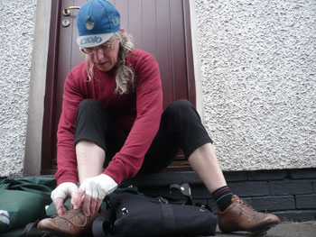
a company that only makes cycling shorts is unlikely to survive by legs and pockets alone, and swrve are no different; swrve uk sent not only a pair of black shorts and grey jeans, they thoughtfully included a softshell hoodie in case i felt in need of an asbo.
long shorts, or short longs, are not a unique product in the world of leisure and fixie cycling: i have a number of similar garments occupying the shorts drawer in washingmachinepost cottage. the swrve pair of threequarters are fabricated from a mix of 38% cotton and two percent lycra to allow for a modest degree of stretch at strategic points. seen in context, there is little to distinguish the swrve variation from a regular pair of similar shorts, but to my mind that's the clever bit. the gusset at the crotch ensures that no seams can be sat on when in the saddle, while the zipped rear pockets (there's two front and two back) are incredibly deep allowing loose change to sit well away from the seating area. nice.
these particular shorts are of the hipster variety, which may look as cool as mince, but seem hardly the stuff of which cycling shorts are made. perhaps it's the type of bicycles i ride, or perhaps i'm just an old fuddy duddy on the way to a simon cowal waistband, but the feeling that the shorts were falling down (they weren't) still hasn't gone away. in order to give swrve the benefit of a bit of a hard time, i wore variations on a theme throughout the islay whisky festival week, covering more than a few hundred kilometres in the process. they got wet, they got sweaty (sorry) and they had to work for a living up and down stairs and into more still rooms than most will see in a lifetime.
during this period of hard work, the seating area showed signs of wear and sheen. i should qualify this by pointing out that the fabric itself had not actually worn, it simply appeared the same as those faded jeans you can buy new at great cost. the fact that my brooks team pro caused a shiny area at the seating area was not unpalatable, but it was somewhat unexpected.
shorts are perhaps the most practical lower wear for cycling, if only because it leaves no portion of material able to catch in those very sharp chainring teeth, but sometimes such a relaxed approach to apparel can be frowned upon in polite company. for this very purpose, swrve produce a pair of jeans style cycling trousers made from a similar mix as the shorts already mentioned. the no seams to sit on policy is continued here, as are the rather voluminous pockets of which the rear are also zipped. the fly zip and pocket zips fitted on both trousers and shorts are somewhat on the course and chunky side, but likely a lot more robust than some of those fitted to the racey stuff. none showed any sign of malpractice during the test.
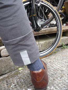
the really, really clever bit on the trousers relates to keeping those hems and lower legs away from wildly spinning chainsets and cranks. turning up the bottom of each leg reveals a substantial scotchlight strip at the back; an alert to any following traffic with headlights when pedalling after dark. art lies in the details. despite being made from the same constituents as the shorts, there were none of the wear and shiny signs on the trousers; with the weather being less than kind and the mercury not rising too far, these were worn more often than the shorts. as could perhaps be expected, a pair of legs will get more hot and bothered in trousers than in shorts, but even though a couple of rides were a tad faster than was seemly, hot and bothered wasn't as desperate as it could have been. the cut was similar to the shorts; not even close to simon cowal territory, but i did like these.
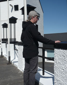
the last swrve item that allowed emulation of a civilian, and one of the funkier variety at that, was a softshell milwaukee hoodie. fleece lined and as softshell as a softshell can get, you'd have thought this a bit over the top for late may. sadly, on more than one occasion a fleece-lined softshell came in very handy as british summertime edged closer without heating up. should things become a bit warmer in transit than is strictly comfortable, there are a couple of zipped vents under each arm which definitely help in the cooling stakes. two front pockets in which hands can be stuffed when standing about on street corners are a nod to normality. just make sure you wear it with the hood up trying to look menacing next to that fixed gear colnago.
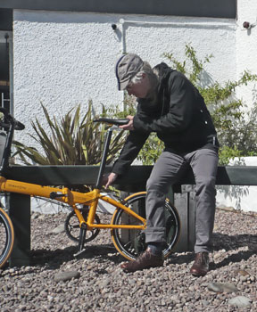
the sleeves have hidden internal cuffs to aid cycling niceties, but without destroying any street cred you may have managed to acquire on that street corner. a drop tail covers your behind from spattered spray off the back wheel (mudguards ain't cool apparently), and there's a zipped, full width, enormous back pocket for lots of small stuff, or maybe one enormous stuff. the outer shell is promoted as wind and water resistant; a wind-resistant softshell is largely unremarkable, that's kind of what softshells are supposed to do, but the water resistance of this item surpassed my lowly expectations. i have worn many a water-resistant garment that has turned out to cower in the spray from a passing car. the milwaukee softshell survived solid rain for 15km without letting the jersey underneath even taste a dribble of water. very convincing.
i doubt i am the target market for any of these items, which makes it all the more welcome that i thought/think all three items are particularly adept at their given task. if the need to look less pelotonic has started to impinge upon your cycling life, you could do worse than take a look at the swrve range. it's not for everyone (i still haven't figured out what the point of the hood is on a cycling jacket), but that relates more to the styles on offer rather than the impeccable construction, a factor that seems all but beyond reproach.
the swrve threequarter shorts cost £56 and are available in waist sizes 28"-38"; the trousers cost £80 and are in waist sizes from 30"-36" and either 32" or 34" leg sizes; the swrve milwaukee softshell hoodie costs £110 in black red or grey, and sizes small to xl.

posted friday 4 june 2010
..........................................................................................................................................................................................................come and gone by joe parkin. velopress 179pp illus. softback. £14.99/$21.95
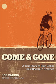
there's not many of us have a keen sense of our own worth, and certainly not within our cycling community (let alone the greater world at large). it's quite likely that larry, bertie and eddy were similarly challenged even during their victorious years, though armstrong and merckx may have gained a smidgeon of insight as the years have moved on. while concentrating on the task(s) at hand, there is little time available to grasp the perspective that is comfortingly all around, but largely invisible. so if you or i were suddenly challenged to write down life's little stories, but realistically placing them with a sense of proportion, we'd be pretty much stuffed.
i'm not having a go at us, it's simply the truth.
so it takes someone with a refined degree of nous to not only attack a career in cycling from the outside, but turn out to be comfortably successful at it for enough years to gain the respect of his peers. american joe parkin detailed the opening stages of his career as a professional cyclist in belgium in the first instalment of his biography; a dog in a hat. generally reckoned to be among the finest books of its genre, it heralded the discovery of a rider who not only knew his place in the grand scheme of pelotons, but turned out to be a particularly fine practitioner of the written word. the opening pages of come and gone are filled with testaments to those facts, quoted from a wide range of knowledgeable sources. they presage a continued wealth of narratve in the pages that follow.
at the end of a dog in a hat, joe found himself without a contract for the following season, and little choice but to up sticks and return to the new world. home. british riders will identify with the situation, given that the uk would hardly be one's first choice of location in which to look for next year's contract. culture shock would perhaps be an apt description. used to a life where new bikes and kit would arrive shortly after signing on the dotted line, parkin had rapidly to adjust to a situation where racing and training could conceivably have to take place in the same kit and on the same bicycle.
as the new year of 1992 rolled in, i was beginning to feel a glint of race fitness, but i still didn't have a team. the money i had saved from my euro team salary and race winnings was running out, and my tulip team clothing was getting threadbare.
joe parkin was never one of the big names in the european peloton, but his ability to work tirelessly in the service of those who were, or thought they were, had made him well-known within the right circles. however, remaining largely unknown on his home continent stored no brownie points in the bank for return to a country with considerably less tradition, knowledge or interest in cycle racing. and the racing was different too. come and gone details joe parkin's return home, and the trials and tribulations that beset a european racer across the pond.
bluntly put down on paper, the prospect of near 180 pages ostensibly detailing the latter stages of a racing career, would seem like a recipe for dreariness. however, i mentioned earlier that joe parkin combines a degree of excellence on the bike, with a remarkable facility on the word processor, so those pages are filled with despair, joy, fun, success and satisfaction. perhaps most satisfyingly of all, he retains an innate degree of humility and lack of ego throughout. joe parkin knows his place, likely his greatest asset, and never allows this to waiver; it's almost as much of a talent and skill as sprinting out of a bunch of marauding cyclists, or pushing into a headwind for hours on end.
with a dearth of road rides available in the usa, and eager to continue with a career as a professional cyclist, parkin switched allegiance to the dark-side and rode cross-country mountain bike for diamond back racing. it's quite possibly a truism that a bike racer is a bike racer; the terrain is merely a backdrop to the performance, and thus parkin enjoyed a degree of success in this change of scenery. his years of pulling at the head of a european peloton for kilometres on end had informed the muscle memory sufficiently to allow for the cardiovascular slog on knobbly tyres. at least, that's what brian smith tells me.
the local mountain bike racers had perhaps even more disdain for me than the road bike racers, but i could get past that if for no other reason than because i could actually race my bike.
"why do you keep doing this? what keeps you coming back?"
"i haven't won anything big yet." i responded without even thinking.
i'm not sure i can recommend that you read come and gone without first having read a dog in a hat, but i would strongly recommend that you don't miss out on two of the finest cycling books written and published in the last few years. and while the ending would make you think that it's the end, full stop, i'd like to think that we'll hear from joe parkin again.
and soon.
come and gone is available from cordee books.

posted thursday 3 june 2010
..........................................................................................................................................................................................................