
..........................................................................................................................................................................................................
endura airshell helmet
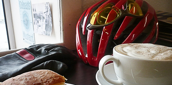
time was that manufacturers held themselves responsible for a single product range. if your business was shoes, then that's what you made; raincoats, likewise and it is but a year or so since i made mention of pinkham millinery in portland's sw washington where dayna pinkham has dedicated her day to day to the artistry of hats. there was obviously little one could do about a competitor who entered a similar fray; market forces would sort out that pecking order. but the order of the day was mostly one thing at a time.
however, an apparent necessity that arrives as so much baggage with modern commerce, more or less decrees that life consists of endless expansion, a premise that has many a corporate head looking for an alternative, yet not altogether estranged product line. if i might provide an example, giro, renowned for their cycle helmets have spread further into footwear and more recently, a surprisingly wide range of cycling apparel. the helmet is no longer enough.
scotland's endura, originally known for their offroad clothing, and very successfully joined by clothing for the roadie, subsequently received a substantial boost in functionality and quality with their attendant sponsorship of a road-cycling team. the latter had been particularly successful at uci continental status before moving up a rung to pro-continental, having merged with germany's net app team. managing to not only win this past weekend's ronde van drenthe, but take second and third into the bargain, they have already been given wild-card entries to this year's paris-roubaix and ronde van vlaanderen, and nominated as a possible wild-card entry for the tour de france.
that's what you'd call a success story.
but what is less well known is that when endura proprietor jim mcfarlane returned from australia in 1991, cycling apparel was not exactly what he had in mind. "When I came back from Australia in 1991 and set up what is now Endura, my initial plan was to design and develop cycle helmets rather than clothing. I was in Sydney when New South Wales brought in the legal requirement to wear a helmet when cycling, and this inevitably caused a short-term boom in helmet sales there. EPS moulded helmets back then were pretty dreadful and I thought I could design something better."
mcfarlane had graduated in mechanical engineering, and started work collaborating with a department at glasgow's strathclyde university to develop helmets using finite element analysis, to maximise a helmet's ventilation while simultaneously minimising stress flow around the vents on impact. at the time, however, "I was struggling to find enough finance to both develop prototypes and pay for safety testing, and Giro exploded into becoming massive almost overnight. I abandoned the idea as too ambitious and got on with cycle clothing instead."
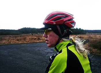
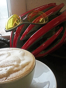
however, here we are some 22 years later, and mcfarlane has realised his pipe dream by bringing the endura airshell helmet to market, perhaps a brave move considering the wide variety of cycle helmets currently available, but one that can realistically be seen as a qualified success. for the past few weeks, i have been wearing a red version of the airshell which has been given the added disadvantage of needing to be worn over a variety of belgian style winter caps. the ones with the stretchy band to cover the ears. in a world of specialist helmet makers, is this a tentative step or a firmly planted foot?
"Most definitely a firmly planted foot. A tentative step would have been to a launch a single model of helmet, perhaps using an existing open mould model with re-badging and customisation of pads, colours/print, straps etc. as we have seen some other brands do. That's not how Endura is approaching this or any new projects; it's very much full commitment or leave it alone and you can expect to see additional helmet models over the next 12-24 months."
short of purchasing a helmet for each season, it becomes necessary for any example to fit safely and comfortably over scraggly hair, a regular cotton casquette or the aforementioned winter cap. having done so with more than one brand of helmet, i can attest to this being a factor that not all handle equally. there is a certain truth in the belief that a helmet, is a helmet, is a helmet, for with a bit of luck, the only differences of which any of us will ever be aware are the styling, colour and comfort. crashing it is not the preferred option. and to be honest, with such a wide available choice, if it's not comfortable, the customer will simply move to the next booth.
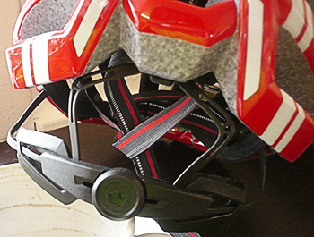
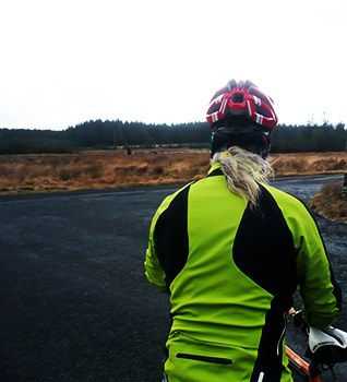
weighing only 220g in the small/medium size, the helmet easily lives up to its moniker. it achieves this through a substantial number of air vents, while retaining a solid integrity via carbon fibre reinforcements on the vent bridges. the fit can be dialled via a rear retention system, one which coped rather well with the extra bulk of the aforementioned winter cap. this retention system, which endura have wisely not saddled with some faux technological name, does seem rather flimsy, but in practice gave no cause for concern and this apparent flimsiness, may well be the outer face of a flexibility that coped with the winter hat.
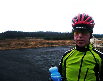
the internal padding, of which a spare set arrives with each helmet, seems way too thin to provide the level of comfort actually experienced, and though i had one or two trials and tribulations with the velcro attachment at the brow, in truth, these had no real bearing on the helmet's comfort factor. fitting the airshell prior to fastening the chin strap is quite impressive, that rear retention system offering substantial grip all on its own. the chin strap is easily adjustable and more than strong enough for the job with which it is charged, however, it's not as soft and fluffy as could be hoped for; there's no chafing of any sort, even when pulled tight, but a wee bit of smoothness wouldn't go amiss.
however, the helmet reviewed was one of the first kids on the block, and jim mcfarlane says they've spent more effort on improving the strength in the size adjustment system, offering a better level of comfort through the internal padding and adjusting the shape of the inner ring/head basket, all of which will likely answer my minor gripes at this stage. what, of course, i'd rather not verify, is the airlight's ability to keep my head intact in the event of a crash.
"Our EN1078 safety tests were performed by TUV, recognised as the toughest testers in helmet impact testing and nobody likes failing a helmet better than they do. We thought it important that there could be no question about the safety standard of our helmets and so chose to go out of our way to make things difficult for ourselves by choosing TUV."
short of making life a lot harder than it currently needs to be, i'm more than happy to take his word for it. the helmet also has the ability to look after itself; aside from the polycarbonate hardshell extending to the lower portion of the helmet's underside, obviating any untoward dings when set down harshly, for a limited time, each airshell comes with a pod in which it can be safely stowed and/or transported. endura also offer a limited crash replacement scheme where replacement of a crash damaged helmet can be made for 50% of the original price within three years of original purchase. when you consider the asking price is a breathtaking £89.99, there is a great deal to like about endura's first foray into the helmet market.
does mcfarlane see the airshell as appealing predominantly to existing endura customers, or an enticement to those who may not have previously given you too much consideration? "The view here, as was the case right from the outset when specifying and designing both helmets, is that the Airshell follows the same ethos as Endura's clothing products in that the emphasis is on delivering technical performance across all the key design parameters at a great price for the spec. As with many of our clothing products, its not an entry level product and you can easily buy cheaper but we think it's hard to find better value for money. The positioning is a high end helmet at mid range price and a product that you can have faith in. We believe that Airshell ought to be appealing regardless of whether the potential customer has never heard of Endura before and is evaluating helmets purely on their own merit or, for existing Endura customers, where the positioning is consistent with what we offer in the rest of our range. And, again consistent with Endura's garment range, it's backed up by Endura's well regarded product guarantee as well as its helmet crash replacement policy.
if i might briefly pop back to the net app endura cycle team, their successes this season have been made while wearing this very helmet, a team issue replica forming one of the offered colour schemes. if you're in the market for a new helmet, i'd nab an airshell pdq, before jim realises his price calculator isn't working properly.
monday 11th march 2013
 ..........................................................................................................................................................................................................
peter english-art for cycling's sake
one of the more notable aspects of road racing are the stories to be told and the narratives to be related. it's the very reason we are party to so many periodicals concerning the history, drama, and passion engendered by each successive year's racing. the races, pat mcquaid's bid for world domination not withstanding, may well remain the same year in, year out, but the riders are in constant flux, as are the jerseys and bicycles. so even as we approach the 2013 spring classics at exactly the same time as we did last year, the variables have changed; not necessarily for the better or the worst, but simply changed. it's what keeps the sport fresh and its aficionados likewise.
modernity can be examined in such exquisite detail; everyone's a photographer or film-maker these days thanks to the complexity of what used to be known as a phone, allied to the now ubiquitous social media. for those bereft of access to a televisual feast of european racing, follow the right folks on twitter, and you can be sure one of them will be tweeting a blow by blow account of the proceedings. to harness a well-worn saying, 'we've never had it so good'.
but what this incessant technological development has a propensity to ignore is the ambience; the imagination, if you will. for in the days of yore, when a telephone was still something used to talk to each other, communications were a tad more rudimentary, and the speed of light still had far more to do with the theories of albert einstein than the time-lapse between action and the recording of same. so, as has been testified elsewhere, the reports alluding to a day's racing may well have had as much to do with joining dots than a pinpoint accuracy of detail.
newspaper column inches had to be filled, for in many cases, that's the very reason certain road-races had come to fruition in the first place; to sell newspapers. so while we can now watch every minute and second of each tour stage or cobbled chase, the early years of racing were less well accurately documented, not through lack of application on the documenters, but due simply to the technological wherewithal available. such situations could conceivably have given rise to a degree of melodramatic inventiveness. there are few who would doubt this to be the case, and even fewer who would deny that this inventiveness has had a significant bearing on cycling's great heritage.
if only, i can hear myself say, there was someone who could add a visual element to such cycling mythology. and, of course, there is; his name is peter english.
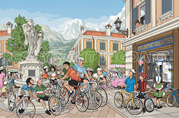
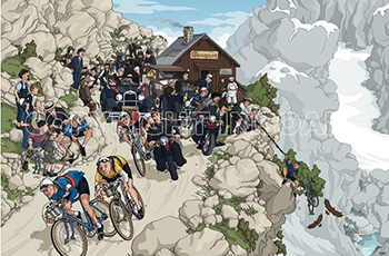
a graphic designer to trade, peter has extended his innate skill to provide us with (currently) five individual prints that pay tribute to road cycling's early years, incorporating one or two of the legendary tales that have filled many of the volumes regarding the sport's history. while football and rugby fans could doubtless argue till the cows come home over which owns the right to refer to their own preference as the beautiful game, there really is no discussion necessary as to which is the beautiful sport. the latter is a factor encapsulated in each and every one of peter english's illustrations.
it gives me no pleasure to admit that, until a week or two ago, i would have counted myself amongst those completely ignorant of peter's artworks. in all the years i have been inhabiting my own cosy little corner of the social media world, i have never once come across any mention of his work under the umbrella of ingo art. how long has he been producing such fabulous illustrations?
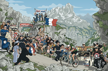
"Just for the past two years really. I've been a graphic designer for 30 odd years and occasionally had to produce illustrations which I enjoyed, so over the years I've developed this strong, bold, colourful look which I thought would be ideal for cycling related work. Working part-time also gives me more time to pursue this."
it's not so very long ago that i made mention of a lack of bicycle drawings amongst the children in the care of mrs washingmachinepost, a fact that i am putting down to the difficulty of rendering in crayon on paper or even on a megasketch. i don't mind admitting that i too struggle somewhat in getting the proportions correct, though at least i can manage to place the chainset on the correct side. though i doubt there's any particular subject that is easy to draw or paint, does peter ever find it a struggle to achieve the level of detail in each of his paintings, or do they simply roll off the brush (so to speak)?
"Getting the idea is the easiest thing, then the struggle begins! I find drawing bikes and riders correctly, one of the most difficult things to achieve from scratch, without copying. I suppose I can get away with a lot as it's not a particularly serious style, but I usually do loads of 'thumbnail' sketches to get the composition right. Then I start drawing the individual parts, till they're as good as I can get them."
read through any history of the tour de france or of the great classics, and it's possible to accumulate numerous anecdotes, perhaps originally true, but stories that have developed lives of their own and become somewhat larger than life. an enhanced reality, perchance. are each of his illustrations based on factual happenings, or are they the result of his fertile imagination?
"In 'Where Eagles Dare' there is a poor chap being hauled up a mountain side using a string of tubs. That actually happened, but generally speaking I've tried to steer clear of specific events and characters, so most of it is made up. But it could be true, if you see what I mean. I've soaked in all those cycling stories since I was young and there are so many epic tales, particularly as you go back in the history of cycling and it's not hard to come up with something that has an element of truth in it."
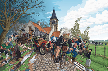
peter english's work reminds me of nothing more than the original illustrations for herge's adventures of tin tin, and i mean that as a serious compliment. for while none carry a blatant level of humour, there is a subtle hint of the cartoon about them, a feature that i believe makes them far more desirable in their own right. however, within their individualistic historical realms, the bicycles and following vehicles display an admirable degree of accuracy. does peter endeavour to make these as period accurate as possible?
"I do try to get them as accurate as possible. Each of these latest prints are based on a particular time period. For instance 'Shake Rattle And Roll' is around 1910 so I had to research a motor vehicle and bikes from that period. The bikes had these strange front brake pads which clamped onto the top of the front wheel and they had single speed transmission. In 'Yellow Fever' I originally had an Italian Alfa Romeo as a following vehicle, but as I wanted a French feel, I changed it to a Tour-issue Jeep so I could put the French plaque on the front.
"Google is excellent for quick answers and I have books and magazines to help with research."
the very best of the modern day breed of cycling photographers can achieve a mood in their images, through composition and attention to overall colour. the contemporary tour de france has become so much of a mobile circus, and the peloton a riot of sponsored colour, that it must be hard to avoid imagery that resembles an explosion in a dulux factory. however, it is down to the skill of the artist to achieve a homogeneity of colour in his/her images that reinforces the subject matter depicted.
in the case of peter english's art, the colour and mood are quite magnificent, as indeed are the compositional qualities. does he have an overall atmosphere in mind at the commencement of each, or do they simply turn out that way?
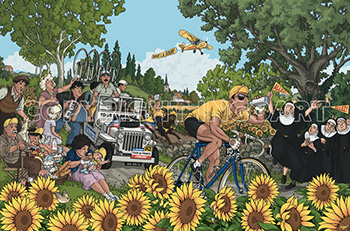
"I have an idea of what I want regarding atmosphere before I start. The first print I did - 'Cycle Of Life' - I wanted it to be a typical Sunday morning meeting point with a wide range of ages from the old experienced, 'seen it all, been there, done that' riders, to the young hopefuls just starting out. I also wanted to go beyond the usual bike stuff so I added a statue looking up to the mountains to add a spiritual dimension. I've no idea how the colours are going to turn out, so that part just evolves as I go along. Cycling is such a colourful sport so you can't go wrong."
more usually in this day and age, it's possible to build a reputation in a relatively short space of time. the internet allows that. in my days of being a world-famous artist, i had about four paintings wrapped in a sleeping bag while wandering around the streets of edinburgh, hoping that a gallery owner would take pity on me, or recognise that i was about to become the next big thing. yet despite all mod cons, i'm willing to bet that, along with yours truly, this is the first notice you've had of the works of peter english. is he cycling art's best kept secret?
"I haven't done much to promote myself really; a couple of cycling friends have helped on that side, I just concentrate on getting ideas and developing the work. It may fizzle out or I might fizzle out first!"
if there is any justice left, fizzling out will not be an option. all peter's works are available in two distinct sizes and formats; printed on a3 card at a cost of £12.99 or a 588mm x 415mm limited edition giclee print for £49.99. debbie's is soon to play host to one or two on the wall of the cycling corner. quite superb.
you know you want to.
ingo art - the illustrations of peter english
sunday 10th march 2013
 ..........................................................................................................................................................................................................
breadwinner
a long, long time ago, in a land far, far away (not strictly true, but it might just aid my narrative a smidgeon), having learned (so i thought) to successfully build bicycle wheels, i decided to create my own cottage industry in this, the most southerly of the inner hebrides, and offer my services to the cyclist at large. having yet to reach maturity, these early profferings were made to the offroad community, for at that time, i still had a penchant for falling off on grass, sand or mud.
i had built 28 spoke two-cross on a suspension hub despite being warned against just such an option by the distributor, and ridden the resulting wheel into every obstacle i wasn't scared of. it hadn't broken. and in order to cater for the fine and dandy, i had also made a snowflake patterned front wheel and given it to someone i knew to be less careful than i. that didn't break either. puffed up with my new-found mechanical confidence, i thus took a three month option on advertising in a now defunct mountain bike magazine and sat back to wait for the orders to flood in.
they didn't.
to en extent, this was not entirely unexpected, for i had no reputation, and to be honest, no parts for building. the idea had been to garner an order for wheels before ordering in the specific components, always a dangerous game, but in my rather parlous financial situation at the time, the only appropriate method of so doing.
i am somewhat thankful that events turned out the way they did, for the notion of liability insurance had not occurred, and having now met with both jude at sugar and derek at wheelsmith, i realise just how flimsy a proposition i had created, not only from the business point of view, but pointedly relating to my meagre wheelbuilding skills. i still enjoy building wheels, but now i am more aware of their serious limitations in a commercial world.
added to all the above, and one i had scarcely taken into account, was my geographical location. though the velo club peloton now occupies more road space than was once the case, it is still miniscule in comparison to towns and cities on the mainland, so there was no existing market that might provide me with even an impoverished living in the meantime. unlike, say edinburgh, glasgow or even portland.
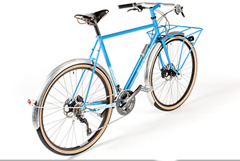
and it's funny you should mention portland, for what i really wanted to be able to do was build bicycle frames. but a very real terror of gas canisters and a total inability to complete even the simplest of tasks in metalwork at school rather mitigated against my entering the fray. yet visit the workshop of tony pereira in portland to view not only the results of his day to day, but the attention to detail exhibited from the front fork dropout all the way to the red light at the tail-end of the colour matched fender/mudguard, and i know there is no way on this earth i could ever do that.
but even in a city like portland, where a sizeable proportion of the population can be seen daily aboard all manner of bicycles, the day to day existence of a custom framebuilder is a precarious one. for as richard sachs is on record as having stated, with the standard of the off the shelf bicycle these days, the reasons for having a custom build have diminished almost to the point of non-existence. and it's very difficult to live on a bank balance based on non-existence.
however, as with most walks of life, water always finds its own level, and those who are particularly good at what they do will not only get by, but perhaps prosper in the face of perceived adversity. which is exactly what not only tony pereira has managed to do, but also close friend, yet rival framebuilder, ira ryan. you may have come across both these names in the one place on a previous occasion, more specifically in relation to the continental model produced for rapha's bicycle collection. it is principally as a result of this collaboration that brought them to the realisation they got on well and could see themselves working with each other in the future.
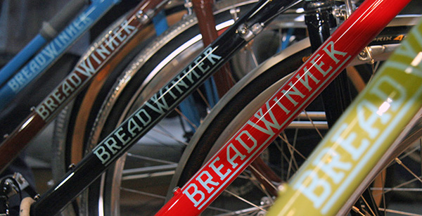
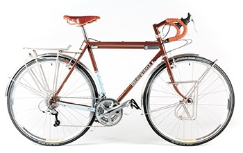
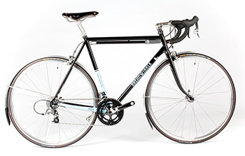
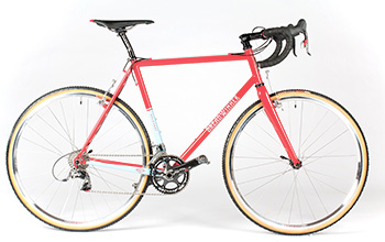
such has now come to pass, with the unveiling of breadwinner bicycles at the recent north american handmade bicycle show in denver, colorado. this consists of a range of six individual models, built from steel and designed to satisfy the needs of pretty much every cyclist on the planet. in retrospect this collaboration seems all but inevitable, but did everyone else see it coming before tony and ira? it seemed only polite to ask ira ryan.
"I don't think anyone really knew about Breadwinner before us. What started as a collaboration on a finite project evolved into a full on business plan. After years of working alone on our own brands, it was a refreshing change to work together and bring our individual strengths to a joint venture. Most of the Portland builders are pretty close knit and we often get together for shop nights so Tony and I have been good friends for a long time. We are honest with each other but also able to work together well in the shop."
naturally enough, as two independent portland builders, each inhabits their own space, both figuratively and metaphorically, and there were one or two photos released during the rapha continental build that saw bits of frames being trucked from one workshop to the other prior to completion of each frame. does that now mean trucking bits of breadwinner frames back and forward between respective workshops for completion, or is there a central headquarters for breadwinner?
"Since our workshops are 13 blocks away from each other, we often build sub-assemblies and then combine everything in one shop near the end. It is nice to have our own shop spaces but they are not set up to work with more than two people. We plan on moving and consolidating our workshops into a larger space where we can build more bikes and have a chance to grow over the next five years."
it's not particularly unusual for one of the majors of the industry to bring a new range to market consisting of several different models, for they have the financial and production clout to make this a relatively simple reality. however, for two guys working in separate workshops, with currently their own individual waiting lists to deal with, an initial offering of six handbuilt bicycles seems quite ambitious. did they ever think of starting smaller?
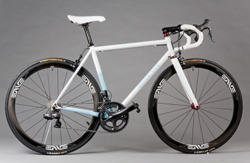
"The six bikes we showed at NAHBS represent the bikes that we build most often and also are the bikes that we are most passionate about (both riding and building). We wanted to offer a complete range of bikes that reflect our ideals. Portland has great road riding (as you have seen!), a strong racing culture with road and cyclo-cross, access to some of the best singletrack in the world and of course a robust commuting and riding culture. Our bikes fit all of these styles."
when i was at art college all those years ago, one of the most difficult decisions that required to be made was what to call the band we'd formed to play at venues around the city. once posters and advertisements had been crafted and the name handed to the network of agents that controlled the live music scene in the north-east, it would have been very hard to change it on a whim, so it was fairly important that we got it right first time. to this end, the guitarist in the band had kept a notebook for many a long year, jotting down any word or idea that seemed like it might translate into rock'n'roll stardom at an unspecified time in the future. so in this case, why breadwinner?
"It started as just a name to operate our collaboration under but as the idea of making a bicycle company evolved, we liked the name more and more. Once we decided to go big we looked at a bunch of different names but kept coming back to Breadwinner. It fits our ideals for the company, the style of bikes we offer and it is also very proletariat and Portland. We want to make bicycles that help people to be their own Breadwinners either on their way to work or at the races."
it's an approach that does have its precedents, but usually with the proviso that you accept it in the colour shown on the website and the only real option is that of frame size. ask for a slightly longer top tube or head tube, and your request would be met with a stern gaze that pre-empted any thought of asking twice. are there any customisation options available, or is it simply a case of 'take it or leave it'?
"Breadwinner will build semi-custom bicycles. The fit will be custom by changing the seat tube, top tube and head tube lengths. We offer six colors for each bike and some models have more options than others. But the goal is to be able to make bicycles in a shorter time frame than our current solo businesses where we start each bike with a blank slate. Instead of offering 100 choices for geometry, parts and paint, we wanted to narrow the options to 6 colors, 30 parts build options and still offer a custom frame fit."
a bit like having kids, there's never a good time to start. all the planning, prevarication, obfuscation and procrastination in the world won't necessarily bring a project to fruition. in which case, was this year's nahbs the catalyst for a launch? and how long had breadwinner been in the pipeline?
"NAHBS made a lot of sense for the Breadwinner launch since Pereira Cycles and Ira Ryan Cycles have both been show attendees and show winners for years. We have been planning on growing Breadwinner for a year but most of the heavy lifting took place in the last six months. The small building community is very strong and we want to show that it is possible for the bicycle frame building industry to be taken as a legitimate and sustainable business where we can afford to send our kids to school, eat well and still be able to ride our bikes."

as mentioned at the start of this feature, there are three important aspects to be considered at the launch of any major undertaking: location, location and location. setting myself up as a wheelbuilder of some repute on an island of 3,500 people, four of whom actually cycle on a regular basis was never going to buy me a holiday home in the bahamas. does ira figure that both he and tony being portland builders of considerable repute made it a simpler task to bring breadwinner to market?
"I am not going to lie; both Tony and I see being based in Portland has helped our brands grow over the last seven years. As I mentioned before, the community of small builders in Portland is tight and for the most part we all get along well. Seeing companies like Chris King, Rapha, Castelli USA move to Portland and thrive has shown that the cycling culture of Portland (and the DIY business attitude) makes it an ideal place to grow. Building bikes solely on passion, hard work and diet of beans and rice will only get you so far. Breadwinner is a maturation of our frame building business balanced out with a desire to make a modest income and be able to ride our bikes a little more than we do now.
(riding bikes---->building bikes---->riding bikes----->building bikes.)"
if you took even the briefest look at the price tag appending to the colnago c59 disc recently reviewed in these very pixels, you would note that it was a rather contrived £9,999.95. with only five pence change from £10,000, despite being a portent of cutting edge technology, price was also apparently a prime consideration. was that something taken into account by tony and ira, or are the retail prices of each bicycle simply a by-product of the design process.?
"Price was a factor but time line is a larger factor. Both Pereira Cycles and Ira Ryan Cycles have both developed long wait lists and in the realm of bespoke bicycles, our frames are affordable and functional but we have had to turn away customers because they don't want to wait for 2 years to get a bicycle. Offering a bike with a custom fit, solid design and build with a choice parts all in a 8 week turn around time makes sense. Breadwinner brings our designs for racing and daily riding bikes to people in a shorter timeline for a little lower cost. We also feel it's important to make frames and accessories in the USA and also spec the builds with as much American made parts as possible."
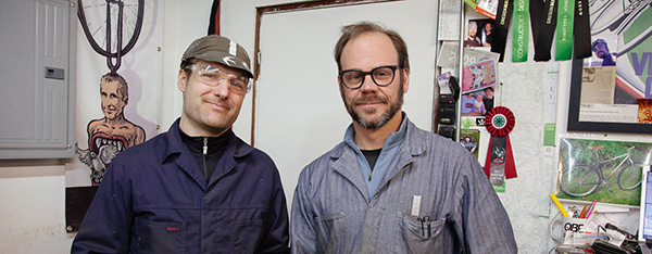
so, you have two guys with healthy waiting lists of their own, considerable national and international reputations for offering top class bicycle frames who have organised themselves into a partnership to offer semi-custom bicycles over a well-considered range. the cycling public may be rubbing their hands with glee at the prospect of owning a cycle with breadwinner written on the downtube, but what of their peers? get to nahbs, and suddenly you're in amongst a great deal of reputable builders, each with their own unique selling point and mostly with their own healthy waiting lists. what was the reception like in denver?
"Great! We wanted to launch with a lot of bang and suspense and we both feel like we got what we wanted out of NAHBS in that regard. The lead up to the show, getting there, being on your feet for 3 days straight and then getting back is always a task but the show was good and the buzz about Breadwinner was worth the effort. The best part was not only the people who came to see Tony and I and were excited to see our new company but also the encouragement from the community of builders such as Richard Sachs, Curtis Inglis and Mike Desalvo. Breadwinner has launched and now we have to keep up the momentum."
there's no getting away from the fact that breadwinner is a brand that indigenously inhabits the united states. having one sent over to the uk could be an expensive option, what with carriage and british import duties. but as with everything, if you really, really want one...
saturday 9th march 2013
 ..........................................................................................................................................................................................................
scottish bike show
i'm sure that, in the daily process of preaching to the converted, i need not spend too much time detailing the vicissitudes of the car-owning public and their seeming need to use those four wheels for journeys of only a few hundred metres. those who share an office with me are doubtless sick to the back teeth of my regular rants about this very subject, but i cannot find any reasonable excuse for such behaviour other than laziness or a lack of being willing to take the trouble to either cycle or walk.
and the worst part is that one instance of the problem is right on my doorstep; my son insists on driving to his work, a distance very similar to that undertaken by myself each day, and which takes less time than it would be to get the bike out the shed. in his case, it's laziness, but on my five minute walk to work each morning, i see many using cars because it's just to much trouble to use shanks's pony.
for the last two years, the scottish bike show has taken place in glasgow's secc, a hangar-like complex housing all manner of spaces fit for showing bicycles, cars, weddings etc., and for featuring concerts by bands you and i have never even heard of. it is a popular venue for a wide variety of activities involving more than just a handful of people. and when visiting the scottish bike show, as i have done from its inception, the logical choice of somewhere to put my head at night, has been the adjacent crown plaza hotel.
however, for 2013, rowan mackie has moved the entire bike show lock, stock and chainset to the new sir chris hoy velodrome in glasgow's east end, a part of glasgow that is now benefitting from a modicum of renovation and redevelopment, but which currently lacks anything like appropriate nearby accommodation. and on my recent visit to the selfsame velodrome for the final round of the revolution track series, it's also an area that lacks any appreciably convenient method of transport to and from the city.
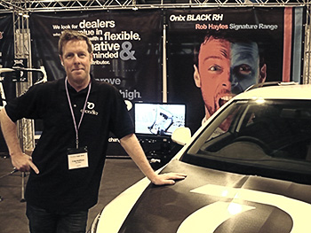
this combination of circumstances has entailed that this year's partner hotel for the event is at least three miles away in cambridge street, just off sauchiehall street in the shape of the thistle hotel. so unlike the 2012 scottish bike show, it will no longer be a matter of rolling down to breakfast then shambling across to the exhibition. this year is going to require effort, but on the evidence of the past two years, an effort that is well judged and definitely worth making. for where else north of the border are you going to have the chance to chat with craig middleton of onix bikes, while away the hours with dean and richard from purple harry, accidentally bump into steven shand or endura's jim macfarlane and have speaks with the two neil's from edinburgh's ronde?
opportunities such as this arrive, but once a year, and if you don't take a firm grasp of them, they might not come back the following year.
other than the above mentions, it might be foolish to attempt a list of others who will be exhibiting, for there will doubtless be others adding their names between now and 27th april. however, i have never been one to shy away from foolishness, so you may wish to consider the following: 2pure, condor cycles, alpine bikes, and singletrack magazine to name but a tiny portion. with the promise of such bicycle trinketry on show, the notion of staying in an hotel several miles from such aisles is more than worth the effort.
and for those who wish to be more actively involved, as far as pedalling is concerned, the second incarnation of the scottish bike show sportive takes place in and around loch lomond and the trossachs on 5th may. a guide to both routes (65 mile and 100 mile) by rapha condor jlt rider and king of scotland, jimmy mccallum can be found here. sponsors gatorade and high 5 are providing fully-stocked feed stations, and along with timing chips, onsite catering, scenery to die for and free entry to april's bike show, it's hard to see why you'd want to miss out. the shorter route entry fee is £27.50 or there's the longer event at £29.50 for those with a bit more oomph in their pedal strokes.
worth going the extra mile i'd warrant.
friday 8th march 2013
 ..........................................................................................................................................................................................................
the wide blue yonder

i am all too painfully aware that the world is a substantially large place, with even now, several corners that have been less than exposed to the vicissitudes of so-called civilisation. what makes this all the more of an impingement, is the knowledge that i am too much of a homely chap to find out about such locations other than through the pages of national geographic magazine, or perhaps the photos and words brought to my attention via the stories told in the pages of the rapha continental, if we'd like to keep this conversation linked tenuously to the world of cycling.
these are regions of the globe that i have espied only through a fabulous series of photographs, for i here refer not to locales that might be adjectively preceded by the word suburban, and certainly not those that can be reached by ten hours on a delta airlines flight over greenland and a short-haul flip on alaska airlines. the intrepid amongst us (yours truly not included) feel no restraint in donning rugged clothing, stout footwear and with a stuffed backpack, heading into the wide blue yonder.
i am not made of such hardy stuff.
and though hopefully less than an obvious ploy, that rather neatly brings me round to daniel wakefield pasley. that's possibly a name unknown to many, but in truth, daniel is the guy who came up with the concept of the rapha continental in the first place, a means of documenting the roads/tracks less well-ridden across the united states, using a loosely agglomerated bunch of riders to illustrate his narratives. the fact that daniel is not only a rather fine writer and superb photographer, provided the entire affair with the wherewithal to make it just a tad more than addictive.
after three years of traipsing here there and everywhere with a white hoop on the left sleeve, daniel left rapha to go traipsing across larger tracts of both the united states and continental europe, chasing a slightly different, but essentially similar goal. in this guise, you may know him better as one of the two clever minds behind manual of speed, though he has placed his considerable talents at the behest of kiui outdoor clothing, spending rather an inordinate length of time in the more remote regions of alaska, recording the hunting explorations of that quality outdoor clothing company.
but, strange to relate, not all men (or women) can live by cycling alone; they have demands that require looking further afield. which is likely one of the reasons that daniel wakefield pasley has added to his seemingly endless capacity for work by conspiring with others to create yonder journal, a website that at least partially concerns itself with a modest level of cycling action, but just as often with the simple process of exploration devoid of any wheels, spokes or saddles.
from where did the impetus for yonder journal arrive? "Yonder Journal was created by Emiliano Granado, Benji Wagner and myself. It's produced and published by Kevin Edward Brown. Kevin works for Emiliano and I. He makes things go into the internet right; the right photos, fewer spelling errors, etc. We made Yonder because it doesn't exist. Because we wanted to create a timeless, semi-academic, anthropological look at sport, wilderness (human and geographical) and pursuit, especially those that are American and/or have a Frontier or marginal quality to them."
"Yonder is about Exploration and Western principles. Exploration is basically short-hand for adventures and sport and pursuits with the whole context in mind. Not just the activity. The whole thing. The landscape. The history. All the people. The whole place. It's about going in, all the way in, being all the way engaged, and coming out educated. Western Principles: 'Western' is not a place. It's an attitude and a quality, the hallmarks of which are self-sufficiency, self-reliance, transformation, rugged independence, saltiness, a predisposition to risk and margins, and a DTF-type of commitment to one's pursuits.
arriving at the yonder website there's a 'just discovered' feel about it, as if stumbling upon a vintage archive, the purpose of which is, as yet, unclear. subdivided into 'studies' and 'briefs' this effects an appealing 'academic' perspective. is that what daniel had hoped for? "We wanted the website to be clean, quiet, useful and timeless. We wanted it to feel like an ongoing permanent record. Like one big study. We divided the site into three basic levels of information. Briefs are sometimes educational, hopefully always entertaining, vignettes drawn from our experiences in the field. It's basically a blog with no sense of time or chronology.
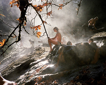 "Briefs are just that, a brief look at something in the world, something we think has intrinsic value. Studies are long-from essays and photo essays about a world or event or thing with which we've spent some time. Guides will be organized by category (hot springs, swimming holes, fire towers, etc.) within a legend, and paired with a map of the United States of America. We're taking an impressionistic approach. More often than not each guide will include a downloadable or printable cue-sheet complete with instructions and maps and useful beta, but really, we want to inspire and compel. We want to plot some of America's most incredible "spots" on a map, show-dont-tell people why they have value, and inspire people to go, there or anywhere really. Just go."
as regular readers will by now have realised, there is no real point to thewashingmachinepost; in other words, there's no final objective that will join two ends of a path and render everything sensible and complete. that may be true of many a blog or website, but yonder journal implies that such may not be true in this case. ultimately, what do they hope to achieve through yonder journal and how long will it take to get there (if that stage hasn't been already reached)?
"Yonder is a life-time project. We hope to be relevant indefinitely. We launched with 'Brovet' in early January. The full site will launch April 1. From that point on, we will publish content weekly if not daily."
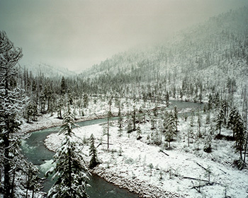
brovet is a variation on the french brevet, a term beloved of audax riders and those with the tenacity to participate in paris-brest-paris. in this particular instance, it has its roots in riding the old ridge road that runs between los angeles and bakersfield, essentially an almost forgotten route all but rendered redundant by the opening of interstate 5. to quote from the guide "a reverberation of a romanticized past that truly existed only as much as it was imagined. On what remains of the Ridge Route, the initiated can hear echoes manifesting themselves in the visual, sonic, and transcendent senses."
those intrigued by the thought of taking this long-forgotten pathway between two towns in california can order the brovet manual, one that not only documents in words and pictures, but offers a route card for those who figure to undertake the ride for themselves. on completion, it is a mere matter of completing the card and returning it to yonder journal to receive an official brovet patch. and casting one's vision to the top of the journal, there is a currently untrammeled link to a yonder journal store, the sort of repository on the website where you'd expect to find items such as the brovet route card.
eventually, what goodies can we look forward to? "Once the store is up we will offer tee-shirts, prints, one-off publications and guides (like Brovet), and some bags and clothing. all will be either equipment that we use and recommend, and/or something we had made, based on our needs in the field. Some product will be a direct result of our experiences in the field. For example, we've been going to Mountain Man Rendezvous for the last three years, and while there we learned about Capotes. We love Capotes. We will make and sell Capotes."
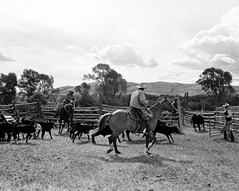
no, i have no idea what capotes are either.
in the late nineties, i taught myself the basic rudiments of html, all the better to fashion some incredibly basic websites. as one who was trained in the art of pre-press and print, this was as intriguing as it was disappointing, for the need so to do was brought on by an apparent need for clients to eschew the printed word in favour of coloured pixels. that was a state of affairs that existed for more years than i hoped would be the case, but more recently, having sat in the background for long enough, print has made/is making a resurgence. in the light of the talents proffered by messrs pasley and granado, is there any likelihood that yonder journal might emulate its historical definition and at least partially inhabit the print medium?
"Printing is important to us. Borrowing from the McSweeny's model, we will print as much work as makes sense. And we will let the story/content dictate the medium; guidebooks, photo essays, posters, postcards, newsprint, etc."
if yonder journal is not an experience you have recently indulged in, i would implore you to go pay a visit. but be sure not to do so when there are other pressing engagements. you will likely be there for a while.
'given enough time and distance one will chance upon a golf course and an affluent home. ride even longer and farther, however, and one will stumble upon history.'
yonder journal | you can see more of daniel wakefield pasley's work in the current issue of the ride journal
thursday 7th march 2013
 ..........................................................................................................................................................................................................
the missing link
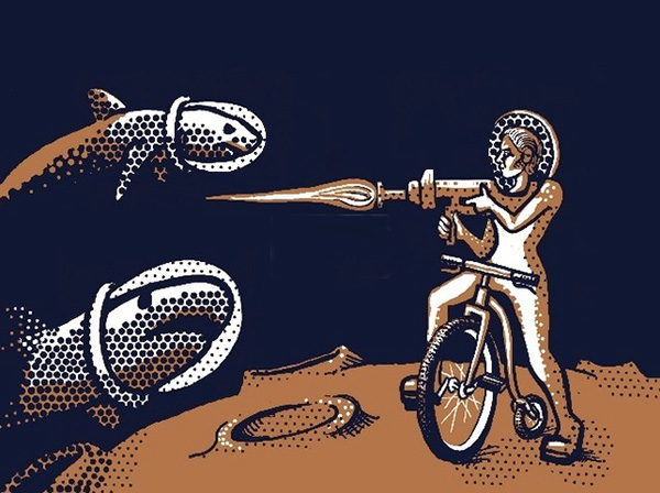
there were only around 1000 metres of the descent left. the four parachutes had deployed as intended to slow the lander craft to an acceptable speed, and even in the relatively rarefied atmosphere, they had proved their worth, glowing in a bluish light from the faraway sun.
it had taken just under two years to reach here from earth, and now with the orbiter left far above the, the detached landing craft was mere seconds away from reaching the planet's surface. everything was controlled ultimately from the earth-based computers at mission control, despite the signal taking an hour or so to reach the craft, and pretty much the same period of time to return. however, much of the 'grunt' work needed to safely deposit the craft on the dusty cratered surface below had been pre-programmed into the onboard computers, leaving little for its occupant to do other than hope somebody, somewhere at sometime had known precisely what they were doing.
the craft started to drift almost imperceptibly to the right as it continued the 'chute controlled descent, but a short, sharp blast of compressed gas from an external thruster, pushed it back onto the straight and narrow, and a softer than expected landing occured more or less as it had said on the tin. the parachutes ought to have disconnected as soon as vertical motion ended; three of them had done exactly that, but a fourth seemed to have left it just a tad too late, draping itself over an antenna array on the craft's left side.
that was going to be inconvenient later.
she checked all the computer readings for anything that might indicate an immediate or future problem, but to be honest, nothing seemed particularly out of place or context. lights that should have been on were on, and those that ought to be blank, were blank. it had been, as mission control would have described it, a textbook landing, though earth wouldn't be aware of that for another hour or so, by which time she hoped to be out on the planet's surface doing what she'd been sent there for in the first place.
but first things first; at some point in the forthcoming weeks, she'd need to leave this cold, estranged planet. mandatory switchings had to be taken care of to save as much energy as possible. the indigenous gravitational pull was certainly several degrees less than that of earth, but forward planning and a welcome safety net, should all not progress to plan, seemed a more than pragmatic choice. anything deemed surplus to immediate needs was shut down for the duration.
there were large tracts of planet surface to be explored, distances that would have proved laborious, slow and possibly insurmountable on foot, yet the size of the lander precluded an appropriately sized, powered vehicle. additionally, since little was known about the atmosphere and surface (hence the desire for exploration), there was always the possibility of a mechanical failure that might prove tricky or impossible to repair. therefore the notion to specify a bicycle for the purpose of personal transport had been an inspired one. spacesuits were no longer the bulky, inflexible human containers of the early years in space. aside from the helmet, space couture had become more svelte and agreeable to improved mobility. riding a bike in space was now a reality.
the bicycle was light and sturdy, constructed from carbon fibre and, in the manner of most bicycles, easily maintained. lowering frame and wheels to the surface was a simple matter, though the draped parachute on top of the lander rather took the shine off that 'one small step'. the tyres were just like those on the schwinn beach cruisers of a century or so ago, except they were devoid of an inflationary gas; at least something had been learned from the mars missions. she fitted both wheels easily, stepped through the one-piece carbon frame and pushed herself onto the saddle.
one foot on the left pedal, a single push downwards and... nothing. the chain had come off.
i will graciously forgive those of you who have checked the url in the web browser just to check that this is still thewashingmachinepost. rest-assured, it is. and the foregoing paragraphs are my rather feeble attempt at bicycle-related science-fiction, the notion for which was promulgated by the latest venture by elly blue. you may recall a feature last year in which i reviewed the fanzine style publications from ms blue's taking the lane stable of print.
very unlike the post, elly concerns herself almost exclusively with the female of the species and their relationships with the bicycle; the female pelotonese, if you will. and in the process of so doing, she has decided to publish a forthcoming taking the lane title nominally named bikes in space, a volume that will contain a selection of submitted short stories using the former as a working title. it has been oft said that inside everyone there is a novel waiting to escape, and i thought it opportune to take baby steps and see if this was true in my case.
as you can read from the above, it quite patently isn't.
thankfully, elly was kind enough to let me down gently, her argument resting on the sound knowledge that other contributions were a substantially better bet than my own. i know just what she means. however, in order for the great unwashed to have the opportunity to read these bike-related science fiction epistles, there's the small matter of funding to be taken into consideration. and that's why elly has a kickstarter page where all contributions are gratefully received. that page is right here.
so if the combination of bicycles and sf is something that you figure might usefully fill your reading time, perhaps you've a few dollars/pounds in your pocket that might bring this project to frution.
any other approach would be illogical, captain.
wednesday 6th march 2013
 ..........................................................................................................................................................................................................
on the big screen
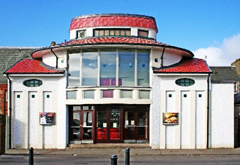
unlike the town of campbeltown, some thirty plus miles south of kennacraig ferry terminal on the kintyre peninsula, the very place you would patiently queue for a ferry to islay, they have their very own cinema. in fact, it has earned a place in the record books as the oldest, continuously run and purpose-built cinema in scotland. were that not enough, it celebrates its centenary on may 26th this year, a countdown to which you can peruse on the cinema website. you would perhaps expect a cinema so far off the beaten track to rely on an organist who would rise from below the silver screen to provide accompaniment to the evening's cinematic programme, but in fact, the cinema temporarily closed at the end of january to have the 35mm projector removed and replaced with a state of the art digital projection system.
what a difference a postcode makes.
despite campbeltown's population exceeding that of islay by a mere 1,500, we have no permanent cinema whatsoever. just prior to my moving to the island in the late nineteen eighties, there was apparently a film club operating in bowmore village hall that would endeavour to show movies of interest, but it quietly disappeared before i had any opportunity to explore its treasures.
we now have the benefit of the screen machine, a mobile cinema sponsored by scottish gas in its original incarnation, but now supported by the royal bank of scotland in its sturdier guise as screen machine 2. (the original mobile cinema succumbed to the unevenness of scotland's rural roads after only a few brief years serving the highlands and islands.)
though touted as a mobile cinema, which it undoubtedly is, the benefits offered by such mobility are somewhat squandered on its infrequent visits to the isle. for the expanding truck tends simply to arrive on the morning ferry at port ellen, park up adjacent to the ramsay hall and remain there for the duration. while this is ideal for the residents of port ellen village, the lack of any evening transport makes it harder for those bereft of personal mobility. and those who live in the southernmost point of the rhinns are still faced with around a 55 mile trip to go to the movies.
still, no amount of pointing this out has altered the screen machine's islay park-up location.
personally this bothers me little. other than attending a marathon star wars screening in the early eighties, i'm not an inveterate cinema goer; i'm every bit as happy to wait till it comes out on dvd and watch it in the comfort of my own armchair (or bed, since the bedroom tv has its very own cinema sound attached). for regular box office movies this is perhaps less of an imposition, for those are usually watched in the company of mrs washingmachinepost to whom all oooohs, aaaaahs and how cool was that? can be directly addressed.
if i restrict my viewing habits to the more pertinent arena of cycling movies, those that i do not have on my mac, and thus watched while listening with a pair of earphones, will have to be watched alone, for mrs twmp has no earthly interest in anything with a remote connection to the world of cycling. yes, we all know just how wrong she is in her outlook, but some folks are past persuading. but it does mean that any exclamations of oooohs, aaaaahs and how cool was that? are thus rendered redundant, as there is no-one to whom they might be directed. i believe i am now making up for having not had a deprived childhood.
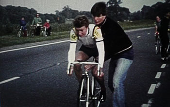
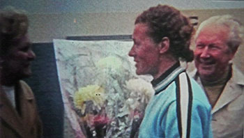
however, those of you better geographically placed than i, more specifically in the vicinity of the riverside cinema in hammersmith, can head along on the afternoon of sunday april 28th to watch the big screen premiere of racing is life, the excellent documentary detailing the life of beryl burton, recently reviewed in these very pixels. and were that not sufficient, hang about long enough and you could watch the reg harris movie maestro. the potential advantages of such group observation are manifold, but most obviously bringing the opportunity to turn to those sitting on each side to express those oooohs, aaaaahs and how cool was that?
the recent cycling film afternoon at the riverside cinema proved rather popular amongst aficionados of the genre, so if the two on offer this time round look likely to satisfactorily occupy the afternoon after the sunday ride, it might be an idea to book in advance. you'll kick yourself if you miss it.
riverside studios | campbeltown picture house
tuesday 5th march 2013
 ..........................................................................................................................................................................................................