
..........................................................................................................................................................................................................
endura fs260-pro jetstream iii

long, long ago in a galaxy far far away, at least so it seems, when you purchased a new bicycle, it arrived with an owner's manual and what i like to refer to as a swiss cheese spanner (one of those, fits everything doohickies). the spanner was invariably so badly made that it either bent when used, or it was impossible to fit over the appropriate bolt because the rest of the spanner got in the way. the manual, however, had pragmatism written all over it (well, actually mine had raleigh, but you know what i mean).
the contents bore relevance to the exact bicycle to which its little plastic packet was attached, offering advice on how to maintain the moving parts, to what pressures the tyres ought to be inflated, and even adjustment instructions for the sturmey archer three-speed hub gear. for those younger than a certain age, this may appear to be a work of fiction, but i can assure you this is all true. if only i'd kept mine in order to prove it.
though i have no real evidence or statistics with which to reinforce my contention, it seems remarkably co-incidental that, when production moved to the far east, it was not only the bicycles that became generic. if you're lucky, the little booklet with the appallingly bad illustrations will have at least the name of the manufacturer printed on the cover, but in most cases that i've seen, the only words featured on the front are owners manual, invariably without the apostrophe. the contents mostly have no relevance whatosever to the cycle of which you are now the proud owner.
explanations of how to fit front and rear 15mm track nuts on a bicycle fitted with quick release skewers are by definition, bound to cause confusion. diagrams showing three front chainrings when the bike has bendy bars and skinny wheels could prove awkward when it comes to gear adjustment, and since almost everything is now affixed with allen or torx bolts, that swiss cheese spanner is merely decorative.
i'd dearly love to take a campaign to the world's bicycle manufacturers requesting that they either re-instigate manuals relevant to the machine which they accompany, or provide a web address from which it might be possible to download a pdf of the very same. however, prior to girding my loins for a lengthy period of to and fro communications, i think i at least ought to educate myself to rtfm in the first place.
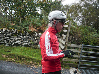
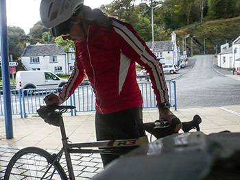
endura very kindly despatched the rather ineptly named fs260-pro jetstream iii (sounding remarkably like the order code for a light aircraft) for the purposes of review. subtitled, athletic wind protection, i figured i lived in the very place that might do it justice; and vice versa. however, having donned a baselayer and endura bowmore single malt jersey, i was about to top them all off with the jetstream when i happened to notice the text at the foot of the hang tag. for though it paid tribute to the description above, appended to the end was the word jersey.

the jetstream, though close-fitting and thin of constitution, resembled a lightweight jacket, one that was about to have provided several hours of overheating had i continued with my initial dress code. both the back of the jersey and the rear panels of the sleeves are insulated with roubaix fleece, while the front of both torso and sleeves are of a rustly windproof polyester fabric.
my first outing was unfair on both rider and jersey, since though windy, at that point we were still experiencing the last vestiges of scotland's so-called indian summer. though i am guessing those windproof panels are also intended to be at least modestly breathable, i fear both my exertions and unseasonable warmth had it in for them from the start. it would have been a good idea for me to have worn a long-sleeve baabaa merino baselayer, not because of any chill factor, but due to my arms perspiring profusely as if in a sauna.
in fact, overall, on that first outing, the end result was hardly favourable. though the windproofing is amongst the best there is, a bit of cooling wind would have been most welcome in order that i felt less like a cooked cyclist. as mrs washingmachinepost continually reminds me, i have to choose my battles, which, in this case, meant waiting for another day of lower temperatures and persistent wind. considering this is the west coast of scotland, i did not have to wait terribly long.
the wearing of a long-sleeve baselayer turns out to have been a good idea, for though lower temperatures start to make the jetstream look a tad more sensible, that windproof fabric, aided and abetted by the roubaix fleece is still not as breathable as one would like. though long-sleeved merino will never make the rider cooler, it does considerably reduce the clamminess that results from bare arms inside the sublimation printed jersey sleeves.

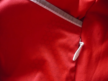
practicalities, however, it owns in spades. the collar is commendably high to keep out pesky winds and the full-length front zip has a suitable garage at the top to prevent nipping any exposed skin. the zip is also assisted by an internal baffle. the three reflectively topped rear pockets are substantially constituted and most helpfully for the carrying of coffee and cake money, there is an almost concealed zipped pocket amongst the three. the hem has a wide strip of silicon gloop to keep the jetstream in place when riding athletically.
whether you admire the contrastingly coloured darts on the arms and torso is of personal preference, but i do think it a nice touch to have the endura name on each sleeve. it's probably also worth mentioning that, though endura make no claims as to any waterproofing qualities, i did get caught in a couple of light showers which it shrugged off very confidently.
overall, it is a well-made and well-fitting jersey, one that looks as if it ought to be a jacket. when the weather turns colder, i might just find that it's true vocation is exactly that, but at present, perhaps a zipped vent under each arm might help ameliorate that feeling of clamminess in moderate temperatures. it's available in red as reviewed, and in blue, black and white. size ranges from small up to xxl and retails at a very reasonable £67.99.
monday 14th october 2013
 ..........................................................................................................................................................................................................
fred perry, bradley wiggins range track jacket and merino sweater
not only do i not recollect the specific date each year, but i also have no idea why its was deemed necessary in the first place. mods and rockers, the empire and the jedi, though i doubt either knew which was which; i know we didn't. and just to mystify this anecdote even further, i can't remember whether i was a mod or a rocker, considering we're talking primary school in the 1960s here.
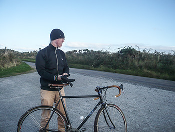
it was a distinctly british approach to subculture, and in keeping with tradition, was centred mostly around music and mode of dress. given that i have a long history of designer scruff, there would seem ample evidence to suggest i would have identified with the rockers, but as i said, i can't actually remember. adorned in leather jackets, leather boots or perhaps even brothel creepers, rockers, as the name would suggest, were particularly into fifties rock and roll. they also, generally, rode motorbikes by way of transportation, though that may have been more of an affectation than truly based around transportational needs.

mods, on the other hand, were less than impressed with the music of the previous decade, something that may suggest their moniker. all these years i had no idea until sky photographer scott mitchell, pointed out that the word was a shortened version of the word modernist. soul, r'n'b (not the bipty-bip nonsense that passes for r'n'b nowadays), ska and beat music was what would have filled the average mod's ipod if they's been invented at that point. and just to be contradictory, they rode scooters, often with more wing mirrors than a person truly needs.
unsurprisingly, given that human nature was involved, mods didn't like rockers and rockers didn't like mods; it was this very conflict that we little people at primary school were strangely attempting to re-enact. i say strangely, because none of us was old enough to drive let alone own either a lambretta or a triumph bonneville, and our aggression seemed only to consist of chasing each other round the playground for the entire lunchtime break.
as i've said, i haven't the faintest idea why, but i now recall that the date might have been close to that of easter weekend, the timing of a major squabble between the two camps at clacton in 1964.
the modernist culture was also identifiable for its concern with fashion, though i must say i'm mystified as to how ex-army parkas fitted into that notion. however, while little is heard of rockers nowadays, the mod culture has continued, personified in the late seventies and early eighties by paul weller's band the jam. it is no secret that sir bradley wiggins is a great admirer of weller, allegedly recently quoted as saying that playing guitar alongside his hero was a greater moment than winning gold at the olympics.
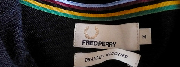
also associated with the modernist culture by implication and by dress sense is apparel provider fred perry, and we can surely forgive them playing up this association by launching a bradley wiggins range of jackets, jerseys, trousers and polo shirts, remaining very close to their own tradition, yet incorporating salient detailing that might allude to sir bradley's identifiable connection with cycling.
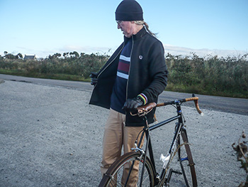
very kindly, fred perry clothing sent me two items from the range, the wearing of which i must suppose, takes me firmly away from my perceived allegiance to the rockers, tenuous though it surely was in the first place.
fred perry, who died in 1995, was a brit who was good at tennis, the last player to win a men's singles grand slam title until andy murray won the us open last year. seemingly reviled by british tennis for having turned professional, he moved to the usa and became a united states citizen in 1938. renowned for having created the first sweatband (?) he devised the fred perry clothing label in the 1950s, though like many a uk business, it is now japanese owned. however, aside from a continuing identification with mod culture even in the 21st century, they make some darned fine apparel, even if sir brad is unlikely ever to be seen wearing it in the giro d'italia anytime soon.

according to the hang tags on both jacket and jersey, fred perry class both as non technical wear, and i can see where they're coming from. the jacket is made from polyester cotton and offers a heft that belies its style, yet one that implies quality the minute you wrest it from its polybag. officially known as the champion tipped track jacket, my medium sized review sample offered both superb length in the green,yellow,black, maroon and blue cuffed sleeves as well as an impressive length in the torso. for those of us used to cycling jackets that barely reach our waists at the front, this was something of a revelation.
you can tell i don't get out much.
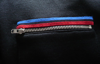
my only real disappointment was a total lack of pockets on the front. though i do see where they're going with this, i feel they may have missed a trick by not offering a couple of side pockets on the front of the jacket. the only concession to cargo space is a single zipped affair at bottom right on the rear of the jacket. sadly, this was not large enough to accept my velo club d'ardbeg wallet, though to be fair i have several other jackets similarly constituted. there is bags of room inside without it feeling bulky, and despite its avowed non-technical stance, it was more than practical enough for a few perambulations of the locale aboard a chris king cielo.
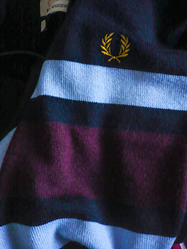
but of course, unless in thrall to the nomenclature bandied about by the more bona-fide of cycling apparel purveyors, a jacket implies a stylish means with which to cover one's leisure clothing; in this case an impossibly soft merino knit sweater. this is offered in two distinct patterns: the review sample features a broad maroon chest stripe bordered by two narrower light blue stripes. these do not continue onto the back of the sweater. yet again, the sleeve length is particularly impressive as is the styling, offering a quarter length zip closing a ribbed collar.
very retro, very cycling, very stylish.
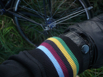
surprisingly, at least to me, this garment also offers a small zipped rear pocket in precisely the same location as that of the jacket. unfortunately that would mean if both contained velo club d'ardbeg wallet substitutes, there would be an unseemly and very definitely unmodernist like bulge at lower right. still, that's probably what trouser pockets are for, and since i believe this comes under the heading of styling i think i'm probably being deliberately unfair. worn together, they are not only the epitome of sartorial elegance, but a tad more practical than fred perry would have you believe. though i'd be loathe to wear them on the ride of the falling rain, popping out on the bicycle to visit friends is well within their capabilities.
my late father spent an inordinate part of his life attempting to make his number one son respectable, something i have managed valiantly to avoid for most of my life. however, though i have no intention of checking out ebay for a used but good condition lambretta (have you seen the price of these things?), i cannot deny that i am mightily impressed with the fit, the quality and the style not only of these two particular garments, but the rest of the wiggo range. i can't say they've made any significant inroads to my time-trialling abilities, but at least i look good when i'm going slow.
the merino knit sweater is available either with the chest stripe as reviewed or in a charcoal colour with vertical body stripes. sizes range from xs to xxl and retail price is £125. the champion tipped track jacket is available solely in the colour as reviewed, again in sizes xs to xxl and retails at £95. i'd like to thank scott mitchell for his invaluable assistance with this review.

sunday 13th october 2013
 ..........................................................................................................................................................................................................
design is a good idea

bowmore village hall used to belong to the local council, that is until they decided that maintaining such hubs of rural sociability was no longer part of their core business. at which point, they held a series of meetings in several regional locales to offer ownership for a token sum to the local communities in which these often dilapidating buildings were sited. intriguingly, halls situated in the constituencies of elected councillors were mysteriously still part of the core business, and in one or two cases received monetary aid for refurbishment or appropriate facelifts.
however, not entirely unexpectedly, the more vocal population of islay was less than impressed at this derogation of duty by the council, and argued that, particularly in the case of bowmore, the hall was not just a local amenity, but one that was frequently used by the entire island. there was never any doubt that the council would have their own way if only in part because each side was tendering a different argument.

though all this happened many years prior to the current government's imposed austerity, the council's argument rested solely on one of economics, while the islanders' counter argument had far more to do with emotional attachment and rural pragmatism. had we been able to offer convincing commercial reasons as to why the council ought to retain ownership and operation of the halls, success may have been less of a moving target. but while all rested more heavily on the plea 'but you can't do this to us', it was pretty much doomed to failure, as indeed turned out to be the case.
and a similar disparity of argument must take place all across the cycling world at the commencement of each season. the larger of the professional teams involved in the world tour or perhaps even uci continental might not hear a single voice raised in anger, but the further down the ladder we descend, the more vociferous that background noise might become.
the hapless chap or chapess landed with the job of designing the jerseys in which the riders may do battle come next season would undoubtedly prefer a modicum of simplicity. it is far easier to offer a decent return for the principal sponsor (always assuming there is one) by way of bold brush strokes loaded with few colours but augmented with sizeable and visible graphics. and it offers far more artistic scope for the designer.

at the other end of the table is the team owner or manager, more intent on garnering sufficient cash to purchase everything he/she needs for a busy season ahead, acquiring the best of riders to add to that palmares of uci points. for after all, 'points mean prizes'. if that means smothering every square centimetre of polyester and lycra with all but meaningless logos, then so be it. designers, and i speak from experience, don't really like that, but since aesthetics rarely concern themselves with economics, the two arguments will rarely, if ever, meet in the middle.
but suppose, just for one minute, that your logo is one of those about to be randomly placed upon one of those less than simplistic jersey designs. naturally enough, visibility is high on the agenda, as it is likely to be on behalf of each of several co-sponsors. look, for instance, at the jersey of androni-giacotelli; there are so many logos emblazoned on front and back that it's a wonder any of them gain appreciable tv time or photos in the monthlies. that's an argument i have no interest in overhearing.

it has taken me nigh on forty one years to realise that simple is undoubtedly best when it comes to percussing behind the majority of musical groups. and exactly the same can be said about that of logo design; the fewer components and colours the better, for you just never know quite how small or how large the end result might be displayed.
it was, in fact, a variation of yanto barker's le col logo that first attracted me to the brand. at one time a colnago aficionado, yanto had been pictured in the comic wearing a black and gold jersey with the word colnago where one might have expected to see le col. from that first iteration, yanto has moved onto providing a sterling range of quality cycling apparel often aided and abetted by that distinctive logo. the corporate world, however, rarely stands still; it is incumbent on the folks at the top to continually take stock of their customers' demands and perceptions along with any pertinent developments by those they perceive as competitors.

though it may seem a trivial concern, sometimes you just know that logo needs updating.
and that is exactly what has happened at le col. this latest iteration of the initial logo design has both presence, modernity and visibility in a crowd. and though it may be stretching credibility a little further than it needs to be, were yanto to take on the daunting task of supplying a certain pro-continental italian team, those myriad other logos ought not to trouble it unduly. nothing is ever quite so simple as just how long the sleeves need to be.
and aside from all that, it's also a particularly fine example of a sans serif typeface.
saturday 12th october 2013
 ..........................................................................................................................................................................................................
what do you call a pair when one of them goes?

overall, we don't really need anywhere near as much stuff as we constantly acquire. despite apple simply clothing their existing mobile phone in coloured plastic and adding a letter of the alphabet, there were still queues outside their stores and a selling out of initial stock over the course of a few days. apple's success almost contradicts their highly successful advertising campaign of a few years ago which exhorted prospective customers to 'think different'. now they all think the same.
(yes, that ought to have read as 'think differently' to be grammatically correct, but marketing departments are not renowned for their grasp of the finer points of the english language.)
the modern ideal is to sell us stuff that we didn't know we needed until it was pointed out via a carefully orchestrated advertising campaign. undoubtedly some good comes of this; despite my own misgivings regarding the necessity of owning a mobile phone, i cannot deny that it has engendered substantial leaps in technological thinking to provide even more things we'd no idea we needed. some will recall the days when it was customary to merely hand over cash money for payment of services; according to barclays bank, it's a cinch to reimburse your mates without even patting them on the back via their mobile app.
but every now and again, along comes an idea, or in this case, a publication, that is exactly the right thing at the right time, yet the majority of its target audience carries on as if it was completely invisible.
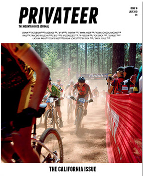
the disappointing news that privateer editor andy waterman's superlative efforts on behalf of the offroad brigade have ultimately come to nought came as something of a crappy surprise. buoyed by the consumate success of rouleur magazine from very humble beginnings in a corner of rapha's offices in imperial works, the current publishers gruppo media launched this similar offering for mountain bikers in october of 2010. according to privateer's website, that first issue is sold out.
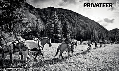
it would be a naive individual that ignored the substantial difference between road racing and mountain biking. leaving the bike design aside, it doesn't take an honours degree in mathematics to note that if la doyenne (liege-bastogne-liege) first took place in 1892 and mountain biking arguably started in the 1970s, there's a more than just a few decades of heritage to keep roadies entranced, but considerably fewer for the knobbly tyre folks.
of course, it would be similarly idiotic to cite a lack of heritage as good reason not to embark upon the path that privateer has confidently ploughed for the last four years. by common consent, number sixteen the california issue was one of the finest examples of modern cycle publishing whatever the genre, and its successor, the recently available number seventeen, provided more of the same. privateer, to all intents and purposes had proved its naysayers totally wrong; the format had suddenly clicked, a clicking that the more perspicacious reader or observer could have seen coming and enjoyed reading for a while.

however, while rouleur proved a critical and commercial success almost from day one, sales of privateer have been less than startling, leading to this week's decision to call a halt after publication of issue eighteen in november. as i have made mention on several occasions in these very pixels, i am not a mountian biker; i do not own a mountain bike. however, the writing and photography was very much to my liking, and i looked forward to each issue of privateer almost as much as the eagerly awaited thud of rouleur on the welcome mat.
based entirely on this lack of sales, it would appear true to suggest that the average mountain biker does not have the same desire to access quality writing and photography as his/her road-going brethren. britain's most successful mountain biking magazine, future publishing's mbuk, sells an average of just under 39,000 copies a month. i have no idea how many copies of privateer sold each issue, but i figure it was probably substantially less.

ironically, after gruppo media's announcement, twitter was awash with belated praise, many pointing out that privateer was surely a text book demonstration of how to publish a quality magazine. i consider it a great honour that editor andy waterman quoted from my review of issue sixteen in their advertising; "it's time that privateer and rouleur were considered two of a perfect pair", a quote i still believe is/was entirely justified. the dispiriting news that it's to disappear from view will have caused much gnashing of teeth amongst aficionados to say nothing of the editorial staff, but the folks who really missed out are those who never read a single copy.
mountain biking will be very much the poorer come 2014.
friday 11th october 2013
 ..........................................................................................................................................................................................................
endura adrenaline race cape

i'm not an alarmingly early riser in the morning; 7:30am is about as bright and cheerful as it gets, though i will admit to a 7:15 alarm call every alternate saturday. for reasons that time has lost all contact with, the radio alarm comes on around 6am, rarely waking either me or mrs washingmachinepost, but allowing interminable dozing until the sports news only a moment or two before half-past seven. bleary eyes continue for several lengthy minutes more, during which radio four's today programme continues unabated.

the occasional weather forecast interruptions are pretty close to being of no use whatsoever; informing the listener that it will be mild in the south and cooler in the north is a bit like a chocolate fireguard. however, presenter evan davis only the other morning mentioned that "you know those days when you start having to wear an overcoat? well they'll start around midnight tonight." that's those southern softies for you.
unfortunately he was probably correct, and again yesterday morning paid testament to "probably the end of our indian summer." at the risk of publicly proclaiming my ignorance, i haven't the faintest idea why it is referred to in this manner; why is the existence of warm weather well past its sell-by date the preserve of the indians? and to which indians are they referring? either way, the sight on the other side of the curtains wasn't something you'd see on a mediterranean holiday, and for once i silently raised a small cheer.

i've mentioned on more than just a singular occasion that the velo club has frequently found itself overdressed of a weekend lately, and all thoughts of waterproofing consigned to the cycle wardrobe. despite protestations of breathability on behalf of the many, temperatures inhabiting the upper teens or lower twenties will, more often than not, result in as much moisture inside the jacket as out. better just to suffer in saturated silence. but the dawning of wet and windy mornings has unlocked that particular section of the clothing cupboard and once more, days of inclement swashbuckling have arrived.
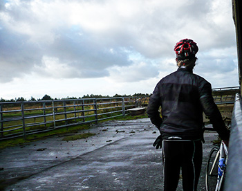
this is october, merely the entrance hall to autumn and winter. by the time the back door is reached in mid-january or even earlier, more substantial waterproofing and moisture porosity will be called into service. at the moment, a thin jacket stuffed in a back pocket will suffice for this member of the pelotonese.
scottish apparel providers endura have claimed the upper echelon (good choice of word for a windswept isle) of clothing hierarchy for their equipe range, but prior to its arrival, the world belonged to fs260-pro. if i recall correctly, it refers to the weight in grams of a square metre of field sensor fabric; or something like that. however, since many of the fs260 outpourings are demonstrably not crafted from field sensor fabric, it seems only right and proper to accept that it is now simply the title of a rather fine clothing line.
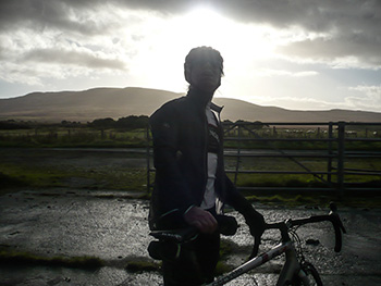
weighing next to nothing and with a thickness that rivals that of quilted toilet paper, the endura adrenaline race cape arrives in its own little drawstring bag. it's an easy method of containing it while in a jersey back pocket, but since squally showers arrive seemingly from nowhere out here, particularly when shelter is either thin on the ground or completely non-existent, i could do without the extra faff. so i left the bag at home.
one of the adrenaline's claims to fame are its semi-transparency, allowing the competitive amongst us to have those stuck behind to see the race number. it's a nice feature, but sadly of little use to yours truly. however, it did allow those in close proximity to view a faint trace of my endura bowmore distillery jersey and tartan armwarmers (whether they wanted to or not). the collar is lightly padded, and the opposite end has a drop tail to keep any rear wheel spray from soaking one's posterior.
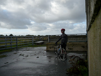
it's really easy to pull on and off in the current spate of changeable weather and alludes to total waterproofness via fully taped seams and comforting breathability. the latter feature seems something of a condundrum; barely challenging the thickness of butterfly wings, the adrenaline jacket offers virtually no warmth despite its wind and waterpoofing (it's not really supposed to); it was a chilly ride in a northerly wind. however, on reaching the safety of froth, the inner reaches bore the unmistakeable traces of condensation.
this is not something that i find at all iniquitous. even if you ride in short sleeves during that rarefied scottish summer weather, you'll find yourself invaded by patches of perspiration; so why the heck would you expect to be internally bone dry when wearing a waterproof? however, with no hope of engendered cosiness, the fact that even cold weather in the face of athletic exertion seemingly tested its breathability was somewhat unexpected. but the waterproofing? now that's a different matter.
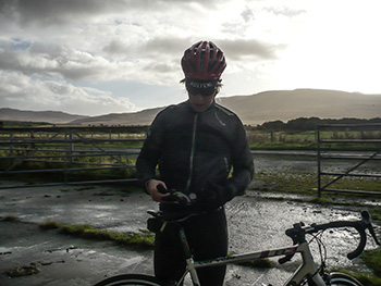
just as i rounded the bend, heading towards crosshouses over the heavily worn but expensively laid anti-skid surface, i entered the world of wind-tunnel testing. a serious headwind bearing lashings of precipitation completely justified my having worn the adrenaline jacket in the first place. and though many a damp patch was visible on the jacket's exterior, patches that looked as if they had breached the fabric, there was no sign of any corresponding dampness on the bowmore jersey or tartan armwarmers.
how the heck something that thin can fend off gale fueled precipitation is quite beyond my ken.
i'm none too sure that i'd like to explore several hours of persistently heavy rain however, and certainly not without more substantial clothing below, but i'm pretty sure that this is not the principal purpose of the adrenaline jacket in the first place. however, in or out of its stuffsack, it's the ideal emergency waterproof to have in a back pocket, and its lack of bulk is very much a creditable string to its bow, both off and on.
endura's adrenaline race cape retails at an impressive £59.99 in sizes ranging from xs through to xxl in either black or white.
thursday 10th october 2013
 ..........................................................................................................................................................................................................
tiddbits
it's the domestiques i feel really sorry for. the guys who have to drop back to the team car to collect a whole phalanx of bottles for their team leaders and the others who are strategically trying to keep the leaders in contention. it's all very well being fit and strong enough to lead from the front and remain there when push comes to shove, but those poor unfortunates loaded down with full bottles, have then to power their way back up to racing riders and enter the distribution stream. a notable clip from the tour of poland showed some poor chap stuffing bottles down the back of his jersey only for them to fall out the bottom and onto the road.
you have to wonder if we're not kind of missing the point in the quest from wattage, lightness and unadulterated speed. take a look at the average touring bicycle; irrespective of the frame material, there are usually fixtures for a couple of racks and panniers, a bar bag and anything up to four sets of bottle bosses. were the world tour guys only to adopt this particular stance, we could all but nullify the need for a substantial train of motor vehicles following the cyclists' every move. granted, speeds might be a shade slower than at present, but surely the sight of bertie the accountant or sir wiggins pulling to the roadside on the ascent of the galibier to rifle through a rear pannier for those gels they're sure they packed along with a copy of the comic, would be worth the price of admission alone?
i'm not the first person to have pointed out the iniquity of bicycle racing that supports around 200 riders with an almost similar count of motorbikes and motor cars. for all our self-righteousness regarding our green-ness, we may have to step back and take a clearer look.
however, the majority of racing bikes, the modern equivalent of the ten speed racer, are not sold to racing cyclists. in fact, the professionals have no need of thumbing through catalogues, visiting cycle shows or peeking at websites at all; they just ride what they're given. we, however, have often need of emulation, perhaps choosing a bicycle on the basis of hero worship or perhaps just the colour that was available at the time. there is no shame in either because whatever we own, it is likely far better than our meagre abilities require in the first place.
and that includes standard features such as a second set of bottle cage bolts.
even on those long rides on which i like to kid myself i am copying the work ethic of cavendish or froome, the sort of distances that take more than three hours (with only a couple of coffee stops), i have rarely found it necessary to carry more than one bottle of water or carbo refreshment. even if that bottle has contained a salutory 750ml, very rarely do i arrive home with an empty bottle. observation of the majority would tend to suggest this is a common occurrence. and even on very hot days (snigger) in the uk, it's nearly always possible to drop by a local hostelry for a modicum of liquid refreshment.
so just what are those second bottle bosses for? even when the disgraced michael rasmussen had colnago build him a unique extreme c with bosses on only the downtube, the theme was not carried through into the retail product. a true cyclocross racing bike ought not to have bottle cage bolts at all, for the cage would get in the way of shouldering the bike, but in a one hour intensive race, there's little opportunity to reach for a bottle in any case.
but still we're happy to purchase 'cross bikes with two sets of bosses. think of all that unnecessary weight being ridden or carried into battle.
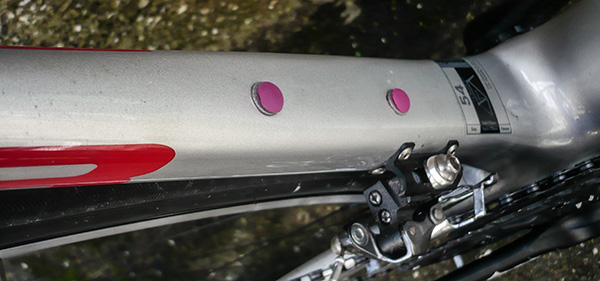
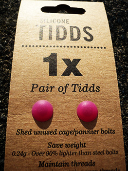
which is where the humourously named silicone tidds enter the fray. these are not, as i initially thought, alternative means by which a bottle cage might be affixed to the bicycle frame, but a substitute for the two useless bolts carrying nothing on the seat tube. the tidds will almost without doubt attract themselves to the weight weenies keen to replace everything on the bicycle with something lighter. however, i would venture that employing them for such a reason may well be regarded as a touch eccentric even by ww standards. you would probably gain the same weight reduction with a good sneeze.
however, the tidds have at their beck and call a more pragmatic reason for existence. it does me no favours whatosever to admit that the two bottle cage bolts in the seat tube of my steel cielo have corroded to the point of non-removal. this is hardly a major cause for alarm given that i barely drink from the single bottle most often carried on the downtube. but the existence of the silicone tidds at the time the cielo arrived from portland would likely have obviated this problem by having kept the threads clear of corrosion.
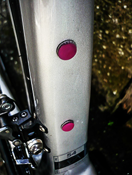
fitting the tidds couldn't really be simpler. assuming your own cage bolts have not rusted in place, simply remove them, put a drop of lubricant on each tidd, then push and wiggle them into place. i admit i was unable to sit them flush with the top of the bottle boss, mostly due to the inherent flexibility of the tidds, but we're talking only a millimetre or so. barely worth considering in my mind.
they simply don't work on my colnago c40, but that bicycle owns a smaller set of bolts than is currently the norm, and the guys at silicone tidds have to set out their stall somewhere. when i can fight my way past the front of thewashingmachinepost bikeshed, i'm going to become a real cyclocrosser and fit a couple of pairs to the ibis hakkalugi.
it's a good idea, well-thought out, bizarrely named and pretty much the same price as a pair of cage bolts. the weight saving will never gain you a professional contract via improved climbing prowess, but they're pretty much guaranteed to maintain the integrity of the boss threads no matter the constitution of your frame material.
silicone tidds are available in black, white or pink at a cost of £3.99
wednesday 11th october 2013
 ..........................................................................................................................................................................................................
ventoux gym bag

during an exchange of friendly e-mail banter with a friend only the other day, the possibility of picking up a book from the library was under discussion. with most, if not all britain's towns and cities playing host to at least one library, doing so could hardly be considered much of a chore; it only needs library card in hand, coupled with a notional idea of just how to find the book or genre in question and the rest is simple mechanics.
that, however, presupposes that the library is an immoveable building, one that has specific opening hours and can be accessed at least five days a week. rural considerations are rarely that simple; in common with many of the country's smaller villages, we have a mobile library; a big blue van that visits bowmore about once every two weeks. suddenly i can see faces realising that perhaps they're not so badly off after all when it comes to public amenities.
and just to lessen the effect of a van every couple of weeks, big and blue though it might be, it does not harbour an inexhaustible amount of space to store all the books you might think you'd want to read. if your needs pertain to a specific genre of literature, it does no harm to give the librarian a call in advance. it saves any disappointment. and should the book you want be not on the island, it can usually be ordered in.
but that doesn't mean we are amongst the uncivilised.
autumn has been in residence for a month and a bit, though the unseasonability of the weather has meant more often than not that the members of the velo club have been unremittingly overdressed. windproof is one thing, but an ambient temperature that is overworking the breathability aspect of any outer garment is making life just a tad harder than it needs to be.
the forecast for the coming week is either encouraging or discouraging depending on your point of view. though it may seem odd to those of you ensconced in the great metropolises of the world, i am eager for the winds to increase slightly, the temperatures to lower just a smidgeon and for even a smattering of precipitation. this is not entirely because my marbles have been lost, but more to do with that having been on the menu come october for the past twenty-five years.
we are nothing if not creatures of habit.
bearing this in mind, when conversations head perhaps naturally towards more regular use of that turbo trainer in the garage/bikeshed, i am not listening. and i am of a similar mind when that selfsame conversation turns to honing one's athletic physique via visits to the gym. because yes, we do have a gym, or rather as it's referred to in local parlance, the leisure centre fitness room. in fact, the centre manager recently managed to confirm suspicions that the english language was not his strongest suit by using the word in its non-existent past tense "if you've not fitnessed for a while, why not consider a monthly membership?"
fitnessed?
however, i like to thing of myself as stoic in the face of atmospheric adversity, more likely simply to head into the wide, grey yonder rather than spend a morning in a hot, sweaty gym (sorry, fitness room). but though i do not think myself singular in this approach, the problem arrives during the annual holiday. for, having braved the elements to the point of insolence in order that those thighs of steel develop a respectable chiseled profile, i am loathe to let it all evaporate during a week of lazing about on leather sofas and inveterate visits to the coffee shop.
it is of great good fortune that the holiday destination usually visited by mrs washingmachinepost and myself incorporates a rather fine, yet compact and bijou fitness room all of its own. however, regular attendance at machinery designed to steel those abs, harden the biceps and improve one's cardio-vascular tubing brings with it protocols all but absent in the rural idyll. the least of these is to avoid arriving in clothing other than athletic in pretence, even though the outer shell will be discarded prior to the onset of physical purgatory. and my acute observation has also noted that bringing the obligatory towel, energy drinks, wool transfer trousers and fred perry jacket ought to be done via luggage other than a bio-degradable supermarket checkout bag.

who knew?
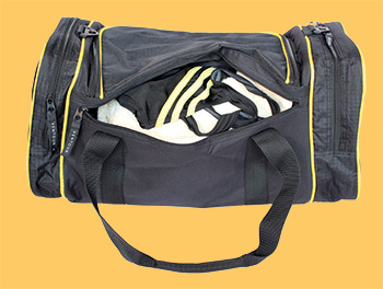
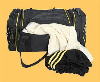
it is natural to wish to place one's heritage on display. i have no desire for my unknown accomplices in the quest for fitness to think i might be merely a civilian on holday. nor do i wish them to consider that i might be an aficionado of the football/cricket/marathon running cliques. though i'd be particularly inclined to sit uncomfortably on an exercise bicycle wearing a velo club d'ardbeg jersey giving manifest credibility to my velocipedinal leanings, there is the journey to and from the establishment to consider. and i can think of no better method of carrying all the necessary paraphernalia than ventoux's latest gym bag.
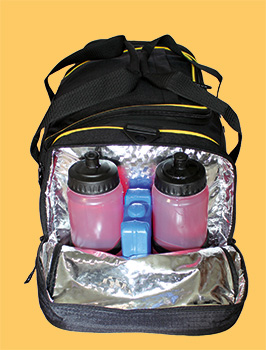
though i have no need of stuffing this bag in a locker, nor to take as carry-on luggage on any aeroplane, it's quite satisfying to know that its size will accommodate either or both. with 28 litres of internal space, i can carry one heck of a lot of cycle/fitness clothing to suit repeated visits. and no fitness session can be remaindered by going straight home; a slight diversion for froth and a sticky bun is all but compulsory, and that needs cash. which is why it was rather a treat to find that the end zipped section opposite the foil-lined bottle and munchie bit has an organiser pocket.
so, while i might not be enamoured of the act of fitnessing when at home, i am attuned to the benefits accrued or maintained when incurring the resting period of a carefully planned training programme (i could be kidding about that last bit). and i cannot deny a certain degree of pride in carefully placing a bag emblazoned with the word ventoux adjacent to my puffing and panting exertions.
the ventoux bag inhabits the same quality and expertise demonstrated by their 'event bag' and 'big bag'. it's available direct from ventoux-bags in red or black with variously coloured trims. cost is £45
tuesday 8th october 2013
 ..........................................................................................................................................................................................................