
..........................................................................................................................................................................................................
assos rs. sturmprinz evo waterproof jacket

there's foul weather and then there's foul weather. we tend to suffer from the latter. frequently. and then, not frequently. the latter state of affairs always seems to rear its ugly head on receipt of waterproofs for review. it's precisely the situation that ensued when the intriguingly named rs. sturmprinz evo arrived from assos in its attractive and appropriate packaging (the outer shell of the box featured a verisimilitude of raindrops).
those faux raindrops became more tantalising as the days and weeks passed, with a hebridean weather system that seemed oblivious to my plight, to say nothing of the reputation that i have carefully curated over the years. yes, indeed, we did experience strong winds and the occasional rain shower, but the latter had always evaporated before i had time to prepare for battle. frustratingly enough, we experienced two thunderstorms overnight; scarcely the ideal time to head out for a bike ride and definitely not the ideal situation in which to take photographs.
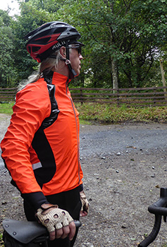
this is the first assos product i have reviewed for well over a decade and a half; lest they thought i had made off with the goods to pastures new, i was moved to e-mail my apologies for a complete lack of prescient review. scotland may have been voted 'the most beautiful country in the world' by the readers of rough guides, but few of those readers would have believed an entire month to have been dessicated, even if that month was august.
according to assos, the sturmprinz is the result of developments commenced four years ago in association with their in-house pro cycling team. this team is apparently often in receipt of products that rarely reach the sales rack due to the lack of financial propriety applied to such garments. this in itself, is not unusual; developing excellence without restraint is a common occurrence, the trick is in subsequently applying such restraint to a marketable product.
however, according to legend, when the sturmprinz was presented to the seamstress, they gave the accountants the day off. this has resulted in a jacket that assos freely admit is a tad demanding upon your bank balance (rrp is a not inconsiderable £315). if you're then willing to accept switzerland's statement that 'The objective was not to make a 100% waterproof jacket' the scene is set for interminable discussion.

unlike many a contemporary cycling apparel purveyor, assos are in charge of their own destiny; they not only design the product, but manufacture the constituent fabrics. the principal contributor to the sturmprinz is a recently developed assos fabric which they have aptly named triton, one that chases the holy grail of impermeability combined with an approachable level of breathability. assos have been refreshingly upbeat about admitting that 100% waterproof would more than likely result in the all-too-familiar boil-in-the-bag scenario, one in which neither you, me or assos are particularly keen.

in keeping with the majority of assos clothing, the sturmprinz is what i believe is referred to as race-fit, featuring a decently proportioned collar, a drop tail with some serious gloop to hold it in place and incredibly close-fitting cuffs. the full-length front zip is backed by a substantial storm-flap, while the rear vents have been cleverly built to allow access to the outermost two rear jersey pockets, in between which is a zipped emergency pocket. elasticated shoulder inserts prevent that coathanger still in place sensation when sat in the coffee shop, supping froth.

so far, so good and, dare i say it, rather impressive. but when i did eventually get it wet (and boy, did i get it wet), did the wet stay on the outside? to cut a longer story shorter, it most certainly did. assos purport that "...when you look out of the window and see that it's not cosy... grab your sturmprinz and have a good ride." partly due to a particular mentality and particularly because i often have no other option, i'm very much in favour of riding in galeforce wind driven rain; it's actually quite good fun. but that sense of fun is immeasurably enhanced if i figure i can get home without impersonating a drowned rat.
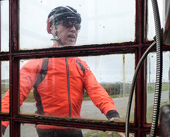
the admittedly minimal g.c. ristorante debbie's peloton spent close to three hours in driving rain, yet on reaching debbie's towards the end of our sunday ride, the jersey 'neath the sturmprinz was impressively dry(ish). there was a smidgeon of perspiration generated dampness on arms and upper torso, while the lower portion of the jersey had not unnaturally become damp from a soaked pair of bibshorts. aside from the arms, all seams on the sturmprinz are taped; the close-fitting cuffs fended off any unwanted draughts, but the neoprene-like cuff fabric does tend to get wet, passing that wetness to armwarmers or long-sleeves.
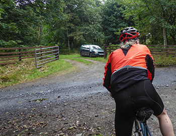
but i'd like to remind you that assos stated their original objective was not to create a totally waterproof jacket. it's a realisation that has occurred to several apparel providers; the ideal is to keep the rider as dry and as comfortable as possible in the face of meteorological adversity. and taking into consideration the bright 'lolly red' option, it's unlikely that you'll remain anonymous even on dark, grey days.
access to the rear pockets via those ventilation flaps is actually a bigger deal than you might think. the sturmprinz is positioned as a race quality garment and assuming that to be your modus operandi, being able to reach into a pocket for gels or energy bars without undue faff is an important consideration. for those of us inhabiting a more sedate sense of purpose, it was most convenient to grab my camera without need of unzipping. however, depending on the constitution of the jersey du jour, it was a bit more awkward to replace because gloved fingers had difficulty distinguishing between jacket and jersey.

assos promote the sturmprinz as an insulating shell, wearable for long rides in cold temperatures. that is possibly the sole point with which i'd like to take exception; those three hours in driving rain were undertaken in temperatures inhabiting the mid-teens celcius, with baselayer, ardbeg jersey and armwarmers worn underneath. while i cannot state that at any time i felt cold, neither did i feel close to overheating. however, in my opinion, that leaves considerable room to manoeuvre when the cold months appear, but it still seems worth mentioning.
it's perhaps also worth my pointing out that, despite such a robust design and substance, the sturmprinz can still be rolled up and stuffed in a rear jersey pocket, poised to take over when the climate suffers a temporary breakdown.
£315 is a not inconsiderable amount of money to pay for a waterproof jacket and though the sturmprinz is arguably more than just a waterproof jacket, ultimately it is that factor on which it's likely to be judged. at the risk of being a tad blunt, it gets my vote.
the assos rs. sturmprinz evo is available in sizes from xs to xxl (assos classify the latter as 'tir') in either national red or lolly red (as reviewed). cost is £315.
assos rs. sturmprinz evo jacket
monday 4 september 2017
 ..........................................................................................................................................................................................................
chrome industries cinelli barrage cargo backpack
sat pretty much at the back of thewashingmachinepost bikeshed is a beautiful italian lugged-steel roadster, sporting a sturney-archer three-speed gear, rod-pull brakes, fully enclosed chain, mudguards, a more-practical-than-you'd-realise newspaper rack on the swept back handlebars and a sturdy, tubular steel rack over the rear wheel. if that is insufficient to whet your commuting appetite, it also has a bell and a sprung brooks leather saddle. there really is little to compare in the velocipedinal universe. riding it confers a status that has no equal and i have been known to emulate the royal wave upon meeting acquaintances along the way.
in order to augment the carrying capacity of that rear rack, i have festooned it with a set of brooks brick-lane roll-up panniers, offering what i regard as the best of both worlds; when there is stuff to be carried, one or both can be unrolled to participate in cargo duties, but when flying free, with the wind blowing in my greying ponytail, they are rolled together atop the colour co-ordinated rack. agglomerating all the above into a single cycling package, you would think i'd resemble the proverbial pig in sh*t, but there is, as always, a weak link in the chain, so to speak.

those of you brought up in the heyday of sturmey-archer, when it was still british and owned by raleigh, will be well aware of the three-speed hubgear's limitations. though a five-speed hub would ameliorate at least two of those limitations, for one reason or another, that particular variation seemed less than popular in the church of sedate cycling, hence the ubiquity of the three-speed variation. basically, first gear is a 33% reduction, second is effectively direct-drive and third is a 33% increase. in other words, never the right gear for any occasion.
so despite the joys to be had from commuting on this particular variation of italian steel, hit anything above a breeze or a robust slope and life becomes harder than it really ought to be. add even a modest amount of cargo (as in the standard 3kg bag of porridge oats) and chris hoy thighs can be developed during the ride home.
what's a porridge-loving coffee commuter to do?
those lovely people at portland's chrome industries are pretty much equal partners in team cinelli chrome a band of itinerant racers who are, if the website copy is to be believed "...a new energy in racing. This is a team that transcends urban landscapes and creative movements - seeing the bicycle as a form of communication." unlike the pampered pros in the world tour, these hardy individuals "carry their own bags, wrench on their own bikes and bandage their own wounds." fulfilling this mission statement requires a backpack that can leap tall buildings in a single bound. if you were a small backpack just starting out in life, this is what you'd hope to be when you grow-up.
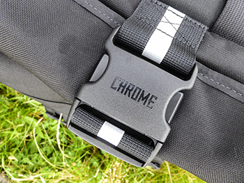
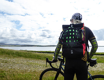
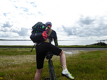
cast from the sort of heavyweight nylon cordura that could repel a concerted klingon attack and backed with a welded waterproof 'truck tarpaulin' liner, this pack would not only swallow several 3kg bags of oats but probably the warehouse in which they're stored. i managed to cram in far more stuff than i'd ever have need of during normal domestic carrying duties and should i have had one at my disposal, there's an internal pocket capable of enclosing a 15" macbook pro. my considerably smaller 13" macbook air almost disappeared without trace. to protect all those contents, the rolltop opening is secured by a particularly substantial adjustable strap and buckle.
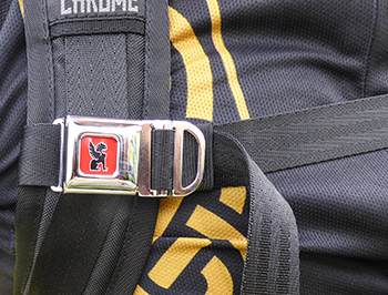
the rear of the pack, the bit that sits against your back while riding, consists of heavily sculpted padding and features channeling to allow cooling airflow. i cannot deny that there was still a modest degree of sweatiness when riding on a warm day, but a bit like the archetypal breathable jacket, the holy grail in this area has yet to be achieved by anyone. the comfort, however, is highly impressive. and in order that all this stays where it's supposed to, even when rocking and rolling up the steepest of hills, there's a chest strap that slots into a chromed miniature seatbelt-style buckle on the rightmost strap.
the more observant amongst you might be querying, if those cinelli chaps are involved in the racing end of bicycling, won't they have need of carting helmets about? well spotted; but those chrome people are already one step ahead of you.
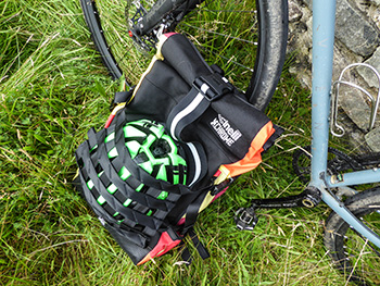 featured on the outside of the brightly highlighted, roll-top backpack is an open mesh easily capable of safely enclosing an entire cycle helmet augmented with adjustable straps. and as if that weren't enough, side pockets can cheerfully grasp a u-lock and water bottle.
this chrome industries barrage cargo backpack will save any intrepid cyclist from the iniquities of sturmey's three awkwardly placed gears, all the while carrying your worldly possessions in safety upon your air-conditioned back. if you've the more contemporary eleven-speeds, even with heavy hauling, you'll be flying. there's more adjustability and versatility available here than you could ever catalogue and the fact that it's guaranteed for life surely demonstrates that chrome have as much faith in their workmanship as we'd like them to have.
state of the art with orange and yellow.
the chrome industries cinelli barrage cargo backpack retails in the usa for $200. it's available from 'always riding' in the uk at a cost of £189.98.
sunday 3 september 2017
 ..........................................................................................................................................................................................................
new ardbeg celtic cycle jersey

i've been saying i've been going to write it for more years than i care to admit; 'the teetotallers' guide to the islay malts'. i'm really not sure quite how i intend to achieve this, but it's very hard not to learn a lot of things about whisky when you're surrounded by the stuff. our back garden overlooks bowmore distillery's bonded warehouses and the distillery itself is but a few hundred metres down the road. every wednesday and sunday, the air is redolent with the smell of peat smoke, as another batch of floor-malted barley is made ready for the next fill.
and as many of you will be aware, bruichladdich distillery is but a few metres away from debbie's; one of the sunday morning peloton holds a senior position in their digital media department. yet, though i have become more accustomed to the aroma than was the case when i arrived, i still feel no compulsion to pour myself a dram of a friday eve while watching yet another repeat of new tricks.

that being the case, it calls into serious question just how i plan to engage with the reading public by publishing a few hundred pages on the amber nectar, aimed purely at others like me who have no desire to join the merry international throng of whisky drinkers. yet whisky's very existence has encouraged the makers of irn-bru to position it as 'your other national drink'. always, of course, assuming that your nationality is scottish.
i have often jested that were the distilleries to be removed from islay, it would leave the island resembling st kilda, a world heritage site positioned some distance off the west coast of the outer hebrides, the population of which was evacuated to mainland scotland in 1930. though islay was once a hive of agricultural and fishing activity, both have declined over the years while the distilleries have thrived. both bruichladdich and kilchoman have encouraged local farmers to grow barley for their 100% islay expressions (which is how whisky bottlings are now referred to) certainly helping to keep certain portions of the island's farming alive. but there's no real doubt that islay single malt whisky is on the up; if evidence were needed in support of this contention, witness the fact that there are currently eight distilleries on the island, with a ninth currently under construction at ardnahoe, about half-way along the road to bunnahabhain distillery.
but throughout all this resurgence and increasingly corporate stance (currently, kilchoman is the only islay distillery still in private hands), ardbeg has contrived to retain its je ne sais quoi. if it were a rock band, it would be the doobie brothers. though we, as a peloton, visit the old kiln café very rarely these days, when we actually do (as in the recent ride of the falling rain), you couldn't ask for a friendlier welcome. and though at least some of that is because staff and cyclists are all islanders together, i can't say i've noticed any diminution in the welcome offered to visitors.
additionally, though i haven't conducted an exhaustive survey of the other distilleries around the principality, i do believe that ardbeg is the sole provider of bona-fide cycle parking.
the louis vuitton, moet hennessy owned distillery was also the very first amongst its peers to offer an appropriately monikered cycle jersey. modesty prevents me from telling just how much pressure they were under from yours truly so to do, but nonetheless, their eventual acquiescence undoubtedly gave them a jump-start on the others, many of whom have now followed suit by selling their own branded variations. woe betide the distillers who ignore the velocipedinists in their midst.

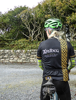
yet, while their neighbours debate whether there's any point in catering to the cycling public, the doobie brothers have not rested upon their laurels; currently, there are three variations of ardbeg jersey available, the original and the retro editions have recently been joined by the celtic variation, a stylish variant of the original but featuring the ubiquitous gold knotwork in a vertical stripe down front and rear. for those more used to ordering a medium-size, these jerseys originated by the cycle jersey tend to be less of a race-fit; i opted for size small and that seems to have been a judicious decision. those of you who realise the compulsory nature of owning just such a statement of intent, will no doubt appreciate that acquiring your very own from the distillery itself is the preferred option.
however, both ardbeg and i realise that this is not possible for everyone, so can i therefore helpfully point you in the direction of the cycle jersey's online store? then you can pretend you wore it while sipping a dram of the latest ardbeg expression (an oa, since you ask) while sat outside the filling store listening to the waves breaking on the pier wall.
saturday 2 september 2017
 ..........................................................................................................................................................................................................
impeccable conduct(or)

nowadays few of us can excuse ourselves from owning some form of computer, the form-factor of which changes to accommodate our specific needs. mrs washingmachinepost is more than content with an ipod mini and a colour co-ordinated iphone. though she seems yet to grasp the practicality of a phone often preceded by the word mobile, these two devices take care of all the facebooking one can accomplish in a day.
i, of course, consider my own computing demands to be ostensibly more onerous; though i do believe it's possible to install a photoshop app that will accomplish the bulk of that which i can achieve with photoshop cc. at least, as far as thewashingmachinepost is concerned, i prefer to exercise my pixel wrangling on a mac. however, though i am currently at pains to profess a studied insouciance with regard to daily computing tasks, for the purposes of bringing the post to your web browsers each day, a bona-fide computer is currently a necessity due to the constraints of server file structures.
but this was admittedly not always the case.
prior to the interweb's existence, a prehistoric state that several of you may not recall, the only means of receiving software updates in a timeous and non-confrontational fashion (yes, quarkxpress, i'm looking at you) was by way of the once ubiquitous computer magazine cover mount cd. and having taken the time, trouble and subscription form to get hold of said magazines, it would surely have been bad manners not to at least skim through the pages, would it not?
though the monthly macworld offered a more copiously constituted cover-mount, it was the fortnightly macuser that those of us who allegedly took ourselves more seriously would look forward to receiving. for the latter featured more in the way of creative uses for that orange lidded ibook and for a brief moment in time, its pages were often punctuated by cutting edge illustration, fashioned by the inmates of why not associates, tomato and the eponymous yet seemingly short-lived sunbather. i always aspired to discover a similar moniker for my own substandard graphic output, an aspiration for which i searched in vain.
those days are long gone, as are many of the graphic studios that existed in those times. however, on receipt of the latest edition from rouleur towers, the arrival of which still raises one's heart-rate in anticipation of both the content and that fabulous litho ink on paper smell, when leafing through the opening pages, i was all but transported back to those heady days of graphic excellence. for there, in all its glory, was a superb illustration attesting to both the parcours and atmosphere of la vuelta.
it's an illustration acquirable as a poster and produced by the superbly named conductor. and just as you would expect, i made further enquiries of creative director, mj jackson, who, along with jonathan davies, co-founded conductor, based in london's south bank.
firstly, what inspired and who designed this minimalist yet quite evocative vuelta poster? "We designed the poster here at Conductor. My co-founder Jonathan Davies and I are keen cycling fans and cyclists ourselves. A great deal of our work is in the cycling industry for clients such as Canyon, KASK and Chapeau! to name but a few."
it's all very well that contemporary designers find themselves involved with the cycle industry, given the latter's more recent upgrade to sartorial and decorative excellence. but did the fellows at 'conductor' fall into cycling, or was their involvement by design (if you'll pardon the pun)?
"Our work in the cycling industry is very much by design, we started Conductor to work with clients whose passions we could understand and share; our work encompasses other sectors including sport as a whole, hospitality, luxury goods and travel."
with two chaps obviously keen on the velocipedinal milieu, it's not outwith the bounds of possibility that messrs davies and jackson found themselves doodling in spanish while watching the highlights programme along with ned and david. was that the case, or is it more likely that the chaps at rouleur asked for a poster to sell?
"The poster was a commission from Rouleur, who we have worked with before. We wanted to capture the allure of the legendary climbs of the Vuelta to show that they're more than just a collection of statistics. We're used to seeing the profile maps of stages of Grand Tours as cold and mathematical graphics. We decided to depict five of the most infamous climbs in a way that reminded us of the feeling of approaching them, seeing them loom up in the distance often obscured by cloud or heat haze.
"The airbrush technique highlights the summit of each col and mountain and conjures feelings of mystery and foreboding. There's a beauty to these mountains; brutal as they are to the peloton, we wanted to create an image to do that beauty justice."
the design studio'tomato', it transpires, was not so-called after the fruit (vegetable?) that accompanies cheese in a cheese and tomato toastie. i'll be darned if i can remember why it was named thus, but the explanation was suitably obscure and totally in keeping with the magnificence and eccentricity of the studio's output. it was altogether easier to accept the origins of 'why not associates' and i figure that 'sunbather' was simply thought to be a cool name. what were the origins behind 'conductor'?
"The name Conductor could be viewed in a couple of ways, and Jon and I probably don't agree as to the definition every time we tell the story. Our role is to tell the story of our clients in the most appropriate and effective way and in this we could be seen as orchestra conductors or the conductors of electricity. Hopefully rarely as bus conductors."
the conductor la vuelta poster, printed on 308gsm hahnemuhle art paper, can be purchased direct from rouleur.cc at the price of £55.
friday 1 september 2017
 ..........................................................................................................................................................................................................
fashion statement

as the vuelta continues through its second week, with chris froome getting ever more comfortable in red, and while the more muddily inclined amongst us look forward to the 'cross season, the people who make and the people who sell us bicycle stuff are commencing their own season at eurobike in friedrichshafen, germany. it's a sizeable annual cycle exhibition that i have so far avoided attending, on the basis that i've no idea what i might bring to the party. at one time solely for the cycle trade, more recently it has been decided to include a day for the cyclist on the street (that means you).
should you still have time to book a flight, that takes place this saturday 2 september.
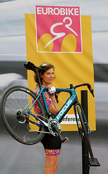
though i still find the cycle industry and its myriad machinations to be of particular interest, developments over the past decade or so offer up more questions than answers. thankfully, by and large, those involved with affecting our velocipedinal world have refrained from simply anodising their product in a fetching shade of blue while adding the word technology to any copy accompanying the press-release. at least, that's true for most of them. but it is becoming harder and harder to tell the difference between that which is fashion and that which is real technological advancement.
i can't be the sole observer who recognises that more than just a few examples of next year's bicycle range is basically just one or two new colours fitted with a groupset that is a tad more sculpted but essentially fulfils the same function as last year's? i'm ever aware that i ought not to be seen as overly complaining in such matters, because i'm as happy to be seen aboard even shinier carbon as the next man, but as a group of spoilt individuals, do we really need (deserve?) new stuff every twelve months?

i for one would be happier if bicycles received an upgrade solely when the available technology made it prudent so to do. and if that only happened every three years or so, i'm sure most of us would be quite content.
the fact that the uk updates car registration plates every six months has engendered a degree of one-upmanship; my car's newer than yours. assuming you pay attention to such matters affecting the bicycle milieu and though we may be less crass than members of the motoring public, how long can you forestall a smug grin stood next to a fellow cyclist astride last year's model, while you congratulate yourself on contemporary modernity?

eurobike, interbike, the uk's cycle show and numerous similar events would undoubtedly be a smidgeon less colourful and possibly less congested both on and off the display stand if the content on show was based more on technological development than that of fashion. however, in a world that seems oddly concerned almost exclusively with constant growth and expansion as opposed to consolidation, i think my less than popular opinion will probably find itself filed under obscurity.
all this razzmatazz, however, still obscures the question as to whether the cycle world's research and development schedules are geared towards peaking at the end of august, or whether any new stuff that surfaces in may (for example) is kept in a plain box on top of the wardrobe till eurobike? that's what my parents always did with christmas presents bought in november.
thursday 31 august 2017
 ..........................................................................................................................................................................................................
rapha colombia kom s/s sportwool jersey

i don't really remember the 1950s. this isn't a variation on the "if you can remember the sixties, you weren't there." scenario, because apart from the rise and rise of bebop, there wasn't any mind-altering concerted situation which it was cool not to recall. when sting sang 'born in the fifties', the sentiment resonated, as long as no-one asked me to reminisce about the decade's more salient features. granted, the we were already heading towards the 1960s by the time yours truly came along, but nonetheless...
i do, however, have one or two recollections from 1963, perhaps the most notable being my purchase, for ten shillings (50 pence in new money) of the beatles' twist and shout ep on the parlophone record label. for those oblivious of the merits of vinyl, the ep, or extended play featured two songs per side of a 7" single, as opposed to the more usual one. audiophiles, who are/were no doubt more educated in the mores of sound reproduction would no doubt be keen to point out that the smaller grooves of the extended play recording hardly led to an improved audio experience and would probably have advised against such a purchase.
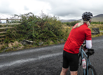
i'm pretty sure that very recording lies silently somewhere in the attic, but would probably require serious investigations to recover.
if memory serves correctly, aside from the title track, that little black circle also featured 'there's a place', 'do you want to know a secret' and 'taste of honey'. though i rather obviously contributed to the record's success, at such a minor age i was somewhat oblivious to such extended machinations. suffice it to say, the record reached number one in july 1963 and remained there for a total of 21 weeks. these were the seminal years of what has subsequently become known as the mersey beat.
the band's name, obviously circuitously derived from that of the insect, was a clever play on definitions, offering the more regular pronunciation, but managing to incorporate the word beat to tie it in with what were still the early years of the new-fangled rock'n'roll.
however, to briefly return to the previous decade, those years were responsible for another group of beetles, more correctly written this time. if we can fast forward to the very year (1987) that mrs washingmachinepost and i moved ourselves to our island haven, colombian rider lucho herrera became the first rider from that country to win one of cycling's grand tours, taking not only the leader's red jersey, but also the king of the mountains. it was the beginning of the rise of colombia in world cycling and due to the riding style of their great predecessor from the 1950s, ramon hoyos, they were collectively referred to as 'escarabajos'; beetles to you and me.

this is important to know, because, if like me you either own or are about to own rapha's latest outing in red sportwool and have need of explaining why the fabric is peppered with a myriad of 'escarabajos'. conjecture at the weekend surrounded the possibility that they were the very beetles that are rather unceremoniously crushed to provide a red dye. logical, if you note the strong colour of this superb jersey, but ultimately wrong.
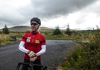
rapha's colombian inflected king of the mountains sportwool jersey is what we might refer to as a collectors' piece; the cycling apparel equivalent of the coffee table book, you might say. and that, i might add, is a very good thing. contrasting completely with the ubiquitous and archetypal dye-sublimated polyester, the graphics applied to the rpm150 merino fabric are, in effect, 3d.
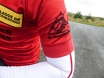
won in magnificent style by the aforementioned luis herrera, the queen stage of that 1987 vuelta summitted at lagos de covadonga, reflected by a sewn-on patch on the left breast. this is offset by the appearance of a colombian flag and rapha patch on the right, a centimetre or two above the applied flock legend rey de las montanas, or king of the mountains. on the leftmost rear pocket is the embroidered number 87 topped by luis' surname.
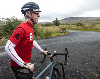
none of that, of course, would amount to more than a bucket of frogs if the jersey failed to live up to its reputation. it would be more than just embarrassing to be decorated with a herd of scarabs while wearing a less than sartorially and functional jersey. before digressing once more, let me assure you that you need have no fears on that score. after a summer of fending off almost unbearable heat (a little hebridean humour there) clad in polyester, donning sportwool of this calibre is a most welcome experience. those delightful little beetles are also present along the silicon gloop that holds the drop-tail in place, aided and abetted by two draw cords offering the required level of personal adjustment.

i'd quite forgotten just how luxurious a high(ish) collar could be; combined with a possibly longer-than-usual quarter-length zip, the fit (medium-size) is nothing less than impeccable. and those sleeves are of a disposition that almost welcomes the humble arm-warmer and obviates the worry of any inadvertent rule#82 infraction.
though i may have alluded to the collectibility of this jersey, it should never, under any circumstances, be encased in a glass table-top or wall-mounted frame. this jersey should be collected upon your person every week on the sunday ride. rpm does not solely refer to the constitution of the fabric.
rapha's colombian inspired red kom jersey is available in sizes ranging from xs to xxl at a retail price of £150.
rapha colombian kom s/s jersey
wednesday 30 august 2017
 ..........................................................................................................................................................................................................
fairbairn fabrication fangs

in bygone days, before someone invented the word telemetry, motor races were often begun with the invitation to "gentlemen, start your engines". no doubt the health and safety executive have put paid to such traditions, combined with the need for all manner of technical faff that has inflicted itself on motorsport. that and the fact that, as far as i'm aware, the engines have already been started by the pit crew.
and despite only one of three weeks in spain having passed without major incident, many of us for whom the grand tours are but a delightful irritation in the cycling firmament, are now eagerly looking forward to figuring out which particular date and event we'd be happy to recognise as the commencement of the 2017-18 cyclocross season. for those now looking at me with a quizzical face - and i do understand your pain - where once we need have looked only as far as the land of frites and mayo, our gaze must, of necessity, stretch across the pond.
naively, i was inclined to look only as far as cross vegas, a one-time uci sanctioned event that initially took place as an accompaniment to the annual interbike exhibition taking place in las vegas (one which moves to reno, nevada in 2018). this year, this blast across the grass (see what i did there?) occurs on 20 september. but several days prior to the notionally traditional commencement of battle, cross occupies 9/10 september in rochester, new york (home of drummer steve gadd, since you asked), followed by an event in eeklo, belgium. but on 17 september, the uci have seen fit to endorse the excellently, if a tad prematurely named, jingle cross in iowa city, usa.
and if aigle thinks the season starts in iowa, who are we to disagree?
which, to bring me closer to my original point, is likely where it becomes practical to exhort "let the scrabbling begin", that point of the year when reality bites and i discover that no matter how many copies of balint hamvas' annual cyclocross photo annuals i have catalogued in the spare bedroom, any skills vaguely reminiscent of those professed by jeremy powers or sven nys, are now effectively non-existent. and that can mean only one thing...
practice.
i agree, that sounds almost as if intended as a negative state of affairs, but in truth, it's one that i look forward to each year.
mr powers impressed upon me a number of years past that, in order that i gather the appropriate mounting/dismounting skills, i ought best to lower the saddle to the point where i might ease myself aboard without undue concern, roll for a few pedal strokes before instigating the converse and continue ad finitum, rasing the saddle a few millimetres each time until i can leap aboard with a devil-may-care flourish of limbs on a bicycle that ultimately sports a less than embarrassing saddle height.
invest the time and effort and any unexpected passers-by will recognise me for the true 'cross expert that i claim to be from the safety of the coffee shop. but, as many of you will be keen to point out, that is only the beginning. getting on and off scarcely addresses the pressing need to be able to cycle quickly over often squishy terrain without examining it any closer than necessary (face plant? moi?). and that's to say nothing of the serious likelihood that, having dismounted the specialized crux, i might possibly have to run. uphill, even.
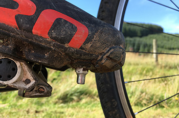
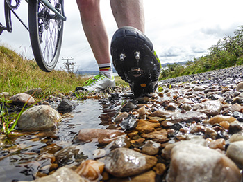
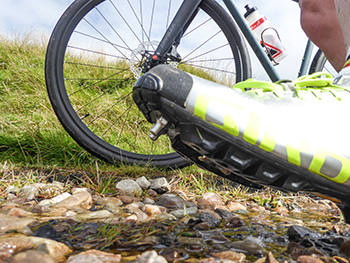
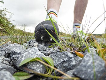
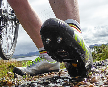
as far as i know, there is little that can be done to improve my uphill speed, other than putting in the effort. repeatedly. assuming i can bypass the inveterate dog walkers in bridgend woods of a saturday morning, repetitive hammering around my improvised course du jour is bound to pay dividends, right? however, when it comes to running with the shouldered carbon fibre up wet, grassy, leafy paths, i'm inclined to take all the assistance i can get. and what appears to have given me the edge in this respect are what i have taken to calling fairbairn fabrication fangs; two stainless-steel machined studs that thread into the appropriate slots in the front of any quality offroad shoes.
these were generously supplied by paul fairbairn. "I started making them last summer. During the previous season I couldn't find a stud which was cross-specific in the UK. There were plastic, cheap alloy, or large diameter rugby studs.
"I made a handful of the stainless steel studs and handed them out to a few guys (Jimmy Mac, Gordon Watt, Jim Cameron) who, along with myself, were racing that winter season. Through word of mouth people started contacting me, asking if I was selling them, which I wasn't at the time."
this season, however, we can all gain the same advantage as former king of scotland, jimmy macallum, for paul is now able to satisfy the potential demand. "The studs are 14mm long, 7.0mm in diameter and have a standard M5 thread to fit in the shoe. They are made of marine-grade stainless steel, and hence wear very well.
They have a hexagonal profile at the top of the stud to allow fitting with a 10mm spanner rather than a plastic key a la football / rugby studs. Due to this design, you can really screw the studs in tight, and when the off season comes, its really easy to get them out again. No more seized studs requiring drilling.
"They retail at £20 posted for a set of four.
as paul weller was once keen to point out, this is the modern world, one in which technical innovation has made the creation of shiny new stuff often a simple matter of programming a computer and letting some automated machinery take the strain. actually "They are all made in my shed on a vintage 1960s Myford ML7 lathe. Totally old school, no CNC or robots. They take me an hour to make from a metre length of hexagonal bar."
when i made mention of the word 'scrabbling', i wasn't kidding. while there are those who manage to make the art of cyclocross look like a performance by the ballet rambert, my own efforts are closer to the archetypal train-wreck. nonetheless, progress is being made, aided and abetted by those fairbairn fangs which seem to have no trouble in digging into gravel, grass, mud and anything else i may have inadvertently stood in along the way. nor did they upset the balance of the shoes when scrabbling from bike rack to coffee table. should you feel brim full of cyclocross potential this season paul says "Customers can contact me through my Facebook page, or alternatively they are available at Hardie Bikes, The Happy Cog Wheelworks, Gamma Transport Division (all in Scotland) and DC Cycles in Cumbria."
tuesday 29 august 2017
 ..........................................................................................................................................................................................................