
..........................................................................................................................................................................................................
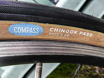
compass 700 x 28c chinook pass tyres
i'd be the first one to admit that i'm undoubtedly guilty of jumping on the vintage bandwagon. when choosing remo drumheads to replace the stock dw heads on my vintage marine pearl drumset, i not altogether surprisingly opted for remo's vintage ambassadors, expressly created to recreate the original plastic head from the 1950s. the very chap that succeeded the calfskin heads used up until that point. though the majority of us have been hitting white, black or clear plastic ever since, i'm still amused to hear non-drummers continue to refer to the heads as skins.
however, one of the bands with which i play infrequently has a predilection for testing the legal limits on noise pollution, so much so, that for the last three or so years, i have used ear-plugs to stop me going deaf. and in order that i don't injure myself in the quest for matching volume, i have my drumset mic'd through the pa system, a fact in itself that doubtless adds to the forcefield of sound assailing the audience. however, beating the stuffing out of a hapless cherry-wood snare drum was always going to take its toll on the drumhead, in this case resulting in the wearing away of the rough white coating, added at the factory to aid a decent brush sound where necessary.
this gig is not one of of those necessary moments.
the problem then arose of what to replace the knackered drumhead with. just for the purposes of reference, when you've finished reading this, take a trip over to remo.com and note just how many variations there are on the humble drumhead, even confining oneself to the 14" size. the original head consists of a 10mm mylar film; the ambassador x that i ultimately chose was double that thickness. but from an aesthetic point of view, it's not the thickness that makes any difference, for the rough white coating seems every bit as expendable as it was on the previous outing.
and you thought that i just randomly hit stuff.
the very same problem (other than the hitting bit) can be experienced when time comes to purchase a set of tyres, price considerations notwithstanding. it's possible many riders have their favourite tyre brands, just as many tend to favour brands of componentry or bicycle frame. prices that now equate with those of car tyres might test some of those allegiances, but there's no doubt that there's still a bewildering number of options for the choosing of, made all the greater due to closer attentions being paid to width.
even in the professional peloton these days, 28mm no longer raises too many eyebrows, a width of tyre once more usually reserved for the annual blast across the cobbles to roubaix. happily, the frame manufacturers have kept their eyes wide open, though older bicycles may struggle to accept this wider and taller rubber. but there is then the matter of tread pattern and just how well you think those rubber designs will suit your style of riding and local terrain. sadly, much of the latter is just so much marketing. we generally don;t ride fast enough for it to make a lot of difference.
i spoke once to a tyre technician from one of the world's more prominent manufacturers, enquiring if it were possible to purchase a clincher featuring the tread pattern on their professional level tubulars. he told me that, while pro riders and mechanics were generally happy with whatever was provided by the tyre sponsor, the average consumer (that's you and me) likes to see squiggly bits on their rubber, preferably updated on a regular basis. happily, the fine folks at the panaracer made, compass tyres, seem not to have fallen for the aforementioned smoke and mirrors, offering their chinook pass clincher with a traditional file tread and (joy of joys) an amber sidewall.
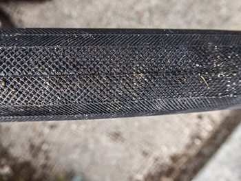
for those of us eager to marry performance with style, that latter feature is of major importance.
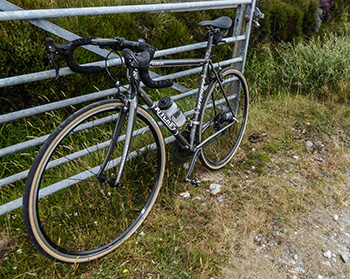
the chinook pass variation (other widths are available, but with different names) is also tubeless compatible, but since the wheels to which i fitted them are not, i combined them with inner tubes. tubeless is fine, but i'm still not entirely convinced it will save the world. compass cycles display a commendable attachment to minimal packaging and the bags in which the pair arrived were hardly festooned with marketing claims or endless warranty booklets. that said, they were pretty darned hard to fit, resulting in sore thumbs for a day or two afterwards. however, i'm generally of the opinion that any difficulty in fitting, ought also to result in a reluctance to depart the wheel in the face of adversity.
personally, i can't see the point in fitting wider rubber and attempting to inflate it to the same pressure as would be common with a 25c tyre. where's the potential for improved comfort? therefore, i inflated the chinooks to 85psi (around 6 bar), a pressure which seems to agree with both them and i. however, according to the online instructions, when run in tubeless mode, the recommended pressure is 60psi (4.1 bar). the labelling on the sidewall attests to a maximum of 105psi, or 7.5 bar. i can testify to the safety of my choice of pressure when using inner tubes, having so far covered around 200km with no adverse effects.
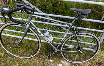
though you may be aghast at the arrogance of presuming to review a pair of tyres after a mere couple of hundred kilometres, let me advise that this is simply my opening gambit; there will be more later. however, initial impressions are exceptionally good; it's not uncommon to fit new tyres and scarcely notice one way or the other. the chinooks offer a remarkable smoothness and grip, both in wet and dry conditions. i have no real fears that this situation will alter, though i expect the combination of caliper brake dust and rain to eventually discolour those delightful amber walls.
to be continued...
compass tyres are exclusively available in the uk from dorset's sven cycles. the standard version as reviewed are priced at £50 each, while the lightweight version costs £75 each.
monday 23 july 2018
 ..........................................................................................................................................................................................................
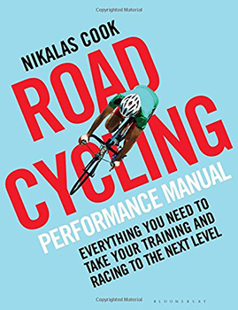
the road cycling performance manual. nikalas cook. bloomsbury sport. 207pp illus. £18.99
said very much tongue-in-cheek, graeme obree once claimed, in response to cycling's growing reputation for alleged 'chemical assistance', that in his mind, training was cheating. it's a stance with which it's hard to disagree; if cycling, along with many other sports, is truly supposed to be 'mano e mano', then surely participants in the competitive milieu ought to best to rely on their natural talent? any attempts to better that situation, such as training, should be considered a rudimentary means of deception.
however, that's easy for graeme to say, given that his cycling cupboard contains olympic medals and world championship jerseys. oh that we could make similar claims. but mr obree is possessed of a constitution considerably more substantial than that possessed by the majority of us and yes, even he trained to get better.
but the real problem with training, other than the knowledge that quite a lot of it is going to hurt, is just how to go about it. the acquisition of athleticism has moved on considerably since il campionissimo proclaimed that pretenders to his crown should "ride a bike, ride a bike and ride a bike'. if you're anything like me, you're still pretty much following coppi's advice. thankfully, i'm well past the point of having any need to train; yes, i like to keep fit, but as long as i don't get dropped off the back on the sunday ride, i'm pretty much good to go.
that being said, there's no doubt that a sizeable number of those who get hooked on bike racing, sportives, or just the race for coffee each sunday morning have an overwhelming need to ride faster for longer. and the only way that's going to happen is by training of one sort or another. but the bit that most of us miss is that of structure. gleaning half truths from magazine articles and attempting to glue them altogether in the vain hope of a phone call from dave brailsford, is not what i'd think of as a cunning plan.
and that's where former masters team pursuit world champion nikalas cook fits in.
along with a little help from a bunch of well-connected friends and a foreword by british cycling's former physiotherapist, mr cook has devised the precise means by which we might all become a tad better at our cycling. however, and i'm not sure the blame lies at nikalas cook's door, i'd really rather the cover did not contain the subtitle 'Everything you need to take your training and racing to the next level'. for me at least, that smacks rather too heavily of an x-factor judge's comment. just saying.
a bit like the warm-up regime we will soon come to know and love, the road cycling performance manual begins with the softly, softly approach. rather than throw us all unceremoniously in at the deep end, the author discusses the ubiquitous bike-fit, the eccentricities of crank length, saddle comfort and almost inevitably, turbo trainers and the invading world of virtual reality, though he does temper all this by including good old-fashioned rollers. by the time mr cook approaches the various types of bicycle, we are already his best pals, more than willing to accept the following stages of purgatory.
nikalas cook, while hardly dismissing the heart-rate monitor out of hand, is firmly in the power-meter camp, already having broached the subject long before considering what sort of sartorial presence it might be best to adopt. from there, 'tis but a short stretch to comparing functional threshold power with functional threshold heart-rate and the slippery slope into training zones.
"Trying to train without using accurate training zones would be analogous to attempting to drive without a speedometer, rev counter or fuel gauge."
having convinced us to exclude a new pair of carbon wheels in favour of a power meter, cook then proceeds to assist us in our comprehension of those selfsame training zones, explaining the testing procedures necessary to discover your own functional threshold. and were you of a mind to think that the author were totally in thrall to those zones, miming 'well, he would say that, wouldn't he?' mr cook maintains a healthy regard for his own expertise, bringing to our attention 'common problems with training zones'.
after that gentle introduction comes the hard part, where we do all the work and nikalas just makes sure we get it right.
cook's 'road cycling performance manual is intelligently written, composed, presented and illustrated, featuring frequent side-quotes from the altogether more physically blessed. tiffany cromwell, katie archibald, andreas lang and hannah barnes, amongst others, help confirm the need for a strict training regime, on the off-chance that our enthusiasm might be seen to be flagging. however, my one gripe with the manual and i'm more than willing to accept its triviality, concerns the plethora of illustrations.
adhering to the 'less is more' philosophy, i'm always in favour of illustrations actually illustrating something, if you see what i mean? illustrations for their own sake may conceivably undermine the veracity of those included out of necessity. to drive home my point probably more forcibly than i need to, all the picture captions feature an arrow in the direction of the pictures, but simply showing a rider on a bike with the legend "Try to divide your year up into focused 8-12 week training blocks" seems a tad disingenuous. similar examples abound throughout the book.
but, as i said, probably a trivial point.
there are many, many cycle training manuals currently on the bookshelf, the majority of which expound a similar path to that of nikalas cook; training is fairly well codified these days. however, i don't mind saying that this particular manual is an excellent example of how it ought to be done. everything is clearly and logically explained, as bang up to date as any publishing schedule will allow, that even those without resort to a coach should have little trouble creating their own little world of exercise purgatory.
i still maintain that i have no need of even a disorganised training regime. but if i did...
sunday 22 july 2018
 ..........................................................................................................................................................................................................
the more things change, the more they stay the same

there was a brief period of time a few years back, when publishers offered the choice of hardback book, e-book or a pdf when time came to review copy options. i've no idea of the choices made by my fellow cycle book reviewers, but i felt a certain degree of economic pressure to opt for the digital version, even though i'm far more a fan of print than of pixels. (i know; ironic huh?) my day job consist of sitting in front of an admittedly large imac for hours on end, shifting words and wrangling pixels, so in my so-called downtime, i'd rather relax with a real book in my hands, than spend more time staring at a computer screen.
aside from which, macbooks and bathwater are rarely the finest of bedfellows.
recognising the fact that every review copy now arrives in an addressed jiffy bag, leads me to believe that either publishers have more invested in print than pixels, or the uptake of digital versions amongst the reviewing fraternity was consistently low. either way, it appears that it's not only reviewers who prefer ink and paper. the guardian newspaper reported a few months ago, that e-book sales have recently declined by 17% and are now at their lowest level since 2011, the year that amazon introduced its kindle. meanwhile, sales of printed matter are on the increase.
the principal reason cited for this state of affairs is that of 'screen fatigue'. it's a fact that is hard to deny, even amongst the pelotonese; the rise in zwift subscriptions has tethered a whole generation of cyclists to a flat screen tv in the garage, while strava has those oakleys spend more time than they should, staring at bar mounted gps units. the relative and static calm of a printed page offers a welcome relief from squiggly moving pictures and digits.
around the same time that the press was advising of the dramatic turnabout in reading habits, it also reported that independent taxi startup, uber had spent $200 million to purchase electric bike-sharing platform jump. having previously partnered with them in the early part of this year to offer bike rental via its smartphone app, it seems that uber now has a cunning plan. i realise that, currently, this applies solely to the san francisco area, but i'd be very surprised if that two hundred million was spent to satisfy a single city.
whatever you may think of the cab company and its strategies, charges and treatment of its drivers, there's little doubt that it has revolutionised the art of haling a cab. but there's just an outside possibility that the tail is about to start wagging the dog. for uber have reported that, in the downtown san francisco area, at times of highest road congestion (and we're talking 8am to 6pm - a significant part of the day), san francisco's commuters are more likely to take a jump e-bike, than try to get from a to b by uber cab.
though taking a bike instead of a cab tends not to be quite so prevalent when the weather's poor, the main reason for this transportational volte-face, according to uber's own policy researcher, is that of speed. downtown san francisco is no different to any other congested city; a former uk government adviser has already warned that traffic in london is likely to slow to 6mph by the end of the next decade. so jumping aboard an e-bike (pun intended), would, on the face of it, make a darned sight more sense than waiting for your uber cab to reach you.
leaving far more time to read a book on reaching your destination.
saturday 21 july 2018
 ..........................................................................................................................................................................................................
two sides of the same coin

it has probably always been the case, but most of us have been too caught up in our own headspace to acknowledge the fact. a quick perusal of the cycling magazines in w h smith would probably enlighten most of us to the differences from which we have been hitherto shielded, but i doubt that many see the shelves of the newsagent as the ideal research facility. and my expounding the theory here and now will most likely elicit similar collective responses that could be summarised as 'well - duh?'
because it remains a well hidden secret that there are two distinct models of velocipedinists: cyclists and bike owners.
were i sufficiently well-versed in the mathematical intricacies of the venn diagram, i've no doubt i could present this in a more graphical format, for it seems possible that the two above-mentioned variations may conceivably be at least partially interchangeable. but in truth, they are not. on my occasional ventures south to the grand village of london town, i have witnessed commuters travelling to work in clobber that would shame the average training pro. such garmentage may well field admirable comfort factors for the thus-clad, but even i'd be inclined to regard it as overkill. i fervently hope those of whom i speak do not spend their day in the office dressed in such a fashion.
put succinctly, those are most likely to be the cyclists.
more often, however, those intent on using their bicycles for mere transportational purposes, sport acres of baggy chartreuse, one pannier affixed to a shaky rear rack, broken mudguards and a helmet that would give the technologists at giro sleepless nights. for them, it would appear that pragmatism and fashion are the two opposite ends of a disconnected thread. do not mistake my adjectivery; i do not intend any disparagement of either characterisation. these are merely oversimplified generalisations to illustrate my point.
no doubt e-mails will follow, explaining how the wearing of fluroescent outerwear hardly excludes the wearer from assos, rapha or endura at the weekend. but my own observations, entirely unscientific as they remain, would tend to confound those protestations. most of those i know with weekend sporting aspirations pay every bit as much heed to their sartorial commuting personas as to those of the peloton, where self-curated style will simply not allow the riding of anything that might be accurately described as a bicycle shaped object.
unfortunately, our own self-indulgencies and questionable spending power may not be sufficient to save our own niche corner of the planet.
depending on who you believe, cycling is either experiencing a boom at present, or it is not. that boom, may simply be an increased awareness optimistically misconstrued by the cognoscenti. in other words, the fact that one or two more of your colleagues may be willing to share conversations regarding the tour de france, does not necessarily equate to increased sales on the bicycle shop floor. and while it may not be the news we would wish to hear, unless more bicycle shaped objects are responsible for increased takings at the till, there's every probability that there will never be a bicycle boom.
thus, while most of what i like to think of as my 'readership' will probably view cheap and nasty in the same portion of the venn diagram as occupied by e-bikes, it is those genres that harbour the potential to draw people out of their cars and onto possibly less than comfortable saddles. mamils quite probably have swollen the ranks of the drop-bar brigade, though, as with many so-called fads, many will already have dropped by the wayside. i'd be inclined to think that the number of roadies has increased by very little, in the grand scheme of things, though even if i'm completely wrong, still by not enough to qualify as a boom.
recent innovations such as the electric bike, dockless bike and the less innovative boris bike have a far better chance of creating long-term cyclists of whichever distinction, a fact that our scarcely-hidden snobbishness would do well to acknowledge. and though i have been somewhat (justifiably, in my opinion) circumspect in my appreciation of the e-bike market, it could be the very transitional stage we've all been looking for.
maybe.
friday 20 july 2018
 ..........................................................................................................................................................................................................
illustratively speaking - a quick conversation
without giving too much away (i'm still a chapter or two away from completion), i'm currently reviewing a book in which, aside from words of wisdom, are a copious number of illustrative photographs. this is, i readily admit, not a particularly unusual state of affairs, but in this specific case, many of those images seem somewhat surplus to requirements. i cannot disagree that pictures are often every bit as important as a textual narrative, but predominantly when they pragmatically serve the latter. in the case under discussion, while the captions often pass on valuable nuggets of information, the images to which they point, frequently fail to be relevant.
an editor i once worked with in the past was firmly of the belief that 'a picture is worth a thousand words', a belief that he often stretched to extremes, providing me with a phalanx of photos and scarcely sufficient words to accompany. those page layouts still give me nightmares.
but there is no doubt that a book of any genre is immeasurably enhanced by the inclusion of a measure of illustration. i would include even the ubiquitous novel in that assertion, though budgetary constraints probably mitigate against such revelatory thoughts. thankfully, no such restrictions were applied to the recently published and reviewed, rapha editions 'getting started in road cycling' by guy andrews, superbly illustrated by laura quick. you would probably not be wrong to assume that rapha were every bit as impressed as was i with laura's artistic flair. beginning this week they're posting a laura quick animation on the rapha website.

but what of ms quick herself? are these illustrative skills self-curated, or the result of a formal art education? "I went to Brighton University. A great illustration course, which, back then, was a really free creative process, where none of us worried about getting a good grade!"
that shows a maturity sadly lacking in my own art education of many years ago, where the overshadowing knowledge that my four years would end with the need to find gainful employment. this knowledge squeezed me into what i surmised might be a more employable discipline. however, at the time, i was bereft of the potential benefit of being a dyed-in-the-wool cyclist, something that may well have saved my (vegetarian) bacon had i invoked a velocipedinal interest. laura's accompaniment to mr andrews' words would indicate that she's no real stranger to the ways of the saddle, so is she an experienced cyclist, or is 'getting started in road cycling' aimed squarely at her bikeshed?
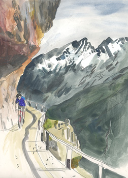
"I was born and raised in Nottingham, so obviously, being the home of the Raleigh factory, my Dad always got me Raleigh racers. I loved them. I had one called a Candice. It was, to me at the time, the Ford Capri of bikes. I loved everything about it, the colours, the font, the white handlebars with red dots. I cycled a lot on that bike. I'd go out round the boating lake on my own to clear my head, and mull over a boy I fancied, (who didn't fancy me back), or why my parents were so infuriating!
there are observed parallels between the visual and the musical arts, particularly related to inhabiting the genre of choice. for instance, it's all well and good to hold bill bruford or pat metheny in high and influential regard, but an entirely different matter to find a musical situation allowing hopefully similar talent to be expressed. i may have an unrivalled ability to percuss in a 7/8 time signature, but if i'm perfectly honest, there's not a ceilidh band on the island that has ever required me so to do.

possessing drawing and painting skills such as those demonstrated by ms. quick are to be much envied, but it strikes me there might be a smidgeon of frustration to be endured if those skills remain as unused and unwanted as my ability to play in 7/8. with this in mind, is the recent collaboration with guy andrews her first artistic foray into the world of cycling?
"I did work with Brooks on their 'Brooks Compendium of Cycling Culture'. I provided imagery about travelling/traversing long distances with some interesting stories about carrying bikes through crocodile infested swaps and going weeks without proper food, and eating saddles."
if you will allow me to stretch the bounds of incredulity and continue my tenuous comparison between the illustrative arts and those of music, i'd be inclined to think that an artist employed in this realm is somewhat akin to that of the session musician. once again, if no-one needs the skill of playing in odd time signatures, the hapless musician is highly unlikely to be re-employed should seven over eight be force fed into a 45 second advertising jingle. thus is often the state of affairs for the illustrator, engaged to provide drawings of teddy bears when their heart pines for the inner workings of a sturmey archer hub gear.

in their recent collaboration, did guy tell her specifically what he wanted, or was she left pretty much to her own devices? "Guy made the odd suggestion, as did Taz (Darling). However, they were great to work with and gave me masses of creative freedom. The kind that rarely comes your way when working with a big brand."
contemporary, state of the art image scanning and high resolution colour reproduction rarely mitigate against one illustrative medium or another. this can be clearly seen when observing laura's acutely observed draughtsmanship in both the animations currently featured on rapha's website and the copious number of static illustrations in the book. both demonstrate an appreciable versatility with differing media, but does laura have a favoured means of expression?
"It depends on the mood/subject. I love my fountain pens and gouache, but sometimes I use Posca Pens, gel pens, and whatever catches my eye in the art store. and I always use a leuchtturm1917 sketchbook. I can't think how to draw without one. (I should tell them this!)"
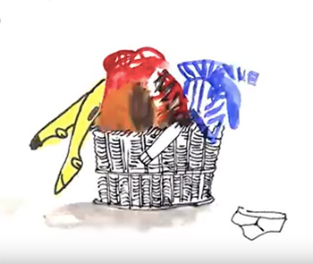
recent posts in these pixels have paid lip-service to the ever-increasing complexity of the modern-day bicycle, more specifically the irreverent tinkering with the inners of the humble bottom bracket by those with apparently little better to do. but that is merely scratching the surface of technological advancement, often requiring more pages of explanation than would have been the case as recently as a decade ago. however, laura's illustrations for 'getting started' display a remarkable simplicity of form, describing the necessities with a minumum of pen or brush strokes. how did she approach the subject matter?
"I just try to keep it as simple as possible. Over-thinking or explaining is no use. I don't worry about creating the most obvious image that everyone will get. I make a leap and if people get it, then great. If they don't, hopefully it's a nice enough image to get by anyhow. I don't like to spoon feed the viewer too much.
 "And I try to be as ordinary as possible about my experiences. Trying to pinpoint the everyday bits is a real interest of mine. I did an illustration the other day about all the nobble ends that you get in tins of pre-chopped tomatoes and how annoying it is. Ordinary stuff interests me and amuses me, because we tend not to discuss it."
cycling is, however, an active sport and activity, even when it's not being done right. even the slowest of us describes a modicum of movement and the ability of today's designers to imbue carbon fibre with a sense of movement, readily apparent should it be only resting against the rapha club window, is often difficult to encapsulate on the printed page. moving pictures are probably where it's at. but to ask a question that was pretty much answered before it was asked, is animation an area in which laura has dabbled?
"As you've already mentioned, keep an eye on the Rapha website: every day from 17 July, they are releasing one of my animations. I also do animated gifs for perfumier, Miller Harris and some for Brooks too. I aim to do this more from now on; it's fun, but it is labour intensive."
so now that our appetite for laura quick's artistic observations has been whetted, is there a chance we'll see more of her work in future rapha editions/bluetrain publications? "I'd hope so. They are great to work with, and they seem pretty happy."
laura quick | getting started in road cycling
.thursday 19 july 2018
 ..........................................................................................................................................................................................................
so what are you going to do about it?

like many a rural scottish region or island, we have seen arguably more than our fair share of consultation exercises. though ostensibly well-meaning, few of them ever see any tangible results, unless, of course, you happen to be one of the well-paid consultants involved in such exercises. there mostly seems to be far more money available to fund the consultations than will ever be made available to capitalise on their results (should such ever become codified into any useful format).
such varied discussions are usually staged above my pay grade, but on occasion, when formulated as grass roots exercises and seen to be relevant to my dubious experience, i have received an invite to participate. in common with my approach to joining committees (islay was once famous for harbouring more committees than any similarly sized community anywhere in scotland), i prefer to sit as quietly as possible and appraise the lie of the land, before feeling justified in weighing in on one side or another. it seems in this regard, i am frequently in the minority.
since the majority of such consultations are of a fairly generalised nature, the outcome is mostly expected to be one that favours the common good. large wads of financial investment are rarely offered to specific sports, activities or points of interest. however, were you to be a fly-on-the-wall during these allegedly open discussions, you'd often be confused as to the veracity of my latter point. for it seems that most participants in such events are keen only to proffer their particular, often self-centred, points of view, paying scant heed to the needs or desires of their fellow attendees.
oddly enough, an inadvertently similar situation may be about to impinge upon decisions affecting the future of cycling.
arriving in my e-mail inbox yesterday was an e-mail from scottish cycling featuring the seemingly obligatory hashtag, in this case #scasksyou. planning to hold three open workshops to help inform their four year strategy consultations (that word again) reaching from 2019 to 2023, scottish cycling also politely requested that i undertake their online survey, answering some pointed questions designed to elicit responses that might aid their ministrations. as a member of scottish cycling and always willing to help, i did as they asked.
i'm nice like that.
the central tenet of the survey and thus presumably the aforementioned strategy, concerns our suggested means of getting more bums on saddles, to use the vernacular. though i dearly hope that my answers eventually prove useful, i have serious doubts that this will turn out to be the case, more because of me, than the phrasing of the questions. i, along with many others, have frequently been asked how i would convert current non-cyclists into the cycling public of tomorrow. whether those potential converts choose to race, commute, both, or otherwise, is likely of academic interest to both parties. but though in context it may seem a tad obscurist, why ask me?
would it not be more pertinent to ask those who don't cycle, why that is the case? i cannot truthfully recall a time when i didn't cycle; for me it seems a perfectly natural mode of transport. and as one who doesn't own a motor car, riding a bicycle for travel and leisure purposes is something of a necessity as well as a lifestyle choice. that's probably the case for many of you. the weather, the traffic (insignificant as it is this far west) and a lack of any definable cycling network, for yours truly, is of no real nevermind. but i'm willing to bet that a number of those factors, along with many others, would be cited by non-cyclists as reasons as to why they might prefer to remain motorists or pedestrians.
however, any pertinent suggestions concerning how a national cycling organisation would contact currently disinterested, yet potential velocipedinists, is yet another question to which i have no credible answer.
anyone?
wednesday 18 july 2018
 ..........................................................................................................................................................................................................
endura pro sl road helmet

a well known british cycle clothing purveyor (not endura), recently released a lengthy movie depicting a form of adventure cycling in the usa. while this in itself is hardly groundbreaking news, it did provide the youtube 'trolls' (for want of a better word) with the opportunity to extend their fifteen minutes of fame by apparently ignoring the merits or demerits of the film itself and pointing out that the four riders involved had had the occasional temerity to ride their bicycles without helmets. i don't intend to enter a potentially long-winded monologue or discussion regarding the pros and cons of helmet wearing, particularly bearing in mind that currently, there is no law compelling riders to include a lid as part of their velocipedinal sartorial elegance,on either side of the pond.
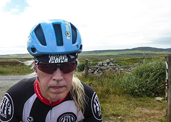
however, personally, i won't leave home without one, but that has a tad more to do with the remote nature of a few of my pedalling locations than any serious thought that wearing a helmet will protect me should i inadvertently meet a large motorhome while descending the hill at foreland. in fact, perhaps to underline just how little inconvenience is engendered by a cycle helmet, i willingly admit to leaving debbie's for home only to realise after a few hundred metres, that the helmet has been left behind on the table top. modern protective headgear has been refined considerably since the days of bell helmets' v1, a helmet that could not only withstand a helicopter strike, but weighed about the same.
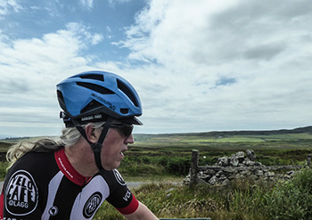
for those less well-versed in the safety technology available to keep your head intact, the endura pro sl helmet featured here weighs a scant 238 grammes; a mere half a pound in old money. if i may briefly return to the prospect of riding into one of those bizarrely named motorhomes near foreland, though the pro-sl is unlikely to come off best in a helmet/motorhome interface, i have every assurance that my cognitive powers will remain intact were i to investigate either of the roadside ditches while taking evasive action. but, a bit like a home or car insurance policy, a helmet is something that you purchase and fervently hope that you'll never need, so it's to the collateral benefits that we must look for further appraisal.
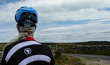
in an interview with endura's jim mcfarlane conducted a few years ago, he mentioned that the company originated in the early nineties with a cycle helmet projected to be its first product. circumstances subsequently dictated that not to be the case, but the possibility never disappeared, resulting five years ago in the endura airshell helmet, a particularly striking design available at a sub-£100 price that looked like an accounting error. this new pro-sl helmet couldn't be more different, in looks, technology and price.
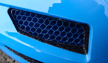
the pro-sl offers a chunkier, more solid looking format than its predecessors, the most notable feature of which is the very welcome koroyd honeycomb that can be clearly seen in every air-vent. while this is an integral part of the helmet's structure, it also functions as an effective bug-net, something that can be seen on other helmets, but principally on the front-most vents. it's available in three sizes: small/medium, medium/large (as reviewed) and large/extra-large and in black, white or hi-viz blue which closely replicates the colour seen on this year's movistar team, to which endura are offical clothing supplier (but not helmets). the price for all sizes and colours is £149.99.
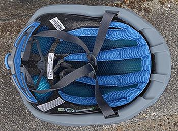
ultimately, the only 'real' way to review a cycle helmet would be to take a header over the handlebars, but while i'm always open to suffering for my art, there are limits. therefore, i'm quite happy to accept the wording on the sticker affixed to the top evincing it to adhere to the koroyd helmet safety initiative. this calls for helmet manufacturers to "voluntarily outperform the minimum helmet certification requirements." according to the selfsame sticker, when wearing endura's pro-sl helmet, you're eight time less likely to suffer a skull fracture than those adhering to the minimum standards.
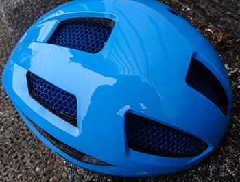
i'm happy to take their word for it.
internally, the padding favours your sweated brow before continuing all the way to the rearmost portion at the top of your head. there, it all but meets the adjustable fit system at the rear, closing in on my carefully coiffeured ponytail with easily adjustable tension. i believe i must have an incredibly average-sized head, for every helmet i receive for review seems to fit almost perfectly with very little in the way of adjustment. however, should you be less-favoured, moving the straps about is nothing at all like appearing on the krypton factor. 8.5 ounces of polystyrene and koroyd atop your head was never going to be a hard ask; well-vented and very comfortable, it's a delight to wear.
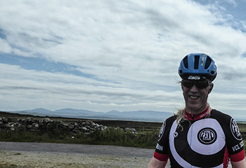
and everyone knows that this particular shade of blue is waaay faster than any other colour. the wind tunnel never lies.
the two small vents on each side facing forward apparently double as an eyewear dock, but since i have prescription inserts, i'm afraid that's another feature i'm happy to take endura's word for. the pro-sl also qualifies for endura's crash replacement policy, reducing the cost of a new one by up to 50%, should you be unfortunate enough to suffer an impact. details are available on endura's website.
if you're in the market for a new helmet, an upgrade, or your very first helmet, i figure it would be hard to do much better than this.
tuesday 17 july 2018
 ..........................................................................................................................................................................................................