
..........................................................................................................................................................................................................
respro hi-viz hump rucksack cover
the principles of painting, in the artistic sense, are reasonably basic, particularly if the subject matter is presented directly in front of the canvas; or whichever medium you feel comfortable with when brush wielding. if we take the ubiquitous still life as an example, unless the objects about to be depicted are of bizarre hue, mix a few pigments from the tubes carefully laid out next to the palette (it may surprise you to know that, concealed in their lonely garretts, berets worn at a jaunty angle, very few artists hold an oval-shaped piece of flat wood on which to mix the paints. you'd only need to take a peek at frank auerbach's studio floor to understand of what i speak) and use that innate artistic talent to match canvas with subject.
of course, the artistic ability may be the stumbling block, though i confess there is also an additional art in knowing which colours to mix and in what proportions to match artifice with reality. still lives traditionally consist of bowls of fruit with the odd slice of newsprint perhaps, and maybe an item of metallicised surface just to challenge that acute visual perception; natural colours, and even better if viewed in natural light. if i give you the benefit of the doubt and assume that you have the appropriate skills to mix your paints in a verisimilitude of lifelike colour, you must see that we're already on the way to, at the very least, providing an appropriately sized portion of illustration to cover that damp patch on the bathroom wall.
but taking even the brightest of pigments suffusing even a small corner of the masterpiece, it is unlikely to have you shading your eyes from the glare.
move on from this appreciation of realism and it may be that your artistic endeavours encapsulate the more imaginative, incorporating idealism, expressionism, fauvism and perchance the abstract. here the colour palette gains, almost overnight, a widening of its limitations, for at least two of the foregoing accepted styles almost demand a vibrancy of colour that it may be hard to find in the natural world.
or not.
many have been the threads on the cycling fora discussing the almost inexplicable affectation practised by the modern providers of cycling apparel to offer a wide range imbued with henry ford's favourite colour. i will not here attempt to defend this situation, for i confess to a degree of incomprehension on my own part as to this prevalence of black, though a stab in the dark (pun intended) might reasonably conjecture that designers like black because designers wear black (actually that's another myth, but it suits my current purposes). look closely in most instances, and you cannot fail to note those almost concealed tabs of scotchlite designed to blend into the smooth courteous lines, hopefully advertising the wearer's presence when out after dark. at this point, we may all query this apparent construct of opposites. for were the principal purpose of such clothing to fend off motorised traffic, surely jackets and trousers of unadulterated scotchlite would carry more visibility?
if your daily grind consists of repairing motorways, sweeping streets, or emptying wheelie bins, the company uniform may well do just this, replacing the tweed of the game-keeper with an eye watering fluorescence. disappointingly, contrary to the blunt and unsubtle, many of us have sensibilities and a daily occupation that mitigates against such glare. how many would feel comfortable, or remain in a job for too long, sitting in the boardroom wearing bright orange and silver with the word cyclist emblazoned across the shoulders? not many i'll warrant. black, on the other hand, even mediated to a charcoal grey, has far more sober propensities, entirely fitting for the modern executive on a swivel chair in an open plan office.
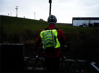
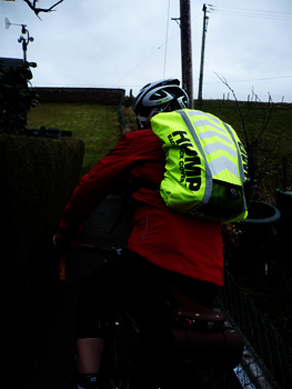
could we not come to a compromise somewhere, donning a removable something that one can allow to dazzle the international space station from the great outdoors, yet curtailing such properties in polite company. a something possessing an additional practical purpose? well, yes we can; a brightly coloured, fluorescent yellow, waterproof rucksack cover that keeps the elements at bay in every sense and implication of the word. but even here there is a fly in the ointment, for who amongst us has the cojones to ride around our city centres, or even the open stretch of road between here and debbie's wearing a yellow something with the word hump substantially emblazoned on each side? a well crafted item of practical avow,and though i can see where they're coming from with the name, i think a bit more time could have been invested in the branding.
that. however, comes under the heading of superficiality, since whatever name they print on the side doesn't affect whether the item does its job or not. as has been minutely detailed in previous editions of this literature (who laughed?) whenever an item of waterproofness arrives in scotland's home of wet weather, i suffer for my art by the infliction of a spell of drought (well, it didn't rain). in this case, i have deviated from my usual pernickety attention to detail, by refusing to sit on the bike shed step twiddling thumbs, until precipitation designs to grace with its presence.
i threw a lot of water on it.
of course, the cover had been stretched over a (black) rapha fixed backpack, no slouch when it comes to repelling water on its own, but it never hurts to have a bit of brightly coloured and reflective help. to gauge whether water could worm its way between the untaped zips, i put some white paper at the top of the rucksack, both inside and outside, before dousing with water. i figured the stuff on the outside of the bag would perhaps become a trifle damp, but such is the effectiveness of the hump, that all remained dry. well, apart from my shoes when i stood a bit too close. as can be seen from the photos, it is not shy and retiring, so i think we can safely tick the visibility box. and just to add utility to effectiveness, the bag in which the hump arrived, can be poppered inside the hump itself, should you need to carry several pairs of drumsticks in dessicated safety. clever.
respro's hump can be acquired in many different flavours, not all of them as brash and uncompromising as this one, for just under £30. if travel by bike, dark night after dark night, through the commuting splash, with your schoolwork on your back, is a regular part of your trasnport strategy, maybe you need a hump.
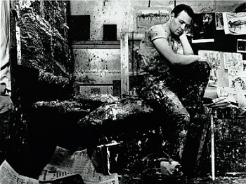
top photo of frank auerbach in his studio, by jorge lewinski
posted monday 13 december 2010
..........................................................................................................................................................................................................