
..........................................................................................................................................................................................................
type casting
at one time there existed a type club (and it may still exist, for all i know), whose motto was 'whoever dies with the most fonts, wins.' given the colossal number of digital typefaces currently available, it may well be a life's work to achieve that status. i own a copy of linotype: the film, a documentary about ottmar mergenthaler's incredible machine that provided a line of type at the behest of a mechanical typesetter, churning out hot metal for newspaper and magazine production from simple typewriter input. mechanical and manual typesetting is responsible for much of the terminology still used in digital typesetting, despite many of those terms having been now superseded by pixels.
'lower case', for instance, which i use pretty much exclusively in thewashingmachinepost, previously referred to the metal letters residing in the little boxes, or cases, on the lower portion of the typesetter's desk. i'm sure you can figure out where capitals, or 'upper case' were kept and the space between each line of type could be varied by the insertion of thin strips of lead, hence 'leading', the term still used in software such as adobe's indesign and its competitor, quarkxpress.
the principal function of type, whether in print or on the web, is to convey meaning, narrative and information to an eager, reading public. a relatively simple and straightforward situation, you would tend to think, and one that could surely be implemented by a single typeface. so why are there so very many variations available from a seemingly endless number of digital foundries? and more to the point, what is the point?
i have a long-running discussion with the teachers of the local primary school, who insist on contributing articles to the newspaper typed in comic sans, often in several colours. i am reliably informed that use of this typeface offers particular reading and legibility benefits for primary age schoolchildren, but, as i have often pointed out, that scarcely justifies the need for the teaching staff to use it for each and every missive. as the poster states 'comic sans is never an acceptable font unless you are an eight year old girl, writing a poem about unicorns.'
'nuff said.
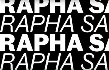
thus, there are fonts/typefaces that are suitable for some purposes, and highly unsuitable for others. this has led to an entire world of typeface ephemera, about which many of us are blissfully unaware. there are more than a few individuals who could care less about such matters, as long as they can read the message. but studying your intended audience in relation to the image you wish to portray, will almost inevitably lead to perusal of as many typefaces as the corporate psyche can withstand. or, just maybe, you can design a typeface all of your very own, something that london's rapha cycle clothing have just accomplished.
but in 2004, simon mottram, founder of the company, stated that his reason for so doing was an inability to find the style and quality of cycle clothing he had in mind. at the time, that was probably true, and since then, i have viewed with suspicion any cycle clothier who trotted out the same mantra. with the wide-ranging current availability of many different types of cycle clothing, anyone who still finds mottram's epithet to be true, must be ruddy hard to please. yet, despite oh, so many commercial typefaces available at the finger tips of their apple macs, rapha decided to commission their very own font. i asked rapha's director of central marketing, james fairbank, if this meant they were particularly hard to please?
"We view type as a key device used to communicate our brand's character. Looking back, Luke and Simon's decision to use Adobe Caslon and Trade Gothic appears prophetic, but arguably that's partially the result of the ubiquity resulting from the wider success of the brand. Since our 15-year history has featured consistent use of type across multiple platforms, we felt that moving to something new, but already in existence to solve the issues we've identified around communication hierarchy, would be to abandon some of the values we've built upon over the years. It also makes sense to own typefaces. It's good to know that we won't have to pay license fees to use Trade and Caslon any more.
"But to answer your question more directly: yes, we are hard to please. We love the sport and try to honour it creatively and that sometimes means we take the long way around."
as james mentioned above, rapha are now fifteen years into their cunning plan for world domination and in many parallel cases, this could be seen as a bit too early to start messing with the formula. however, it could just as easily be said that imperial works has been doing so since day one, particularly in the apparent absence of a cycling-specific formula in the first place. but messing often takes time, so when was the decision taken that a new typeface was required and how long did it take to reach this point. and did they develop this in-house, or was this an external commission?
"We kicked-off the work properly in April 2017, but we'd been discussing it for a couple of years prior to that. The WIGGINS wordmark that Ultan (Coyle - now at Canyon bikes) designed in conjunction with Dalton Maag back in 2015, helped focus attention on the limitations of Trade Gothic. Jack Saunders took up the project and we broadened it to include a complete overhaul of our type. The project's been delivered by Pat Mafham and Arabella Swan produced the animated sampler (from which the accompanying illustrations have been culled). The new typefaces were designed by Commercial Type and we're hugely grateful to Paul Barnes for his help with this project. Paul's one of the partners at Commercial and a very passionate fan of the sport."
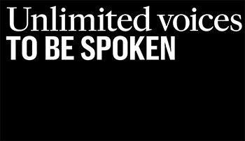
so what do you use a typeface for? at one time, it would have been print, print and only print. but while thewashingmachinepost relies on typefaces that already exist on your computer (because i'm not clever enough to do it in any other way), it has long been possible to embed specifically designed web fonts to carry forward the corporate message. so doing not only underlines the company image, but improves consistency across all forms of media employed by, in this case, rapha. i asked james if the new fonts were purely for use on the web and in print, or will they find their way onto rapha garmentage?
"It's a full overhaul. The changes will be trickling out over the next 18 months, as care-labels and clothing are changed."
not everyone likes change, though i've often heard it said that there's nothing as sure as death, taxes and change. and occasionally, just occasionally, changes are effected for no other reason than simply because they can be. and changes do not always work in the desired manner; how many recall new formula coca-cola, pepsi-cola and one or two chocolate bars of repute? what, therefore, apart from a possible corporate refresh, are the perceived advantages and/or benefits of the exercise?
"Corporate refresh didn't come into it. The main drivers were two-fold: clearer hierarchy across a variety of devices to serve a much-changed communication landscape and the avoidance of licensing costs."
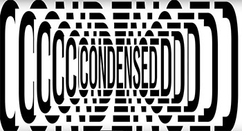
though i have no wish to reveal rapha's web-font licensing costs which are based on the number of website visitors, they are somewhat eye-watering and a factor of which i seriously doubt many members of the peloton are aware. to return to a previous meme, david carsons' much lamented raygun magazine aside (where once an entire article was typeset in 'wing dings'), typefaces are supposed to clearly transmit the message without ambiguity or obfuscation. so doing often requires more than a single 'weight' or 'style', such as bold, condensed, black, italic etc. with rapha's type re-design, how many styles does james now have via his computer keyboard?
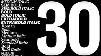
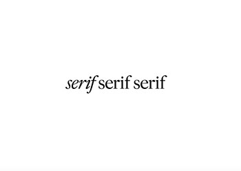
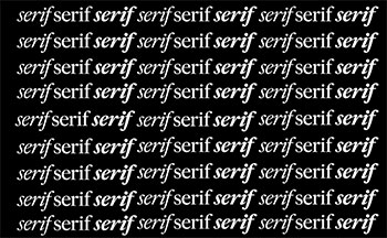
"We now have more than 30 bespoke fonts at our disposal. The Rapha typefaces are made up of two families; sans and serif. The sans is a customized version of an unreleased typeface called Caslon Doric in two cuts: regular and condensed. Both of them are available in three weights with matching italics, and were designed for both print and screen usage. In style they are a modern, in-proportion variant of the old-style model, with a larger x-height and shortened ascenders and descenders. The italic was designed to have character, but also retain legibility. The fonts were designed to be a development rather a reinvention of the current font vocabulary."
those well-versed in the art of proofreading will well know that changing a single word or phrase can often presage a necessity to re-write a lot more than you'd bargained for. similarly, the simple act of changing a typeface could conceivably highlight a need or desire to poke at more things under the bonnet. in which case, does james see any other planned image updates in the near future?
"Nothing as fundamental as a change of typeface."
friday 8 march 2019